

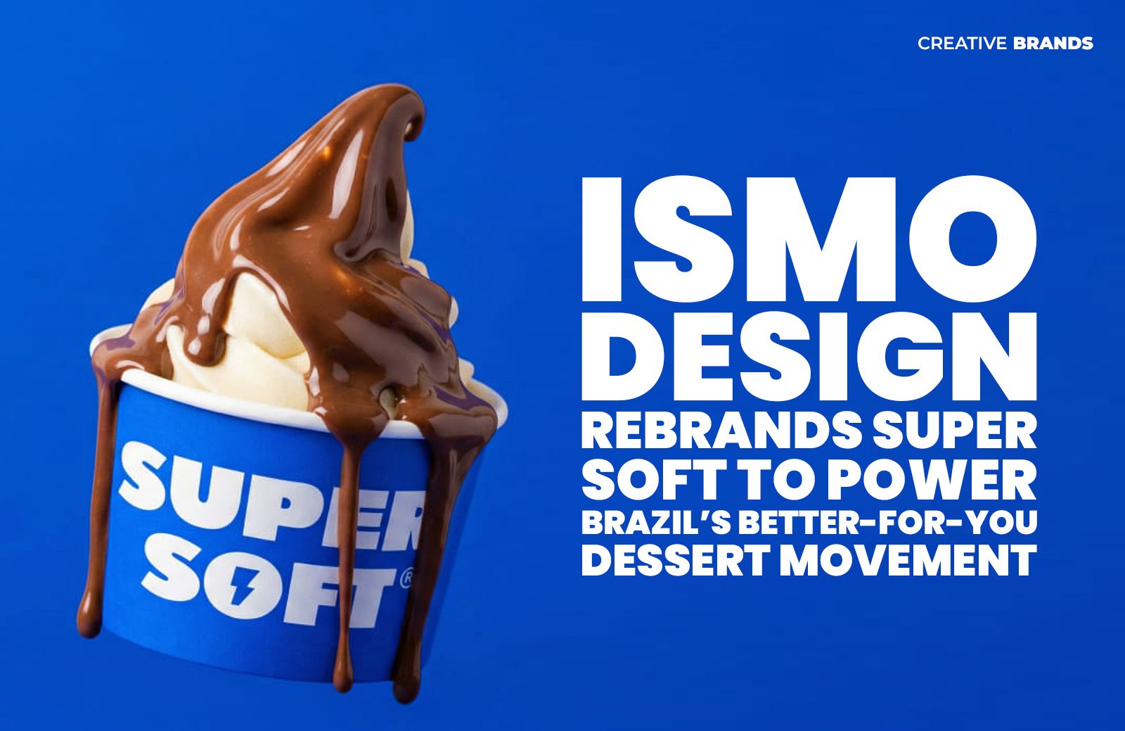
Ismo Design has unveiled a bold new identity for Super Soft, Brazil’s first protein soft serve, repositioning dessert as a functional lifestyle choice. With a lightning bolt logo, vibrant blue palette and wellness-driven storytelling, the brand aims to transform soft serve from a guilty indulgence into an empowering, everyday ritual.
Ismo Design has introduced a striking new identity for Super Soft, a Brazilian dessert concept positioned as the country’s first protein soft serve, as the brand seeks to reshape perceptions of indulgence in the rapidly expanding better-for-you food market.
Developed from the simple yet provocative question of how a guilty pleasure could become part of a daily routine, Super Soft sets out to redefine the role of dessert. Instead of being reserved for occasional indulgence, the product is designed as an everyday treat that aligns with modern health-conscious lifestyles. Combining superfoods, zero sugar, high protein content and a smooth, creamy texture, the offering positions itself at the intersection of indulgence and functionality.
The rebrand by Ismo Design builds on a strategic shift in narrative. In a category dominated by “fit” ice creams, gelatos and açaí bowls, the agency reframed soft serve — traditionally associated with sugary excess — as a symbol of strength and vitality. Drawing on the hero archetype, the brand story transforms dessert from a source of guilt into a statement of empowerment, encouraging consumers to view indulgence as a confident and balanced lifestyle choice.
Central to the redesign is the name “Super Soft”, which reflects both the product’s familiar creamy texture and its enhanced nutritional qualities. The visual identity breaks from convention by replacing the traditional ice-cream cone motif with a lightning bolt logo, signalling energy and performance. A bold blue colour palette further distinguishes the brand from the pastel tones commonly used across frozen dessert packaging, communicating freshness, modernity and a sense of dynamism.
Illustrations within the brand system depict everyday scenarios in which consumers might seek a natural energy lift — before a workout, between meetings, during study sessions or as a more mindful after-dinner dessert. These visual cues reinforce the product’s positioning as part of an active lifestyle rather than a rare treat.
The formulation itself also reflects the brand’s inclusive ethos. Lactose-free, gluten-free and sugar-free, Super Soft aims to appeal to a broad audience looking for convenient ways to integrate indulgence into healthier daily routines.
By aligning its visual language, tone of voice and narrative with themes of performance, balance and empowerment, the new identity presents Super Soft as more than a frozen dessert. Instead, it is positioned as a lifestyle statement — one where indulgence and wellbeing coexist, and where dessert becomes a symbol of modern, mindful living.
Discover more from Creative Brands Mag
Subscribe to get the latest posts sent to your email.


Leave a comment