

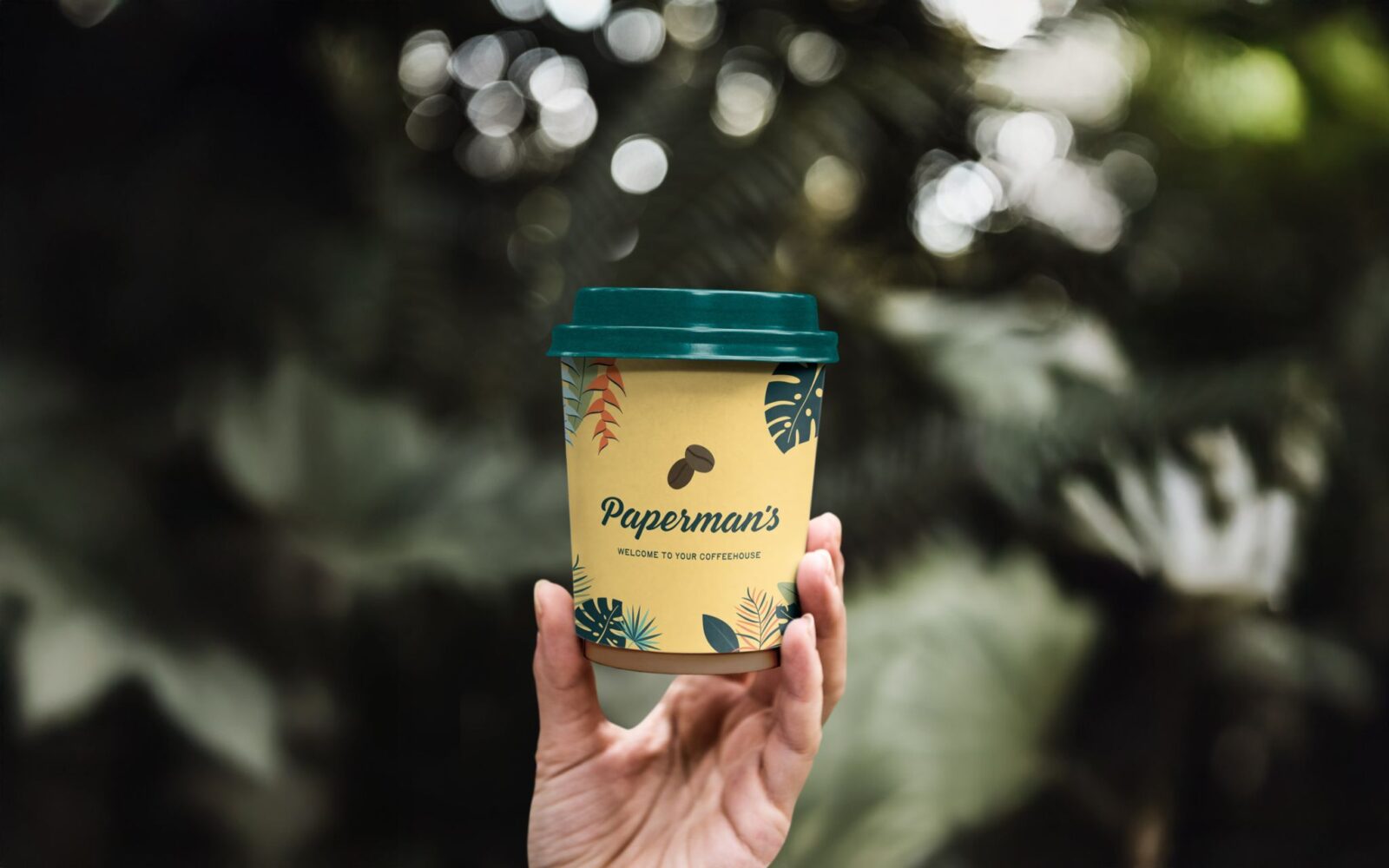
Paperman’s, the beloved trio of island-inspired coffeehouses, has undergone a brand refresh by Love & Logic. Rooted in community and Caribbean heritage, the update retains its welcoming spirit while introducing a confident new identity. With evolved logos and warm typography, Paperman’s steps into its next chapter without losing its charm.
Paperman’s, a trio of coffeehouses that have become fixtures of local life, has unveiled a brand refresh designed by creative agency Love & Logic. The update marks a new chapter for the business, one that balances modernity with warmth while preserving the qualities that made Paperman’s a cherished community hub.
The rebrand is deeply rooted in the origins of the name itself. Inspired by Norman Paperman, the central character in Herman Wouk’s Don’t Stop the Carnival, the story tells of a man who leaves New York behind to open a coffee shop in the Caribbean. That narrative resonates with Paperman’s founder, who partnered with a local family to bring the concept to life, embedding the brand in the rhythms of island life and community. Love & Logic drew on this heritage to craft an identity that feels both authentic and forward-looking.
At the heart of the refresh is a logo evolution that nods to the original mark, ensuring continuity for long-time patrons while signalling a confident new direction. The design is paired with a welcoming script typeface, chosen to evoke familiarity and friendliness. The visual tone strikes a careful balance: modern enough to reflect the ambitions of a growing brand, yet warm enough to maintain the intimacy of a neighbourhood coffeehouse.
For Paperman’s, the refresh is not about reinventing itself but about reaffirming its values. The coffeehouses have always been more than places to grab a drink; they are gathering spots where conversations flow as freely as the coffee. By working closely with the owners, Love & Logic ensured that the new identity reflects this spirit of community. The result is a brand that feels refreshed but not alien, contemporary yet grounded in tradition.
The timing of the rebrand is significant. As Paperman’s looks to expand its presence and deepen its connection with customers, a clear and confident identity becomes essential. The refreshed look provides a platform for growth, allowing the brand to communicate its story more effectively while staying true to its roots. It is a reminder that branding, at its best, is not about surface-level aesthetics but about capturing the essence of a business and expressing it in ways that resonate with people.
For loyal customers, the changes will feel subtle rather than sweeping. The familiar warmth of Paperman’s remains intact, now expressed with sharper clarity and renewed confidence. For newcomers, the refreshed identity offers an inviting entry point, signalling that Paperman’s is both a trusted local favourite and a brand ready for the future.
In the end, the refresh by Love & Logic is a thoughtful update that preserves Paperman’s community-led spirit while giving it the tools to thrive in its next chapter. It is a story of continuity and change, of heritage and ambition—proof that even beloved institutions can evolve without losing their soul.
Discover more from Creative Brands Mag
Subscribe to get the latest posts sent to your email.


Leave a comment