


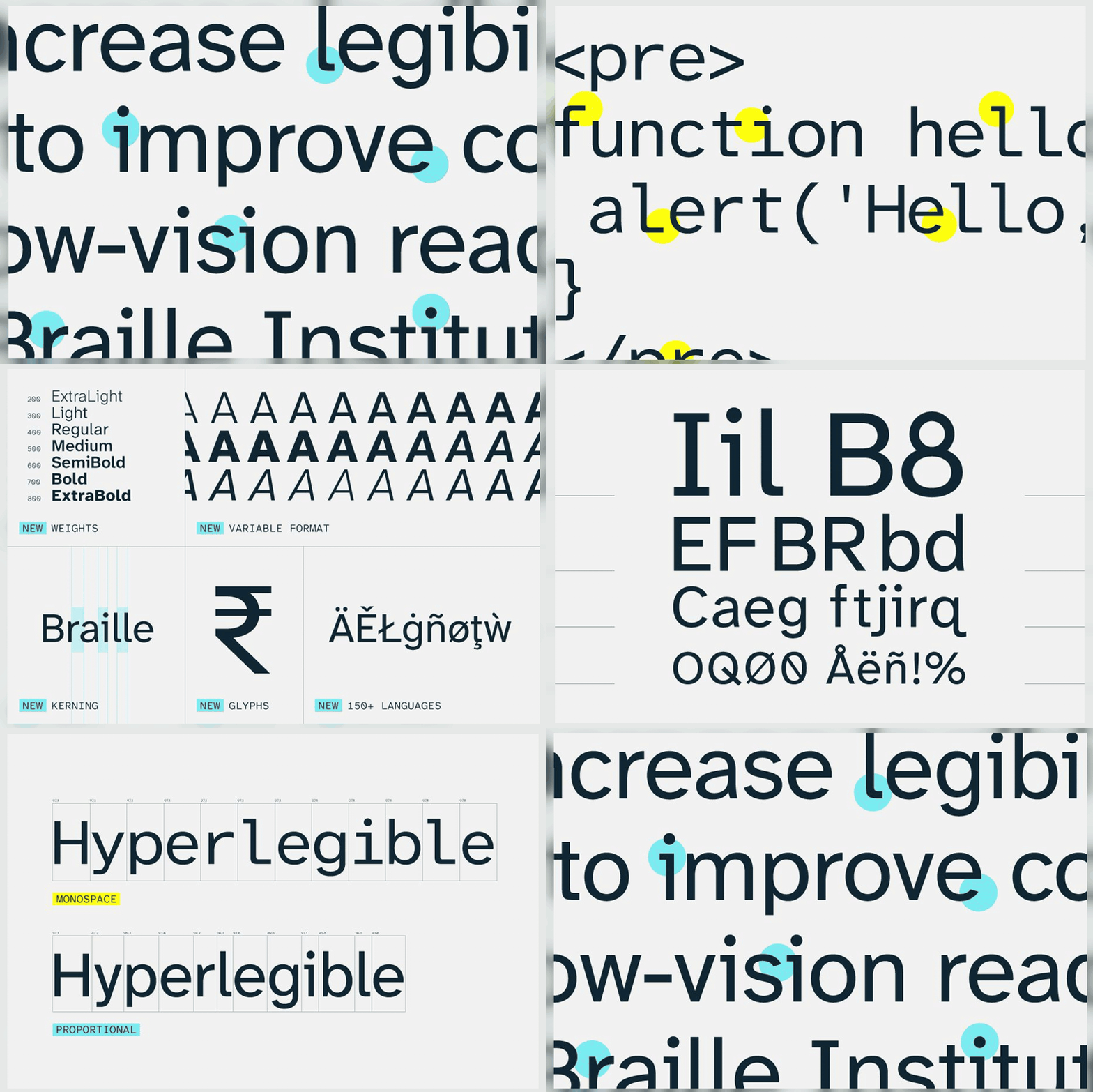
Atkinson Hyperlegible Next and Next Mono, named after the founder of the Braille Institute, have been developed to enhance legibility for readers with low vision. Combining a grotesque sans-serif foundation with distinctive design elements, the typefaces aim to improve comprehension and character recognition across diverse contexts.
Typography has long been a silent but powerful force in shaping how information is consumed, understood and remembered. For readers with low vision, however, the nuances of type design can mean the difference between clarity and confusion. It is against this backdrop that Atkinson Hyperlegible Next and its companion, Next Mono, have emerged as groundbreaking contributions to accessible design.
Named in honour of J. Robert Atkinson, founder of the Braille Institute, these typefaces were conceived with a singular purpose: to increase legibility and comprehension for those who struggle with conventional fonts. The design process was rooted in the recognition that accessibility in typography is not merely a matter of enlarging text or adjusting contrast, but of rethinking the very anatomy of letters to ensure they are distinguishable at a glance.
Atkinson Hyperlegible Next builds upon the foundation of a traditional grotesque sans-serif, a style known for its clean lines and functional clarity. Yet it departs from convention by introducing distinctive, unexpected elements that heighten character recognition. Subtle but deliberate modifications—such as exaggerated apertures, differentiated letterforms and carefully balanced proportions—help prevent common misreadings. For instance, characters often confused in standard fonts, like the lowercase “l” and uppercase “I”, or “0” and “O”, are rendered with unmistakable differences.
Next Mono, the monospaced counterpart, extends this philosophy into contexts where fixed-width characters are essential, such as coding environments or tabular data. By applying the same principles of enhanced legibility, it ensures that accessibility is not compromised in technical or digital applications.
The significance of these typefaces lies not only in their design but in their ethos. They embody a shift towards inclusivity in visual communication, recognising that readers with low vision represent a substantial and diverse audience. Rather than treating accessibility as an afterthought, Atkinson Hyperlegible Next integrates it into the core of typographic design, setting a precedent for how the industry might evolve.
Beyond their immediate utility, these typefaces also carry symbolic weight. By bearing the name of Atkinson, they pay tribute to a legacy of advocacy for the visually impaired, while signalling a future where design serves all users equitably. In doing so, they challenge designers, publishers and technologists to reconsider the role of typography in shaping inclusive experiences.
As digital and print environments continue to expand, the demand for accessible design solutions will only grow. Atkinson Hyperlegible Next and Next Mono stand as timely reminders that innovation in typography can be both aesthetically compelling and socially transformative. They prove that clarity is not a compromise but a design achievement—one that ensures every reader, regardless of visual ability, can engage with text meaningfully.
Discover more from Creative Brands Mag
Subscribe to get the latest posts sent to your email.











Leave a comment