


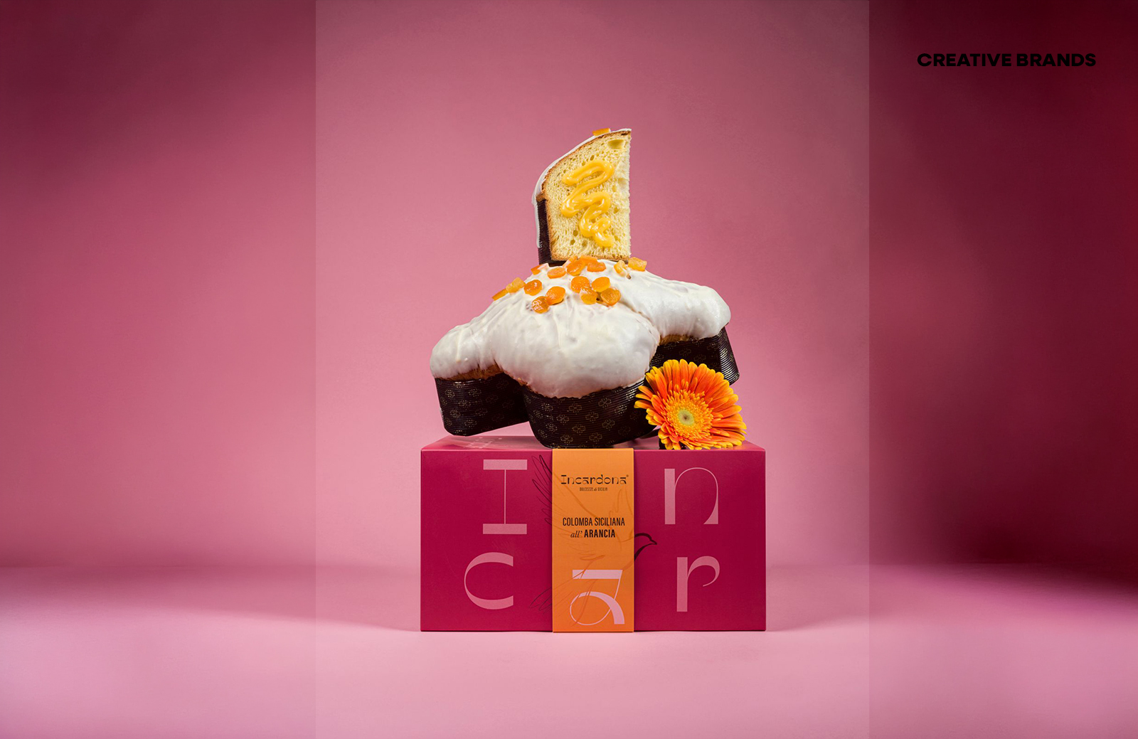
Rosario Lo Iacono Design has developed a flexible packaging system for Incardona’s Easter collection, balancing consistency with seasonal adaptability. Using colour, typography, and layered graphics, the design ensures recognisability across formats while allowing each product to stand out, creating a modular identity that can evolve across future collections.
Rosario Lo Iacono Design has shaped Incardona’s Easter collection into a modular packaging system that balances consistency with seasonal adaptability. Through colour, typography, and layered graphics, the design achieves a coherent identity across formats while allowing each product to stand out within a unified visual language.


The Easter collection demonstrates how packaging can evolve without losing its core identity. Incardona’s colomba cake and chocolate eggs are presented in distinct formats — a box and a cylindrical container — yet both adhere to the same structural principles. Proportions, balance, and clarity remain intact, ensuring recognisability across the range. Colour becomes the key differentiator, with each variant marked by its own palette, while vertical bands organise information and reinforce hierarchy in a minimal, legible layout.
Typography plays a subtle but inventive role. The eggs appear to rest on the letter “a”, which doubles as a graphic anchor, while a key ingredient is delicately placed atop each egg. This interplay introduces controlled visual tension, enriching the narrative and enhancing product perception. On the colomba box, a layering effect is achieved by aligning the illustrated dove on the band with the printed dove beneath, creating coherence between elements and strengthening the system’s visual logic.
The result is a packaging identity that is both flexible and enduring. Designed to extend across future seasonal collections, it adapts to new contexts without sacrificing recognisability. By combining structural precision with narrative detail, Rosario Lo Iacono Design has delivered a system that balances clarity, creativity, and brand presence — a seasonal packaging solution that is as functional as it is visually compelling.
Discover more from Creative Brands Mag
Subscribe to get the latest posts sent to your email.












Leave a comment