

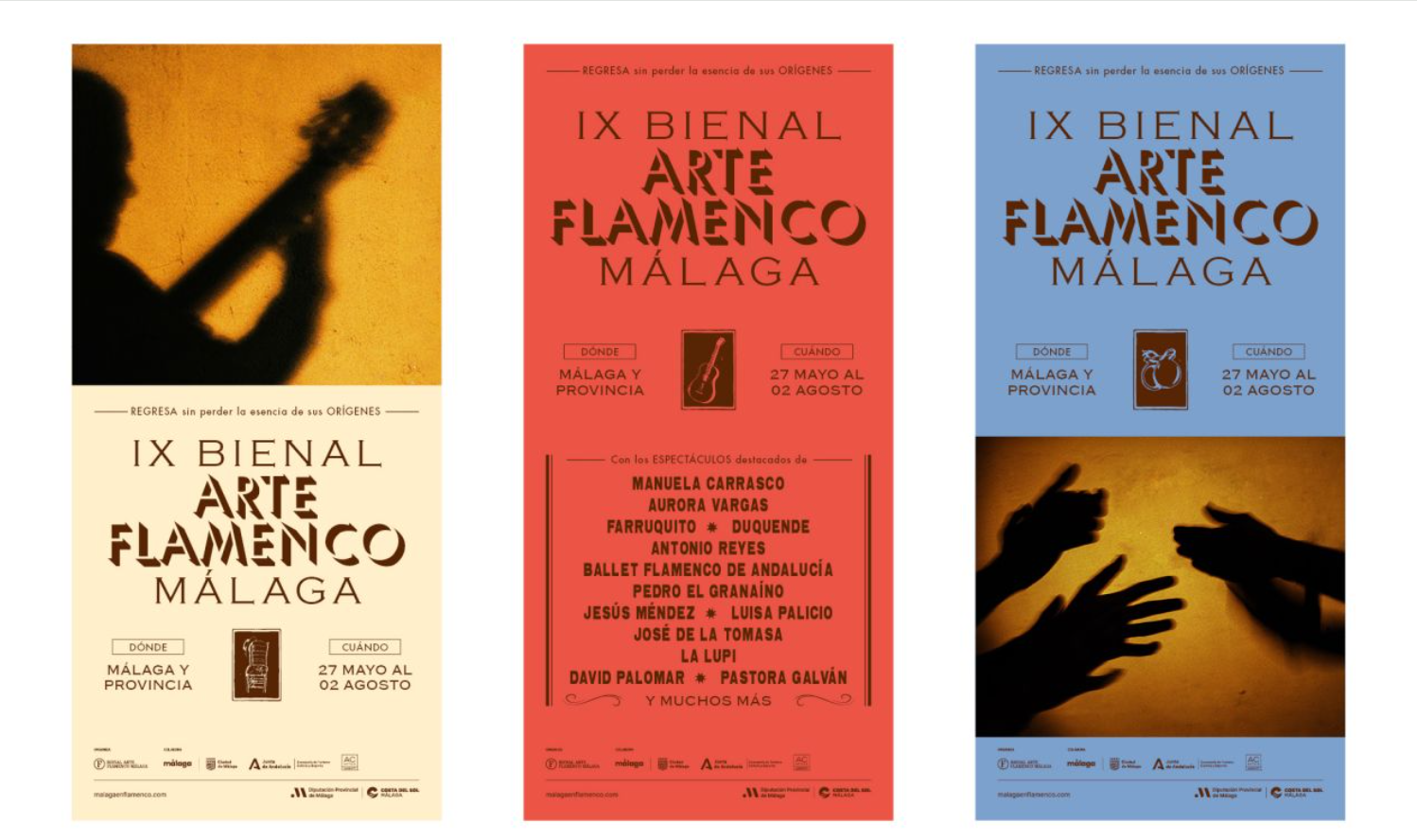
The Bienal de Arte Flamenco de Málaga 2025 embraced a striking new typographic identity crafted by Tiquismiquis.club. Drawing inspiration from 1970s and 80s flamenco posters, the design reinterprets popular graphic culture with contemporary flair, blending Umbra and Copperplate Gothic typefaces to honour tradition while projecting timeless energy and authenticity.
The Bienal de Arte Flamenco de Málaga, held from 27 May to 2 August 2025, reaffirmed its role as one of Spain’s most significant cultural gatherings, celebrating flamenco not only as an art form but as a living heritage deeply rooted in the city’s identity. Bringing together singers, dancers, guitarists, and audiences from diverse backgrounds, the Bienal created a space of exchange and visibility where tradition and innovation met in vibrant dialogue. This year, however, the event distinguished itself with a striking new typographic identity designed by Tiquismiquis.club, a creative studio that turned to the past to shape the future.
The design process began with what the studio described as “visual archaeology.” Rather than inventing a style from scratch, the team immersed themselves in the graphic culture of flamenco posters from the 1970s and 80s. These posters, once plastered across Andalusian streets, were characterised by bold typography, abundant text, vivid colours, and a distinctive flair that spoke directly to popular audiences. Tiquismiquis.club sought to revive that communicative energy, not as nostalgic imitation but as respectful reinterpretation. By studying the way those posters conveyed passion and presence, the designers aimed to capture flamenco’s essence in a contemporary visual language.
The result was a typographic identity that balances authenticity with modernity. For the Bienal’s masthead, the studio chose to combine two typefaces from the 20th century: Umbra and Copperplate Gothic. Umbra, with its expressive play of shadows, lends dynamism and depth, while Copperplate Gothic, with its solid and classical character, provides stability and gravitas. Together, they create a headline that is both commanding and timeless, embodying flamenco’s dual nature as tradition and living art. The dialogue between these typefaces strengthens the Bienal’s identity, connecting it to the graphic heritage that inspired the project while ensuring it resonates with contemporary audiences.
This typographic choice was not merely aesthetic. It was a deliberate act of cultural storytelling. Flamenco, after all, is more than performance; it is a language of identity, emotion, and resilience. By rooting the Bienal’s visual identity in the graphic traditions of past decades, Tiquismiquis.club underscored flamenco’s continuity across generations. The abundance of text and bold colours of earlier posters spoke to communities for whom flamenco was not an elite art but a shared cultural heartbeat. Reinterpreting that style today bridges the gap between heritage and modern design, reminding audiences that flamenco’s energy is timeless.
The Bienal itself provided the perfect stage for this identity to shine. Across Málaga, performances unfolded in theatres, plazas, and intimate venues, showcasing the breadth of flamenco expression—from the raw intensity of cante singing to the intricate rhythms of dance and the soulful resonance of guitar playing. The new typographic identity appeared across posters, programmes, and digital platforms, ensuring that the Bienal’s presence was felt not only in sound and movement but in visual form. The masthead’s bold pairing of Umbra and Copperplate Gothic became a symbol of the Bienal’s character: rooted in tradition, yet alive with contemporary relevance.
For audiences, the design offered more than visual appeal. It invited them to see flamenco through the lens of its cultural history, to recognise the artistry not only in performance but in the way flamenco has been communicated and celebrated over decades. In this sense, Tiquismiquis.club’s work extended the Bienal’s mission of visibility and exchange. Just as the Bienal brings together artists and audiences, the typographic identity brought together past and present, popular culture and professional design, heritage and innovation.
As the Bienal concluded in early August, the typographic identity remained as a lasting imprint of the 2025 edition. It demonstrated how design can serve as cultural archaeology, unearthing and reinterpreting traditions to keep them alive in contemporary contexts. For Málaga, a city where flamenco is inseparable from its soul, the Bienal’s new visual language affirmed that heritage is not static but dynamic, capable of evolving while preserving its essence.
In giving the Bienal de Arte Flamenco de Málaga a typographic identity rooted in graphic heritage, Tiquismiquis.club achieved more than a design project. They created a cultural statement: that flamenco’s passion, authenticity, and energy can be expressed not only in song and dance but in the very letters that announce its presence.
Discover more from Creative Brands Mag
Subscribe to get the latest posts sent to your email.


Leave a comment