

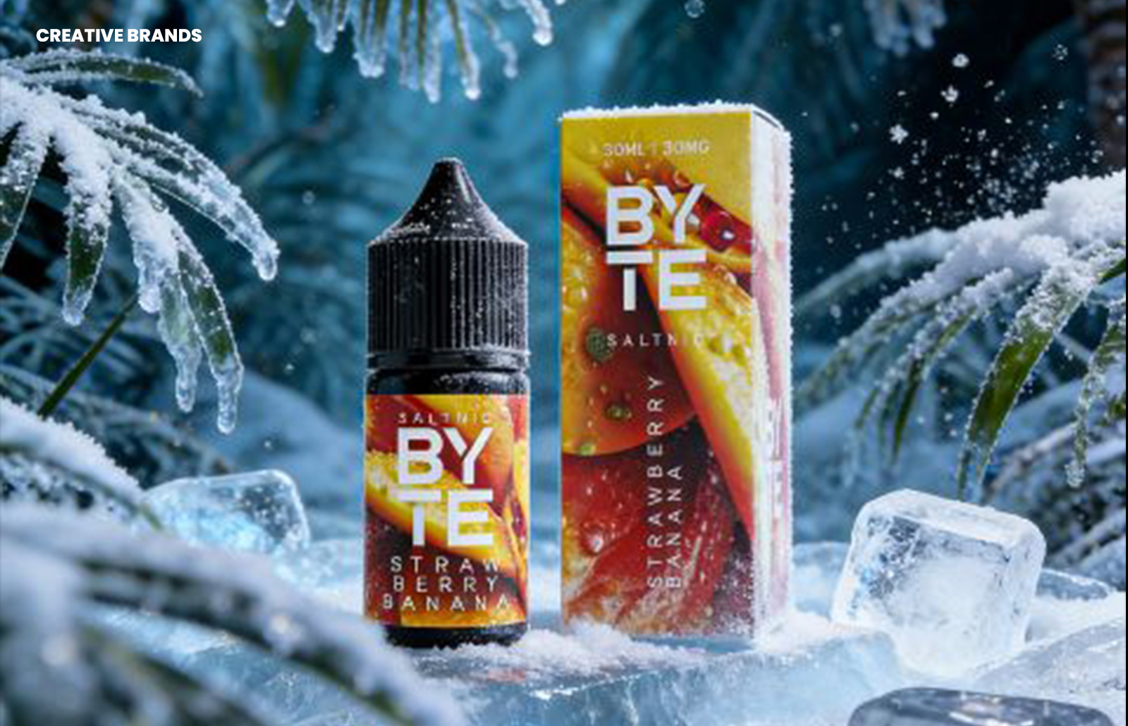
SOVOK Studio has crafted a cohesive packaging and label identity for BYTE Saltnic, uniting eight distinct flavour worlds through immersive macro-texture design, saturated colour palettes, and a consistent logotype. The system delivers strong shelf presence, intuitive pairing of box and bottle, and lifestyle renders that amplify brand impact.
BYTE Saltnic’s latest brand identity is a study in cohesion and distinction. With eight flavours to present, each demanding its own visual personality, the challenge was to create a system that could accommodate variety without fragmenting the brand. SOVOK Studio, a specialist in vape brand design since 2017, approached the task by building a unified framework that balances individuality with consistency.


At the heart of the design direction are immersive macro-texture backgrounds. Each flavour is given its own saturated colour palette, creating immediate recognition and impact. These colour worlds are bold and differentiated, yet they are anchored by the BYTE logotype, which acts as the constant thread tying the range together. This interplay ensures that while each SKU stands out, the collective presence on shelf feels like one brand decision rather than eight separate ones.
The packaging extends across bottle labels, outer boxes, and 3D lifestyle renders, each element carefully designed to reinforce the system. Labels are crafted to read clearly at a distance, ensuring visibility in retail environments, while rewarding close inspection with detailed textures and finishes. The outer boxes are not treated as secondary packaging but as matched pairs with the bottles, designed to work in harmony rather than as isolated objects. This pairing strengthens the consumer’s sense of a complete product experience.
Equally important are the render environments, which amplify the label design without overshadowing it. These 3D lifestyle visuals provide context and energy, enhancing the brand’s presence in digital and promotional spaces. They serve as an extension of the packaging identity, ensuring that the vibrancy of the colour worlds translates seamlessly across platforms.
The design brief was clear: achieve strong shelf presence across eight SKUs, create labels that balance clarity and detail, and ensure packaging elements function as a unified system. The most difficult aspect lay in making eight different colour worlds feel like one cohesive brand. SOVOK Studio’s solution demonstrates how disciplined design thinking can reconcile variety with unity, producing a system that is both flexible and recognisable.
BYTE Saltnic’s identity reflects the studio’s expertise in vape branding, honed since 2017. It is a project that underscores the importance of consistency in a category where flavour differentiation often risks visual fragmentation. By anchoring the range in a single logotype and a shared design language, SOVOK Studio has created a brand system that is immersive, dynamic, and unmistakably BYTE.
The result is a packaging identity that not only elevates the product line but also positions BYTE Saltnic as a brand with clarity, confidence, and creative distinction. It is a case study in how colour, texture, and typography can be orchestrated to deliver both individuality and cohesion, ensuring that every flavour contributes to a unified brand story.
Discover more from Creative Brands Mag
Subscribe to get the latest posts sent to your email.


Leave a comment