


Mumbai-based crafted prebiotic soda brand Hadō is introducing a striking new visual identity built around what it calls “Organised Visual Chaos”. Combining exposed aluminium, bold typography, playful illustrations and mood-driven storytelling, the packaging aims to help the emerging brand stand out and connect with India’s visually conscious Gen Z consumers.
Mumbai-based crafted prebiotic soda brand Hadō is making a confident entrance into India’s increasingly competitive beverage market with a packaging design that is as expressive as the flavours inside its cans.
Built around a concept the company calls “Organised Visual Chaos”, the new visual identity combines vibrant colours, hand-drawn illustrations, bold typography and a carefully structured layout. While the overall effect is energetic and playful, every design element has been intentionally placed to communicate flavour, mood and product information in a clear and engaging way.
For a homegrown brand competing alongside established global and legacy beverage names, packaging has become more than a container; it is a key tool for building recognition and forging a connection with consumers. Hadō believes its distinctive design language will resonate particularly strongly with Gen Z audiences, who often gravitate towards brands that feel individual, expressive and aligned with their own personalities.
One of the most distinctive features of the packaging is its use of exposed silver aluminium. Rather than covering every surface with printed graphics, Hadō has chosen to make the can’s natural metallic finish a central element of the design. Thin, unprinted silver lines divide the artwork into separate sections, creating visual structure while allowing the material itself to become part of the brand’s identity.
The reflective aluminium provides contrast against the vivid illustrations and colour palettes used across the range, helping different visual elements stand out while reinforcing a message of transparency. According to the brand, the decision reflects its commitment to being open with consumers about ingredients and product information. Just as the can does not conceal its raw aluminium surface, Hadō aims to present its products in a straightforward and honest manner.
The layout itself draws inspiration from Japanese bento boxes, where separate components are neatly arranged within individual compartments. This bento-grid approach allows the cans to be divided into smaller sections, each dedicated to a specific aspect of the product, such as the brand name, flavour, mood, illustrations and nutritional information.
The concept also reflects the meaning behind the name Hadō, a Japanese word that translates to “vibe”. By giving every element its own place while maintaining a cohesive overall design, the packaging achieves a balance between order and creativity. The system also provides flexibility, allowing future flavour extensions to fit naturally within the same visual framework.
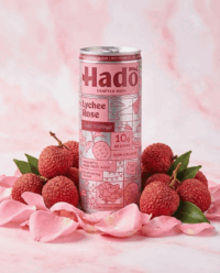
Rather than focusing solely on flavour descriptions, Hadō has developed personalities and moods for each variant. Lychee Rose, called “Sweet Nothings”, features romantic imagery such as roses, candles and hearts, evoking a calm self-care moment. Guava Chilli’s “After Hours” identity leans into nightlife culture with disco balls, turntables and gaming references. Pineapple Coconut, named “Easy Breezy”, embraces beach-inspired visuals including coconut palms and beach balls, while Lemongrass Ginger’s “Clean Slate” uses fresh herbal motifs associated with relaxation and rejuvenation.
These illustrations are designed to reveal new details as consumers rotate the can, encouraging closer interaction with the packaging. Colour selection also played a central role in the design process, with each palette chosen not only to represent flavour but also to reinforce the mood associated with each drink while ensuring the entire range remains visually cohesive.
With its blend of transparency, storytelling and striking visual design, Hadō is betting that a can can do more than hold a drink. It can communicate a personality, spark curiosity and create a memorable brand experience before the first sip is even taken.
Discover more from Creative Brands Mag
Subscribe to get the latest posts sent to your email.










Leave a comment