


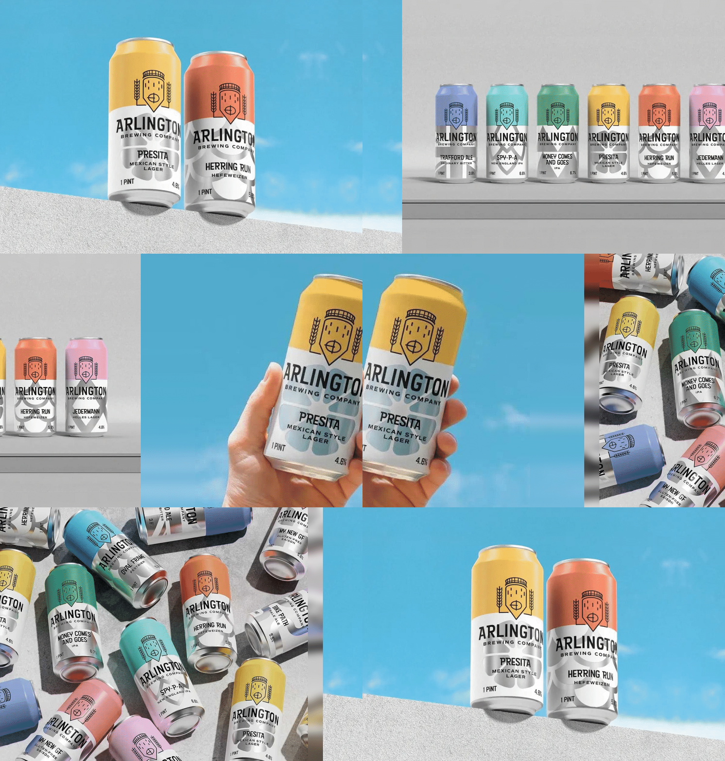
Arlington Brewing Company has introduced a bold new visual identity that reflects its commitment to community, craftsmanship and locally brewed beer. Combining modern design with subtle retro influences, the branding sets the Massachusetts brewery apart in a crowded craft beer market while celebrating its hometown roots and welcoming spirit.
Arlington Brewing Company is staking its claim in the competitive craft beer landscape with a new visual identity that places community, local pride and approachable design at its core.
Based in Arlington, Massachusetts, the brewery was established with a simple ambition: to create high-quality, locally crafted beer that brings people together. Serving beer enthusiasts from Arlington and neighbouring towns, the business has positioned itself as more than just a brewery. It aims to be a gathering place, offering a relaxed and welcoming atmosphere designed to feel as familiar as spending time in one’s own backyard.
That emphasis on connection and community has shaped every aspect of the brand’s identity. Deeply rooted in its hometown, Arlington Brewing Company celebrates local heritage, craftsmanship and the enduring appeal of sharing a drink with friends and neighbours. These values have become central to how the brewery presents itself both on and off the shelf.
The newly developed visual identity reflects that philosophy through a design approach that is intentionally restrained yet highly distinctive. In a sector often dominated by intricate illustrations, tattoo-inspired graphics and experimental aesthetics, Arlington Brewing Company has chosen a markedly different path. Its branding embraces a bold, minimal and contemporary style while retaining the warmth and character associated with traditional craft brewing.
The result is a visual language that seeks to stand apart from prevailing trends without abandoning the authenticity that beer drinkers often expect from independent breweries. Rather than relying on visual complexity, the identity communicates confidence through clarity, using carefully considered design elements to create a memorable presence.
A key component of the brand system is its colour palette. Fresh, vibrant and earthy tones introduce warmth and personality across applications, helping to reinforce the brewery’s approachable image. The colours balance contemporary appeal with a sense of familiarity, reflecting both the natural ingredients of brewing and the close ties the company maintains with its local community.
Typography also plays a significant role in defining the brewery’s character. Bold, clean letterforms are paired with subtle retro influences, creating a look that feels modern while acknowledging the traditions that underpin the craft. This combination provides a visual bridge between past and present, allowing the brewery to honour its roots while projecting a forward-looking identity.
The branding additionally offers an alternative to the more conventional visual styles often associated with local competitors. While some brewery identities lean heavily on heritage-inspired aesthetics that can appear dated, Arlington Brewing Company’s approach seeks to balance tradition with contemporary relevance. The design captures the brewery’s artisanal spirit without resorting to familiar craft beer clichés.
As the craft beer market continues to evolve, standing out has become increasingly important. For Arlington Brewing Company, differentiation is not only about aesthetics but also about expressing a clear sense of purpose. By combining modern design, community-focused values and a strong connection to place, the brewery has created an identity that reflects both who it is today and where it hopes to grow in the future.
The result is a brand that feels confident yet friendly, modern yet rooted in tradition, and unmistakably connected to the community it calls home.
Discover more from Creative Brands Mag
Subscribe to get the latest posts sent to your email.












Leave a comment