

Probiotic coconut yogurt brand Coconut Cult has unveiled a new visual identity and packaging system designed to unify its previously eclectic style. The refreshed look balances quirky cult-inspired illustrations with structured clarity, strengthening shelf presence and recognition while making gut health feel fun, accessible, and unmistakably Coconut Cult.
In the crowded world of probiotic foods, standing out on the shelf is as much about personality as it is about product. Coconut Cult, the probiotic coconut yogurt brand with a devoted following, has long been celebrated for its playful spirit and unconventional approach to gut health. Yet as the brand expanded its product line and sought to reach new audiences, it faced a challenge familiar to many growing companies: how to unify a previously inconsistent visual language into a cohesive identity that could carry its quirky personality while ensuring clarity and recognition across formats.
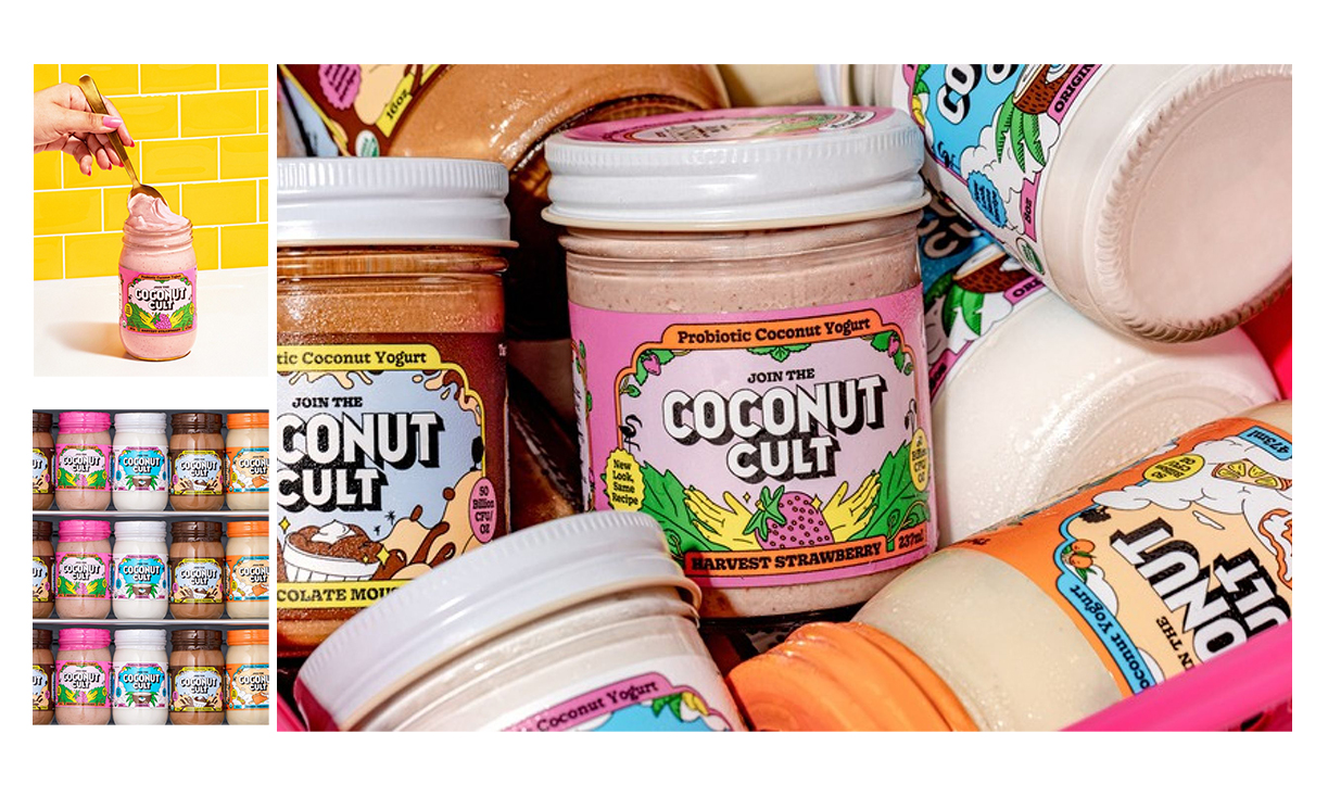
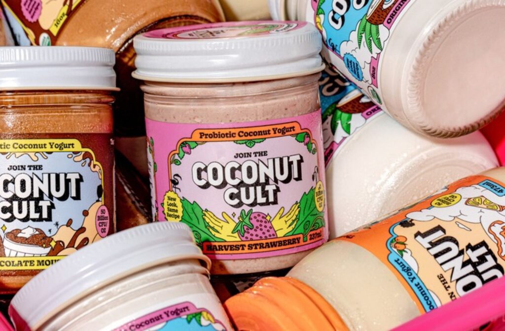
The solution arrived in the form of a bold redesign that reimagines Coconut Cult’s packaging and brand identity from the ground up. At the heart of the new system is a coconut-inspired wordmark, a consistent frame device, and a suite of cult-inspired illustrations that together create a distinctive, instantly recognizable look. The design balances vibrant imagery with structured hierarchy, ensuring that while the brand’s playful energy remains intact, it is now channelled through a system that supports accessibility and clarity.
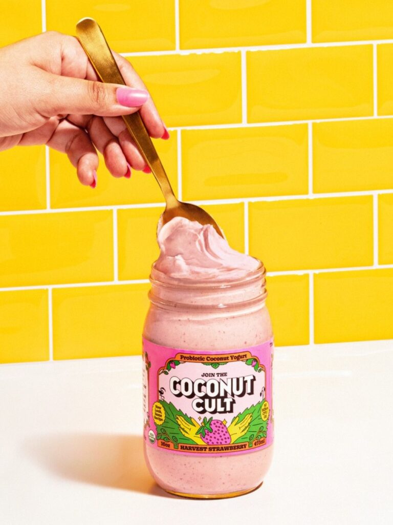
For Coconut Cult, the redesign was not simply about aesthetics. It was about building a stronger shelf presence in a competitive category where probiotic yogurts often rely on clinical cues or wellness tropes. Coconut Cult wanted to break away from the sterile, medicinal feel that dominates much of the gut health space. Instead, it sought to make gut health fun, inviting, and unmistakably its own. The new packaging delivers on that ambition by embracing bold colors, expressive illustrations, and a visual rhythm that feels both structured and spontaneous.
The coconut-inspired wordmark anchors the brand’s identity, serving as a consistent visual cue across all packaging sizes and formats. Paired with a frame system that organizes information, the wordmark ensures that even as the brand plays with vibrant imagery and quirky illustrations, the core identity remains clear and legible. This balance between playfulness and structure is central to the redesign’s success. It allows Coconut Cult to maintain its eccentric personality while offering consumers the clarity they need to navigate product choices quickly and confidently.
Cult-inspired illustrations add another layer of storytelling. These graphics nod to the brand’s name and ethos, creating a sense of community and belonging that resonates with its loyal fan base. The illustrations are not just decorative; they reinforce the brand’s narrative of gut health as a joyful, shared experience. By weaving these elements into the packaging, Coconut Cult strengthens its emotional connection with consumers while differentiating itself from competitors.
The redesign also addresses practical considerations. With an expanding product line, Coconut Cult needed a system that could scale across different sizes and formats without losing coherence. The new packaging achieves this by applying a consistent hierarchy of information, ensuring that whether a consumer picks up a small jar or a larger container, the experience feels unified. This scalability is crucial for a brand that continues to innovate and introduce new products.
Equally important is the way the packaging supports accessibility. Clear labeling, structured layouts, and legible typography make it easy for consumers to understand what they are buying. In a category where functional benefits are often complex, Coconut Cult’s packaging simplifies the message without diluting the brand’s personality. It invites consumers in with humor and vibrancy, then guides them with clarity and confidence.
The impact of the redesign extends beyond the shelf. For Coconut Cult, the new identity is a statement of intent—a signal that the brand is ready to grow while staying true to its roots. It reflects a maturity in design thinking, recognizing that consistency and clarity are not constraints but enablers of creativity. By unifying its visual language, Coconut Cult has created a platform that can support future innovation while strengthening its current presence.
Consumers, too, benefit from the redesign. In a marketplace where choice can be overwhelming, clear recognition is invaluable. The new packaging ensures that Coconut Cult products are easy to spot, easy to understand, and easy to enjoy. At the same time, the playful illustrations and vibrant imagery keep the experience delightful, reminding consumers that gut health doesn’t have to be serious or clinical—it can be fun, engaging, and even a little cult-like.
The story of Coconut Cult’s redesign is ultimately one of alignment. It is about aligning personality with clarity, playfulness with structure, and brand ethos with consumer needs. In doing so, Coconut Cult has not only solved a design challenge but also reinforced its identity as a brand that dares to be different while caring deeply about its community.
As the probiotic yogurt category continues to evolve, Coconut Cult’s new visual identity positions it strongly for the future. It demonstrates that design is not just about decoration but about communication, recognition, and connection. For Coconut Cult, the redesign is more than a fresh look—it is a fresh chapter in a journey that blends gut health with joy, eccentricity, and unmistakable character.
With its coconut-inspired wordmark, cult-driven illustrations, and vibrant packaging system, Coconut Cult has found its visual voice. And in doing so, it has shown that even in the world of probiotics, personality matters—and when expressed with clarity and creativity, it can turn a brand into a movement.
Discover more from Creative Brands Mag
Subscribe to get the latest posts sent to your email.


Leave a comment