


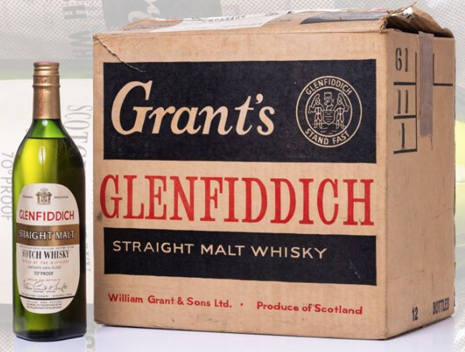
In 1961 Glenfiddich relaunched its single malt in a striking green triangular bottle, designed by Hans Schleger. First used for Grant’s blends, the “tround” became a symbol of sophistication and innovation. Its enduring design has shaped whisky marketing for decades, evolving subtly while remaining central to Glenfiddich’s global success.
When Glenfiddich relaunched its single malt Scotch whisky in April 1961, it did so with a bottle that would become one of the most recognisable in the industry. The green triangular vessel, known as the “tround”, was originally created in 1956 by German-born designer Hans Schleger for William Grant & Sons. Initially used for Grant’s blends, the bottle was a daring departure from convention, embodying the trinity of whisky making – water, yeast and malted barley – while signalling modernity and elegance.
By 1959, the tround had already become the centrepiece of Grant’s advertising campaign for its Stand Fast blend. Cartoons depicted people from all walks of life enjoying whisky from the tall triangular bottle, reinforcing its association with style and sophistication. The humour and boldness of these adverts ensured the bottle itself became inseparable from the brand’s identity.
The success of the design led to its adoption for Glenfiddich’s single malt, which had been bottled in modest quantities for decades. With post-war shortages easing and interest in single malts rising, Grant’s relaunched Glenfiddich Straight Malt in 1961, choosing the tround in green glass to subtly connect the new product with the established reputation of Grant’s blends.

As Glenfiddich grew into the world’s best-selling single malt, and Grant’s became the third-largest blended Scotch brand, Schleger’s design reached a global audience. Though packaging and labelling evolved over the years, the triangular bottle remained largely unchanged until 2008, when its shoulders and base were broadened to give it greater presence. A triangular carton was introduced, and Glenfiddich’s Solera Reserve moved to clear glass. A decade later, further refinements gave the bottle a rounded outline and a premium feel, with a distinctive ‘V’ etched on the front.
The tround’s enduring appeal lies in its ability to balance heritage with innovation. It has become a textbook example of how design can shape brand identity, ensuring that Glenfiddich and Grant’s remain instantly recognisable across generations. More than six decades after its debut, the triangular bottle continues to evolve, yet it remains a tribute to Schleger’s original vision – fresh, relevant and iconic.
Discover more from Creative Brands Mag
Subscribe to get the latest posts sent to your email.













Leave a comment