


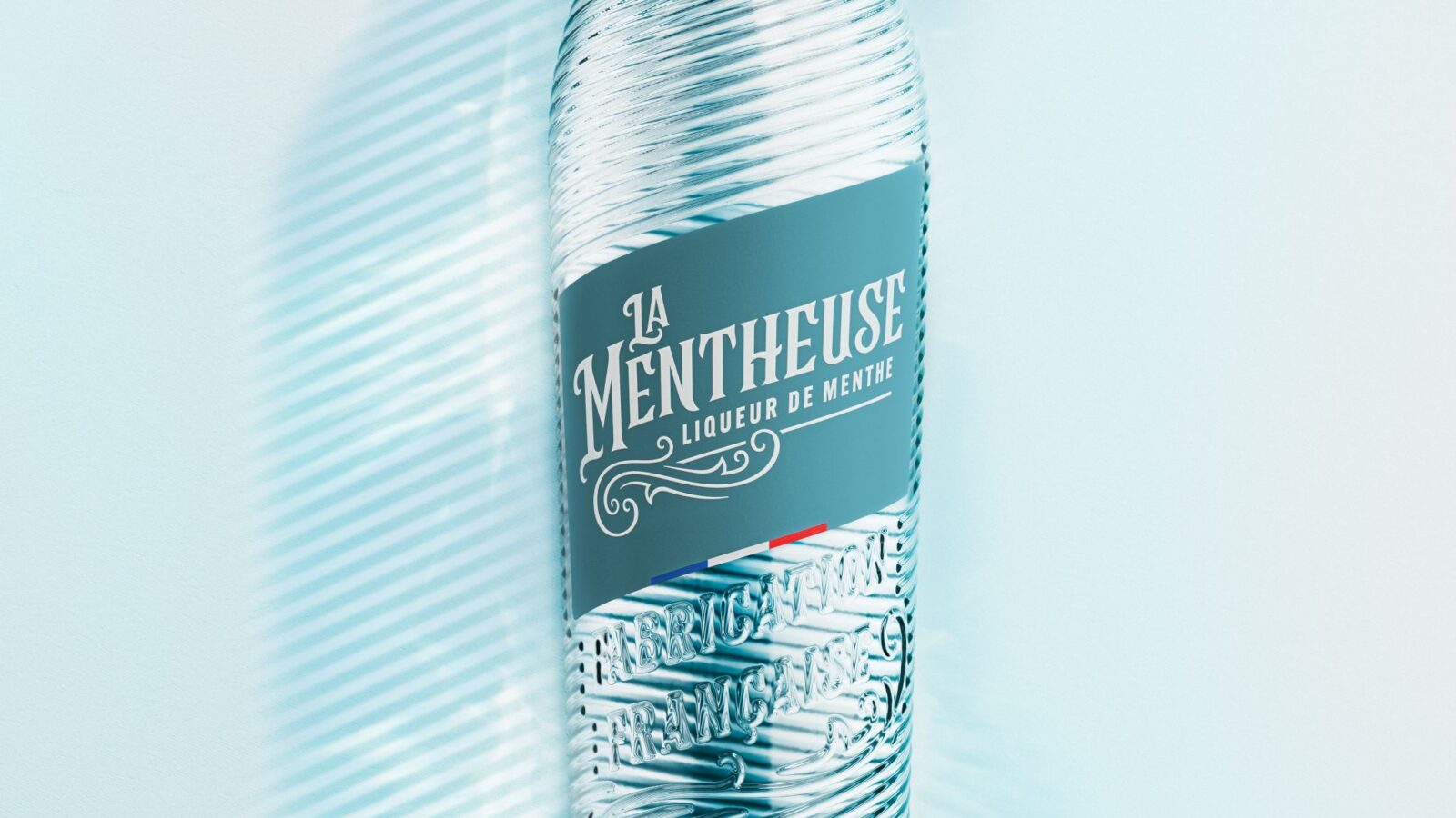
La Mentheuse, the 100% natural French mint liqueur born in the South of France, has unveiled a striking new packaging identity by Appartement 103. With an embossed, elongated bottle silhouette and refined design, the refresh brings a vibrant, distinctive presence to shelves while proudly affirming the brand’s French heritage.
Summer often inspires reinvention, and for La Mentheuse, the season marks the unveiling of a bold new chapter. The 100% natural French mint liqueur, rooted in the traditions of the South of France, has undergone a packaging transformation led by creative agency Appartement 103. The redesign seeks to balance heritage with modernity, offering a fresh perspective on a beloved classic.


At the heart of the refresh is a newly embossed bottle, carefully crafted to build upon the iconic lines of the original. The silhouette has been refined and elongated, lending the liqueur a more elegant and contemporary presence. This subtle yet impactful evolution ensures that La Mentheuse retains its recognisable character while stepping confidently into a new era.
The design language is deliberately vibrant and proudly French. By emphasising clarity and distinction, the new identity enhances shelf appeal and reinforces the brand’s authenticity. The embossed detailing adds tactile sophistication, while the elongated form conveys freshness and refinement. Together, these elements create a packaging identity that is both distinctive and timeless, reflecting the liqueur’s natural purity and enduring appeal.
For Appartement 103, the challenge lay in reimagining a French classic without losing its essence. The result is a design that honours provenance while embracing modern expectations. The refreshed bottle not only elevates the brand’s visual presence but also signals a renewed confidence in its craftsmanship.
La Mentheuse’s new look arrives at a time when consumers increasingly value authenticity and natural ingredients. By aligning its packaging with these values, the brand strengthens its position in a competitive market while reaffirming its French roots. The redesign is more than aesthetic; it is a statement of identity, a celebration of freshness, and a promise of distinction.
As summer unfolds, La Mentheuse invites consumers to rediscover its invigorating character in a bottle that feels both familiar and new. Fresh, vibrant, and proudly French, the liqueur’s refreshed identity ensures that it continues to stand out as an iconic expression of mint, heritage, and modern design.
Discover more from Creative Brands Mag
Subscribe to get the latest posts sent to your email.














Leave a comment