


Odd Culture, designed by Elizaveta Voronova, is a kombucha brand that celebrates individuality through bold illustrations, vibrant colours and playful typography. Each flavour is personified by a unique character, creating a personality-driven identity that transforms everyday packaging into a joyful, memorable and distinctive brand world that stands out on the shelf.
Odd Culture, the latest kombucha brand to hit the market, is making waves with a visual identity that refuses to blend into the background. Conceived by designer Elizaveta Voronova, the brand is a celebration of individuality, self-expression and the beauty of being unapologetically different. In a category often dominated by earthy minimalism or wellness clichés, Odd Culture takes a bold detour, embracing funk, colour and personality to create packaging that is impossible to ignore.
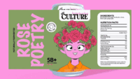
At the heart of the brand are three illustrated girls, each embodying the spirit of a flavour: Lemon Ginger, Mango Chili and Rose. These characters are not mere decorative motifs but fully realised personalities, each with her own attitude, aesthetic and colour palette. Lemon Ginger is sharp and zesty, Mango Chili is fiery and adventurous, while Rose is soft yet confident. Together, they form a trio that gives every can its own identity while maintaining a coherent visual system across the range.
The illustrations are expressive, playful and brimming with character, setting the tone for a brand that wants to be seen as more than just a drink. They are supported by vibrant colour combinations that push beyond safe palettes, ensuring the cans pop on the shelf. Typography is equally unconventional, with quirky, energetic letterforms that reinforce the brand’s sense of fun. Small details — from unexpected graphic flourishes to offbeat design cues — add layers of personality, rewarding consumers who take a closer look.
This approach transforms kombucha packaging from functional container to cultural artefact. Odd Culture positions itself as a lifestyle choice, not simply a beverage, appealing to consumers who value self-expression and creativity. In doing so, it challenges the conventions of the category, where many brands lean heavily on wellness tropes or muted natural aesthetics. Instead, Odd Culture embraces the idea that kombucha can be joyful, funky and proudly different.
The result is a colourful, personality-driven identity that feels fresh and memorable. It is packaging that doesn’t just sit quietly in the fridge but demands attention, sparking curiosity and conversation. By embedding character into every flavour, Odd Culture creates a brand world that is both distinctive and emotionally engaging. It is a reminder that in a crowded market, standing out requires more than flavour innovation — it requires design that resonates with culture, identity and playfulness.
Elizaveta Voronova’s work on Odd Culture underscores the power of visual storytelling in branding. By combining expressive illustration, vibrant colour and playful typography, she has crafted a universe that feels alive, inclusive and fun. Odd Culture is not just kombucha; it is a statement about individuality, proving that being a little different can be the most refreshing choice of all.
Discover more from Creative Brands Mag
Subscribe to get the latest posts sent to your email.












Leave a comment