

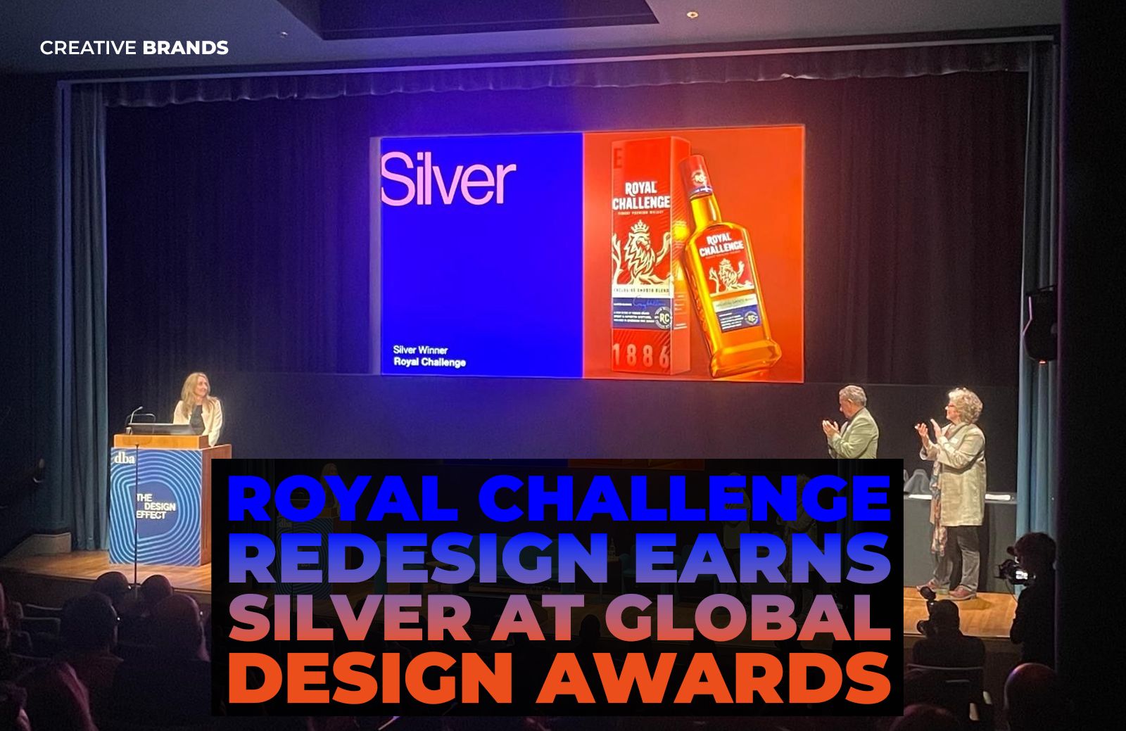
Diageo India has secured a Silver award at the 2026 Design Business Association (DBA) Design Effectiveness Awards for the redesign of its whisky brand Royal Challenge. The refreshed packaging reimagines the iconic lion and introduces a vibrant, contemporary identity aimed at connecting the brand with a new generation of consumers.
In a significant recognition for design-led brand transformation, Diageo India has won a Silver award at the prestigious Design Business Association (DBA) Awards 2026 for the redesign of its well-known whisky brand, Royal Challenge. The accolade highlights the power of strategic design in reshaping brand perception and strengthening relevance in a rapidly evolving consumer landscape.
The DBA Design Effectiveness Awards, widely regarded as one of the most respected global honours in the field of design and branding, recognise projects where design demonstrably drives business impact. Winning a Silver places the Royal Challenge transformation among a select group of global brand initiatives that successfully merge creativity with measurable commercial value.
For Diageo India, the redesign was more than a visual refresh. It was a deliberate effort to redefine the meaning of boldness for contemporary audiences in a category where packaging plays a decisive role in shaping consumer perception. In the highly competitive whisky market, where shelf presence and brand identity often determine purchase decisions, packaging becomes the primary storyteller.
The design team set out to evolve the heritage identity of Royal Challenge while ensuring the brand resonated with modern drinkers. Rather than relying solely on legacy cues, the new visual system introduces a vibrant and dynamic aesthetic that reflects a more inclusive and progressive interpretation of the brand’s personality.
At the heart of the transformation lies the reimagining of the brand’s iconic lion symbol. Long associated with strength and prestige, the lion has been modernised to reflect confidence and movement, bringing renewed energy to the brand identity. The updated design integrates sharper detailing and a more contemporary visual language while preserving the emblem’s symbolic authority.
Alongside the lion’s transformation, the broader packaging system embraces a richer colour palette and refined graphic elements that enhance the sense of premiumisation. The new look seeks to balance familiarity with innovation, ensuring long-standing consumers still recognise the brand while making it appealing to younger drinkers entering the category.
The shift reflects a broader trend within the global spirits industry, where brands are increasingly investing in design to remain culturally relevant. As consumer expectations evolve, successful brand packaging must not only stand out on shelves but also communicate values, identity and experience in a matter of seconds.
For Royal Challenge, the redesign represents a strategic alignment with a new generation of consumers who seek brands that feel modern, expressive and authentic. By reinterpreting its heritage elements through a contemporary design lens, the brand has positioned itself to remain both recognisable and forward-looking.
Industry observers note that the success of the project demonstrates how thoughtful design can bridge tradition and innovation. The challenge for legacy brands often lies in evolving without losing their essence. The Royal Challenge redesign appears to have achieved that balance by retaining core brand symbols while refreshing the overall visual narrative.
The recognition from the Design Business Association also underscores the growing role of design as a driver of measurable business performance. The DBA awards evaluate projects not only for aesthetic excellence but also for how effectively design contributes to brand growth, consumer engagement and commercial success.
For Diageo India, the Silver award affirms the strategic value of investing in design thinking as part of brand building. It also reflects the company’s broader commitment to innovation across its portfolio, particularly in markets where competition and consumer expectations continue to intensify.
As Royal Challenge enters its next chapter with a revitalised identity, the award-winning redesign signals the brand’s ambition to remain relevant in a changing spirits landscape. With its modernised lion and bold new visual language, the brand is positioning itself as both a legacy name and a contemporary icon for today’s whisky drinkers.
Discover more from Creative Brands Mag
Subscribe to get the latest posts sent to your email.


Leave a comment