

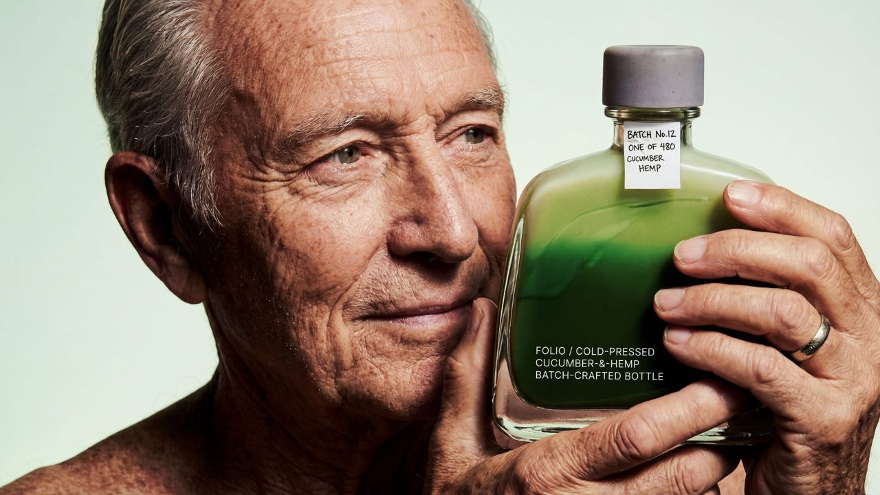
co+lab has unveiled Folio, a cucumber and hemp-based non-alcoholic drink that merges wellness with collectible design. Featuring minimalist materials, numbered bottles and integrated typography, the packaging borrows cues from premium spirits to elevate perception, offering a tactile, intentional alternative within a typically understated category.
In a market where non-alcoholic beverages are often positioned as pared-back substitutes, design studio co+lab is challenging convention with Folio, a botanical drink that fuses wellness culture with the tactile allure of collectible craft.
Folio, made from cold-pressed cucumber and hemp extract, is conceived as more than a functional refreshment. It occupies a space where health-conscious consumption meets deliberate design, placing equal emphasis on ingredient integrity and the sensory experience of the object itself. The result is a product that seeks to elevate the non-alcoholic category beyond its typically simplified visual language.
Drawing inspiration from the world of limited-edition spirits, the packaging introduces cues rarely associated with alcohol-free drinks. Each bottle is numbered and accompanied by handwritten batch tags, signalling small-run production and a sense of rarity. This approach reframes the category, presenting the drink not as an alternative, but as a considered, standalone offering defined by precision and care.
Material choices further reinforce this philosophy. A combination of moulded pulp casing, a cast concrete cap, and unadorned glass creates a stripped-back yet tactile system that feels both raw and intentional. There is a deliberate absence of excess: no superfluous layers, no decorative flourishes. Instead, every component serves a defined purpose, allowing the product to speak directly through its form.
Typography, rather than being applied superficially, is pressed directly into the glass and pulp. This integration lends a sense of permanence, embedding information within the object itself. It mirrors the ethos behind the drink’s formulation, where nothing is artificially added and every element exists as part of a cohesive whole.
Visually, the design is anchored by a restrained palette. The only colour present is the liquid itself, shifting from jade to pale green. This gradient becomes the focal point, carrying the narrative of flavour and freshness without distraction. By limiting visual noise, the design ensures that attention remains fixed on the drink’s inherent qualities rather than external embellishment.
With Folio, co+lab positions packaging not merely as a vessel, but as an extension of the product’s philosophy—one that bridges wellness, craftsmanship and collectibility in a category ripe for reinvention.
Discover more from Creative Brands Mag
Subscribe to get the latest posts sent to your email.


Leave a comment