


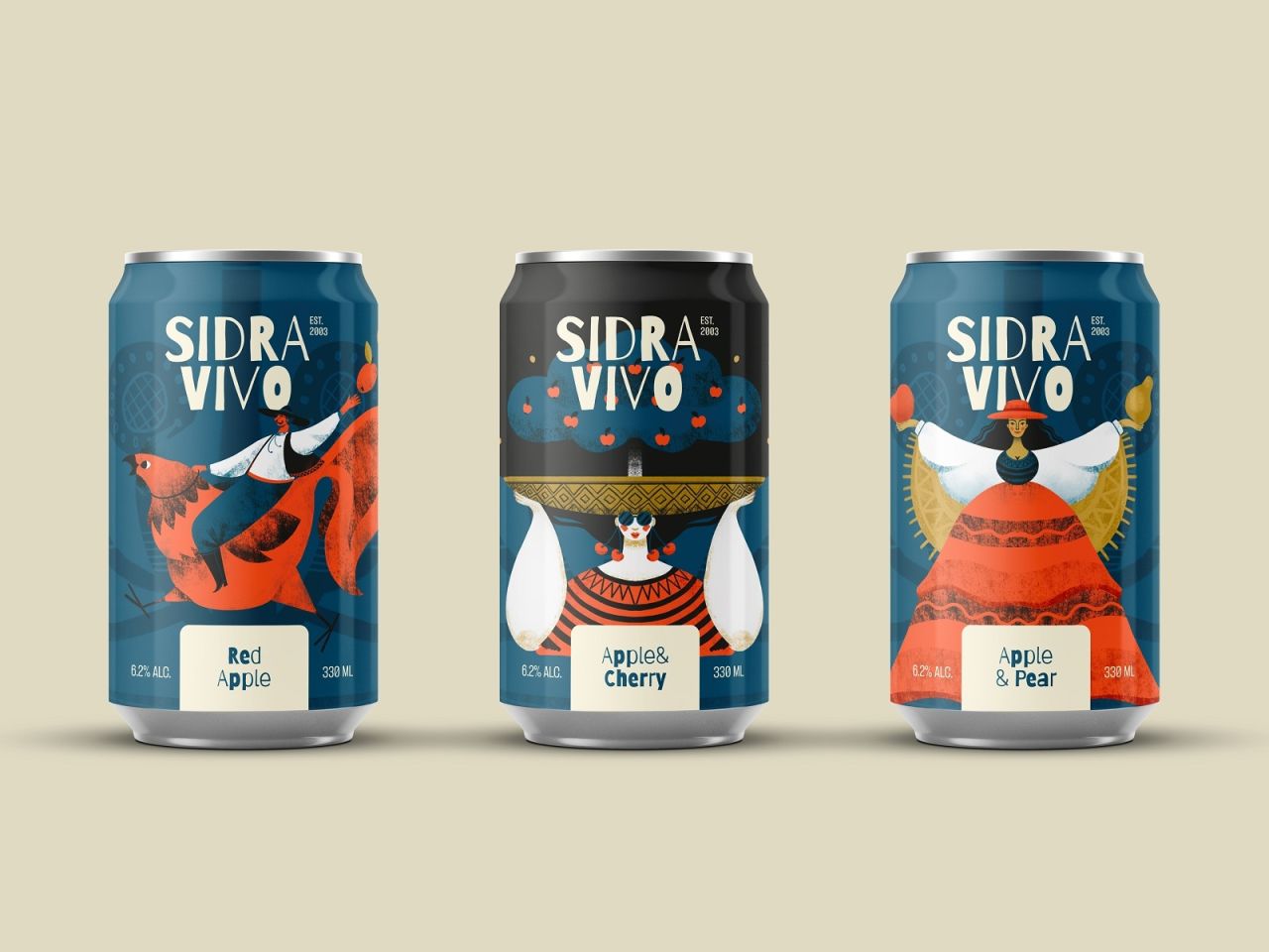
Cider is the UK on-trade’s second biggest alcohol category, worth £2bn to pubs and bars and heavily favoured by 18 to 34-year-olds. Yet despite its scale, the category suffers from visual sameness and loyalty barriers. Sidra Vivo’s character-driven identity, created by Tubik, offers a bold departure from orchard clichés.
Cider’s position in the UK on-trade is formidable: second only to beer by volume, and worth around £2bn annually to pubs and bars. Its strength with younger drinkers, particularly those aged 18 to 34, should make it fertile ground for variety and experimentation. Yet the category’s visual language remains stubbornly predictable. Line up fifty cider labels and the story repeats: apples, orchards, and typefaces gesturing vaguely at craft. The apple, it seems, rarely falls far from the tree.


This lack of differentiation has consequences. Cider drinkers are loyal to their chosen brands, with more than three quarters specifying a label when ordering—five percentage points higher than the average across drinks. While that loyalty might sound enviable, it leaves little space for challenger brands to break through. Heineken’s eye-tracking data underlines the challenge: customers reach the bar in just over eleven seconds, place their order at twenty-two, and only register the fridge after decisions are effectively made. For packaged cider—home to most flavoured and challenger offerings—the battle for attention is already lost before it begins.
Sidra Vivo entered this landscape determined to rewrite the rules. Tubik, led by Sergii Valiukh with illustrators Arthur Avakyan and Yaroslava Yatsuba, built an identity rooted not in orchards but in character illustration. Each flavour is personified by its own protagonist woven into the fruit. Red Apple stages a chase between rooster and fox through falling fruit. Apple and Cherry conjures a flamenco queen under a midnight sky. Apple and Pear transforms a harvest goddess into her own halo.
Distinct characters are unified by a shared palette and linework, ensuring cohesion across the range. Line the cans together and they read less like SKUs and more like a poster series. This system extends seamlessly across posters, stickers, bottles, and social media, creating one visual language designed to scale. Zoom out and the six-pack resembles tour merchandise more than drinks packaging, while social feeds animate the art into surreal motion—cacti sprouting apples, guitars strumming rhythm into the background.
The strategy is timely. With 72% of packaged cider now premium flavoured, the opportunity has been open for years, yet the shelves remain stubbornly static. Sidra Vivo’s identity is built to travel, to capture attention where challenger brands have struggled, and to prove that cider’s visual story can stretch far beyond apples and orchards.
Discover more from Creative Brands Mag
Subscribe to get the latest posts sent to your email.











Leave a comment