

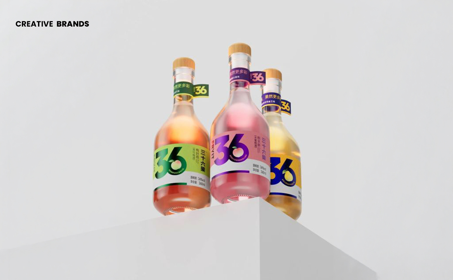
Tenda’s new bespoke glass bottle series demonstrates how simplicity can be powerful in packaging. With clean shapes, soft colours, and bold typography, the design proves that less can mean more. Colour becomes the defining branding tool, creating distinct personalities while maintaining a unified identity in today’s fast-paced consumer market.
In a world where packaging often competes for attention through complexity, Tenda’s latest bespoke glass bottle series makes a compelling case for clarity. The design strips away unnecessary ornamentation, focusing instead on a simple shape, soft colour palettes, and bold typography. The result is packaging that feels modern, youthful, and instantly recognisable, proving that great design does not need to be complicated to be effective.
What sets this series apart is its strategic use of colour as a branding tool. While the bottle shape remains consistent across variants, the interplay of different colour combinations creates entirely distinct personalities. A pastel-toned bottle might suggest freshness and lightness, while a deeper, more saturated hue conveys confidence and boldness. This approach allows the brand to maintain a cohesive identity while offering consumers variety and differentiation.


In today’s retail environment, where decisions are often made in seconds, packaging plays a critical role in shaping consumer perception. Tenda’s design acknowledges this reality by prioritising memorability and ease of recognition. The clean glass structure ensures transparency and honesty, while the typography provides a strong anchor for brand communication. Together, these elements create a visual language that is both straightforward and impactful.
The philosophy behind the bottle series reflects a broader trend in contemporary branding: the idea that restraint can be more powerful than excess. By avoiding clutter and focusing on essential design cues, Tenda has crafted packaging that resonates with consumers seeking authenticity and clarity. The bottle’s simplicity does not diminish its presence; instead, it amplifies recognition, making it easier for shoppers to identify and connect with the product.
This design strategy also highlights the importance of adaptability. With a single bottle shape serving as the foundation, the brand can experiment with colour to suit different product lines, seasonal releases, or market preferences. Such flexibility ensures that the packaging remains fresh and relevant without losing its core identity. It is a reminder that consistency and creativity can coexist when guided by a clear design philosophy.
Ultimately, Tenda’s bespoke glass bottle series illustrates how less design can create more recognition. In a crowded marketplace, where visual noise often overwhelms, the clarity of Tenda’s approach stands out. It is packaging that communicates confidence without shouting, elegance without excess, and identity without compromise. For consumers, it offers a product that is easy to recognise, memorable to recall, and appealing to engage with. For the brand, it reinforces the idea that simplicity, when executed with precision, can be the most powerful form of storytelling.
Discover more from Creative Brands Mag
Subscribe to get the latest posts sent to your email.


Leave a comment