

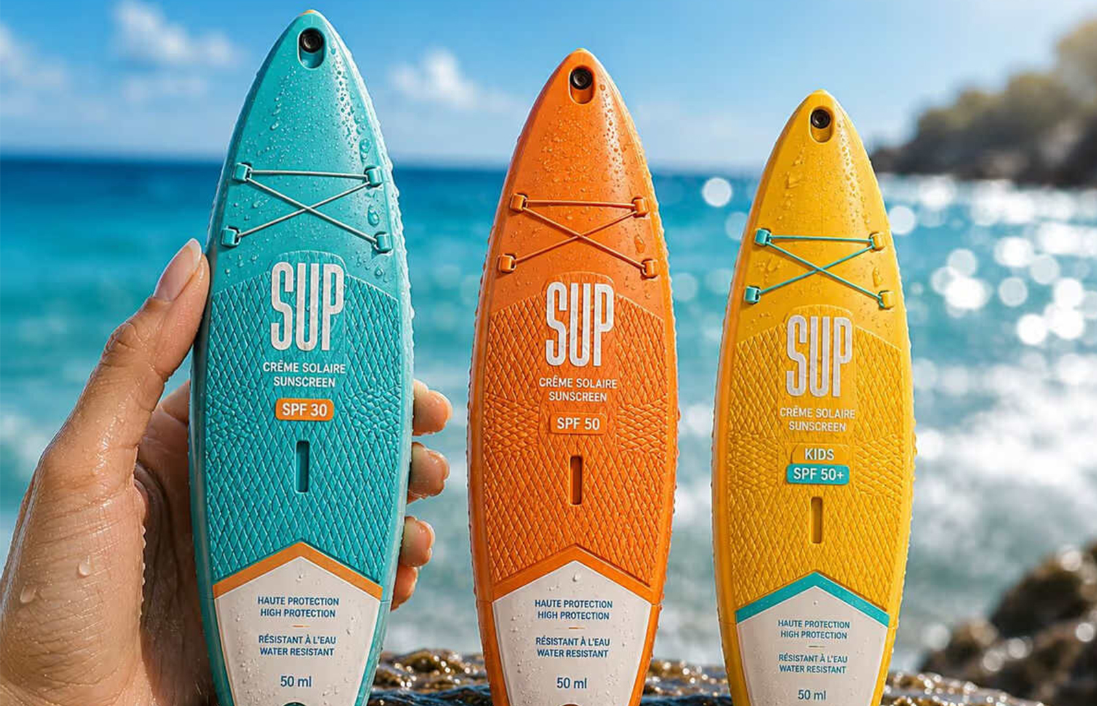
Inspired by the freedom of paddle boarding, SUP redefines sunscreen packaging as a lifestyle statement. Designed by L’Alchimiste Paris, the brand turns data into motion, creating bottles shaped like miniature boards with textured surfaces and elastic cords. SUP embodies summer adventure, transforming protection into experience.
Sixteen years after its founding, Paris-based agency L’Alchimiste has unveiled a striking new project that demonstrates its philosophy of turning data into emotion and back again for validation. SUP, a sunscreen brand inspired by stand-up paddle boarding, captures the essence of summer freedom and outdoor adventure through packaging that is anything but conventional.


Rather than treating sunscreen as a purely cosmetic product, the design acknowledges its cultural associations with travel, water sports, sunshine and seaside memories. Using its proprietary Data-to-Motion approach, L’Alchimiste analysed the visual and emotional codes of beach culture and discovered that motion itself could serve as the foundation of the brand identity.
The result is packaging transformed into a miniature paddle board. The elongated silhouette mirrors authentic proportions, textured surfaces evoke anti-slip deck pads, and elastic cord systems reference real paddle-board equipment. Before a single word is read, the product communicates its universe, instantly transporting consumers to the water’s edge.
Colour architecture plays a crucial role in differentiation. Inspired by coastal palettes, each variant reflects a distinct summer moment while maintaining cohesion across the brand family. This careful balance ensures clarity on shelf while reinforcing SUP’s identity as a lifestyle-driven product.
More than packaging, SUP is positioned as an experience. It demonstrates how strategic insights can be translated into physical form, becoming a memory trigger and a statement of motion. By embodying the feeling of being out on the water, under the sun, moving freely toward the horizon, SUP proves that sunscreen can transcend its functional role to become a symbol of adventure and emotion.
Discover more from Creative Brands Mag
Subscribe to get the latest posts sent to your email.


Leave a comment