


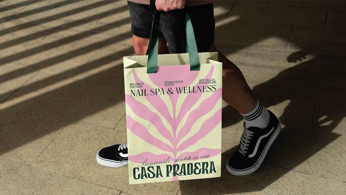
Casa Pradera’s new identity reimagines the nail spa as a meadow of self-care, art and community. With a hand-drawn logo, organic illustrations and a flexible graphic system, the brand creates a warm, personal experience across every touchpoint, positioning itself as a space for beauty, creativity, and connection.
Casa Pradera has unveiled a brand identity that transforms its nail spa and wellness space into a sanctuary where self-care, art, music and community converge. Designed to feel as comfortable as home, the identity is rooted in warmth, artistry and connection, offering a handcrafted experience that extends beyond beauty.


The logo, drawn entirely by hand, gives each letter an organic and distinctive character, while a series of illustrations—flowers, fluid forms and decorative motifs—bring the brand’s creative spirit to life. Built around the metaphor of a meadow, the concept reflects a place where beauty and community can flourish freely, guided by the welcoming phrase: “Make yourself at home.”
A flexible graphic system combines the custom wordmark, illustrations, typography and a balanced colour palette, adapting seamlessly across printed materials, digital communication, social media and spatial elements. Each touchpoint was carefully designed to connect the brand experience before, during and after every visit.
The result positions Casa Pradera as more than a nail spa. It is a space for self-care, expression and community—a handcrafted brand that feels warm, artistic and deeply personal, inviting every guest to step into a meadow of creativity and comfort.
Discover more from Creative Brands Mag
Subscribe to get the latest posts sent to your email.












Leave a comment