


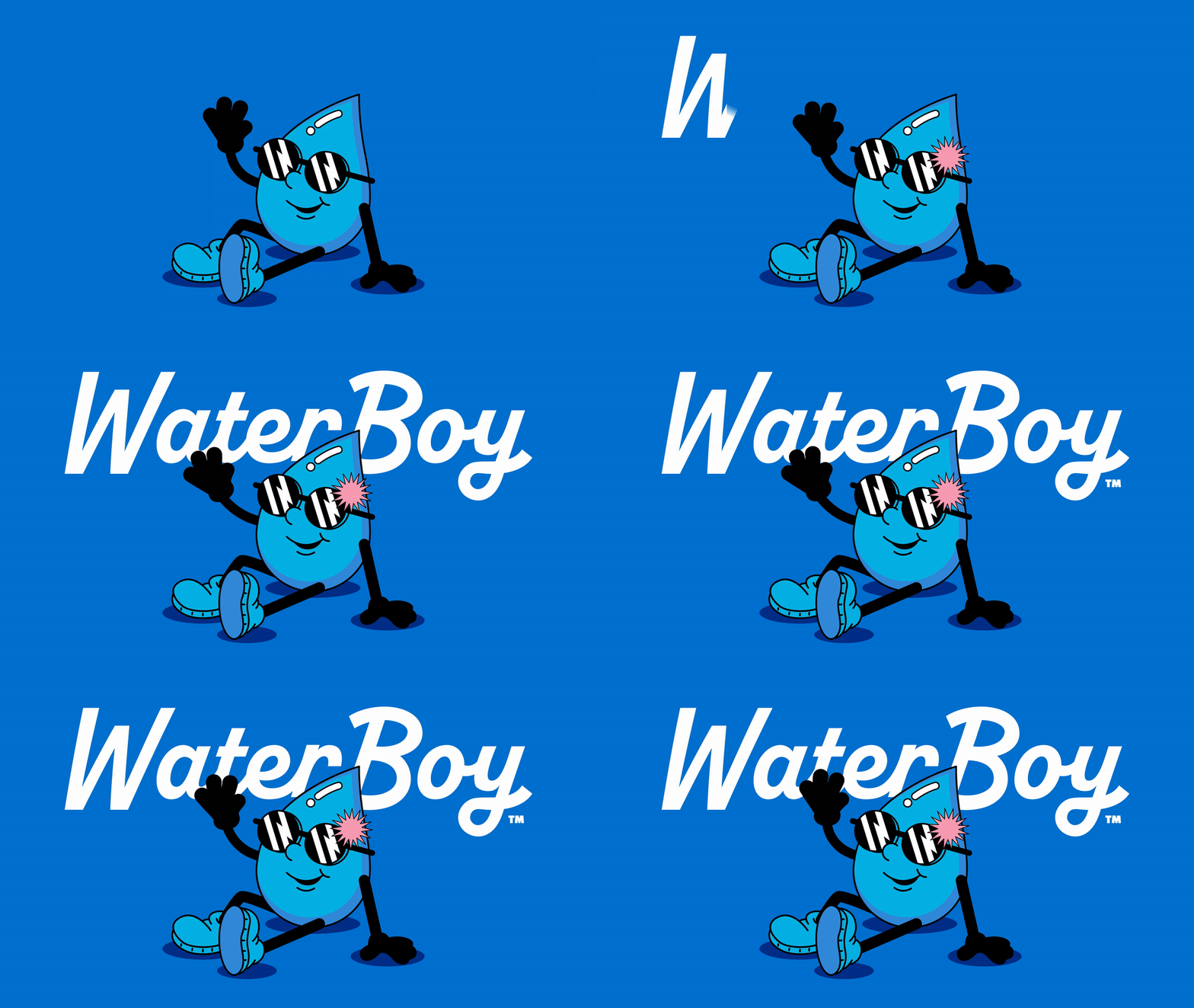
WaterBoy, the functional hydration brand known for its viral online identity, has been transformed by Interact Brands into a retail‑ready system. Featuring vibrant colours, varsity typography and an expanded Danny Drip mascot, the refresh balances irreverence with shelf appeal, positioning WaterBoy as a bold contender in functional hydration.
WaterBoy, the functional hydration brand that first captured attention with its viral direct‑to‑consumer identity, has now been reimagined for retail shelves by Interact Brands. The transformation takes the brand’s cheeky online personality and translates it into a polished yet playful system designed to stand out in the competitive consumer packaged goods sector.
The new look is built on vibrant colours, varsity‑inspired typography and packaging that adapts seamlessly across formats. At the centre of the refresh is an expanded version of Danny Drip, the mascot whose irreverent charm has become synonymous with WaterBoy’s digital presence. By evolving Danny into a more versatile character, Interact Brands has ensured that the brand’s humour and energy remain intact while becoming more accessible to mainstream audiences.


WaterBoy’s retail‑ready identity is more than a cosmetic update. It reflects the brand’s ambition to carve out a distinctive space in the functional hydration category, where consumers increasingly seek products that deliver both performance and personality. With formulas designed for daily hydration, workout recovery and even replenishment after a night out, WaterBoy positions itself as a versatile solution for modern lifestyles.
The packaging system is deliberately bold, echoing the varsity aesthetic to evoke youthful energy and team spirit. This approach not only appeals to younger consumers but also reinforces WaterBoy’s positioning as a brand that thrives on community and shared experiences. The irreverence that made WaterBoy a social media favourite has been carefully balanced with retail discipline, ensuring the brand is shelf‑ready without losing its edge.
For Interact Brands, the project demonstrates how a viral identity can be successfully scaled into a retail environment without diluting its essence. By amplifying WaterBoy’s playful DNA and embedding it into every design element, the agency has created a brand system that is both commercially viable and culturally resonant.
The move comes at a time when functional hydration is one of the fastest‑growing segments in consumer packaged goods. With consumers increasingly aware of the importance of electrolytes and recovery solutions, WaterBoy’s expanded presence offers a timely alternative to traditional sports drinks. Its blend of humour, bold design and functional promise sets it apart in a crowded marketplace.
As WaterBoy makes the leap from online sensation to retail contender, its refreshed identity signals a new chapter in the brand’s evolution. By staying true to its irreverent roots while embracing the demands of retail, WaterBoy is poised to capture the attention of consumers seeking hydration with personality.
Discover more from Creative Brands Mag
Subscribe to get the latest posts sent to your email.











Leave a comment