


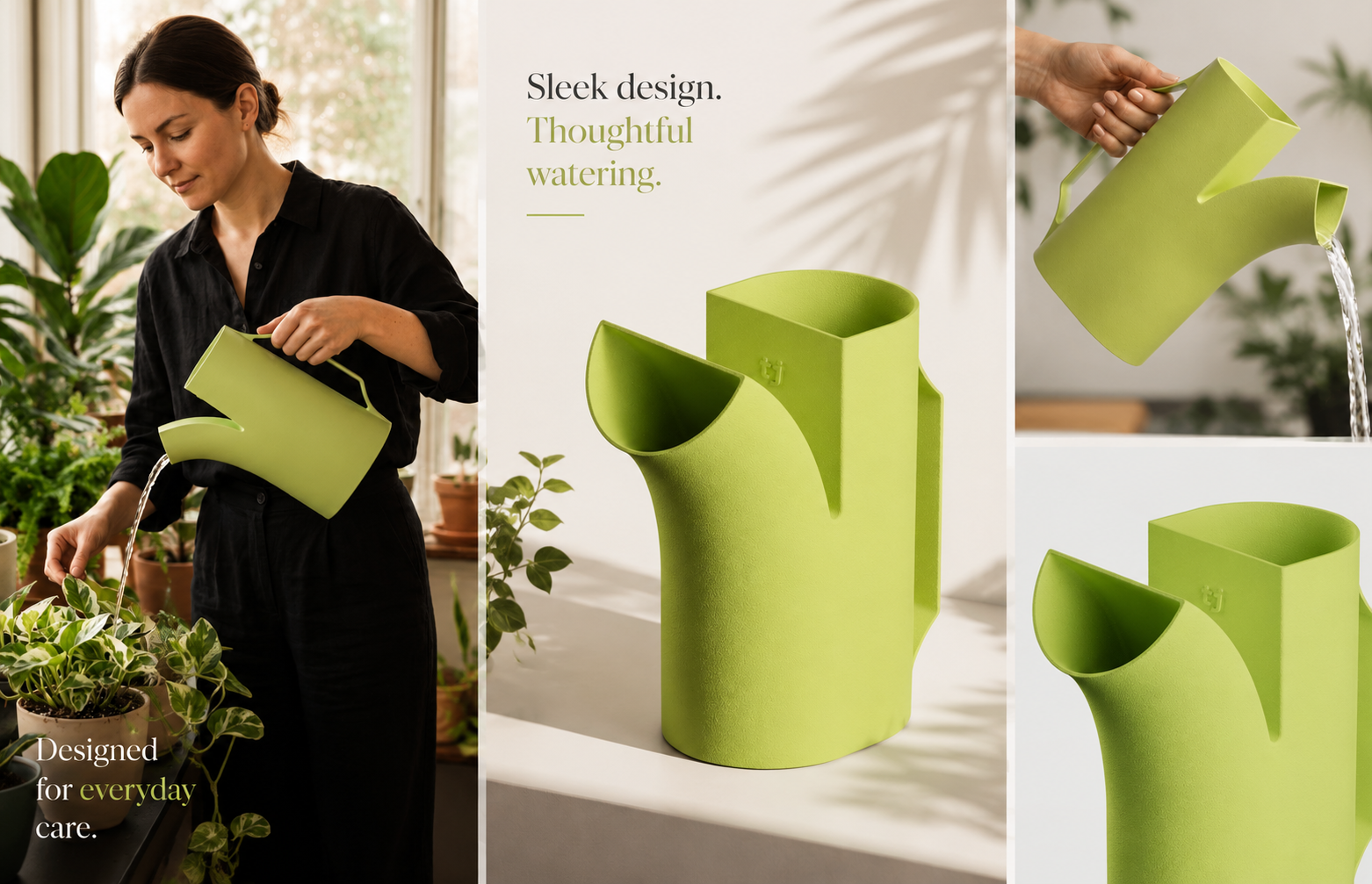
Riega, designed by Manuel Golub, reimagines the watering can through a single bifurcated form that defines both filling and pouring. Intuitive, clean, and visually distinctive, it reflects Golub’s expertise in product design and demonstrates how simplicity and observation can transform everyday objects into timeless, functional works of design.
Great design often begins with a simple observation, and Riega embodies that principle with striking clarity. Conceived by industrial designer Manuel Golub, Riega rethinks the familiar watering can by allowing one gesture to create two functions. Its bifurcated form defines both the filling opening and the watering spout, resulting in an object that is intuitive, clean, and visually distinctive. Rather than layering complexity onto a traditional tool, Golub strips it back to its essence, letting form follow use in a way that feels both natural and inventive.
The elegance of Riega lies in its simplicity. By merging the act of filling and pouring into a single design gesture, the watering can becomes more than a utilitarian vessel; it becomes a sculptural object shaped by the rhythm of everyday use. This clarity of purpose ensures that the design is not only functional but also visually memorable, standing apart from conventional iterations that often prioritise decoration over utility.
Golub’s approach reflects his broader expertise in physical product design. With over five years of experience spanning research, concept sketching, 3D modelling, rendering, and prototyping, he demonstrates a mastery of the entire design process. Riega is a testament to that versatility, showing how thoughtful observation can be translated into a product that feels inevitable once seen, yet refreshingly original. It is the kind of design that makes users wonder why it had not existed before.
In an era where many everyday objects are over-engineered or stylistically burdened, Riega offers a reminder that innovation can be achieved through restraint. Its bifurcated silhouette is not only practical but also emblematic of a design philosophy that values clarity, intuition, and emotional resonance. By shaping the watering can around the way it is used, Golub has created a product that feels timeless, a quiet revolution in the garden shed and beyond.
Discover more from Creative Brands Mag
Subscribe to get the latest posts sent to your email.
















Leave a comment