


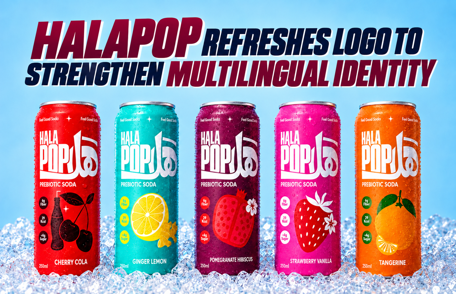
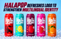
UAE-based prebiotic soda brand HalaPop has unveiled an updated bilingual logo after discovering that non-Arabic-speaking consumers were reading its name simply as “Pop”. The redesign ensures the brand’s full identity is visible to all audiences, balancing Arabic heritage with English clarity to strengthen recognition in a diverse marketplace.
HalaPop, the UAE-born prebiotic soda brand, has refreshed its bilingual logo to address a challenge that emerged following its launch: many non-Arabic-speaking consumers were reading the brand name as simply “Pop”. The original design, which combined “Hala” in Arabic script with “Pop” in English, was intended to reflect the brand’s Arab identity while appealing to a multicultural audience. However, feedback revealed that the logo was not fully communicating the brand’s name to a significant portion of its consumer base.
Co-Founder Karim Jalloul explained the issue candidly: “After launch we noticed that people who don’t read Arabic could only read ‘Pop’, and started calling us Pop. In a market where so many nationalities shop side by side, a big part of our audience didn’t know our name. The goal was simple: make the full name readable to everyone without losing the Arabic.”
The solution was not to abandon the brand’s cultural roots but to adapt the design for clarity. HalaPop retained the Arabic lettering for “Hala” while adding the English word “Hala” alongside “Pop”. This adjustment ensures that the brand name is legible and recognisable to all consumers, regardless of language proficiency, while preserving the bilingual identity that anchors the brand in its regional heritage.
The update reflects a broader reality of designing for multilingual and multicultural markets, particularly in the UAE where diverse nationalities coexist and shop together. For consumer brands, the challenge lies in balancing authenticity with accessibility. HalaPop’s decision underscores the importance of inclusivity in brand identity, ensuring that no segment of its audience feels excluded or confused by design choices.
The refreshed logo also signals the brand’s responsiveness to consumer feedback. In an increasingly competitive beverage market, agility and attentiveness to audience perception can be as critical as product innovation. By listening to its consumers and acting swiftly, HalaPop demonstrates a commitment to clarity and connection, reinforcing its positioning as a modern, health-focused soda brand with cultural resonance.
The bilingual logo now serves as a bridge between tradition and modernity, reflecting HalaPop’s ambition to be both proudly Arab and universally approachable. In doing so, the brand strengthens its visibility and memorability, ensuring that its name is spoken and recognised consistently across its diverse consumer base.
As HalaPop continues to grow, the updated identity will play a pivotal role in shaping how the brand is perceived in a crowded marketplace. It is a reminder that design is not static but a living element of brand strategy, evolving in response to audience needs and cultural contexts. For HalaPop, the change is more than cosmetic—it is a reaffirmation of its mission to connect with consumers across languages while staying true to its roots.
Discover more from Creative Brands Mag
Subscribe to get the latest posts sent to your email.











Leave a comment