


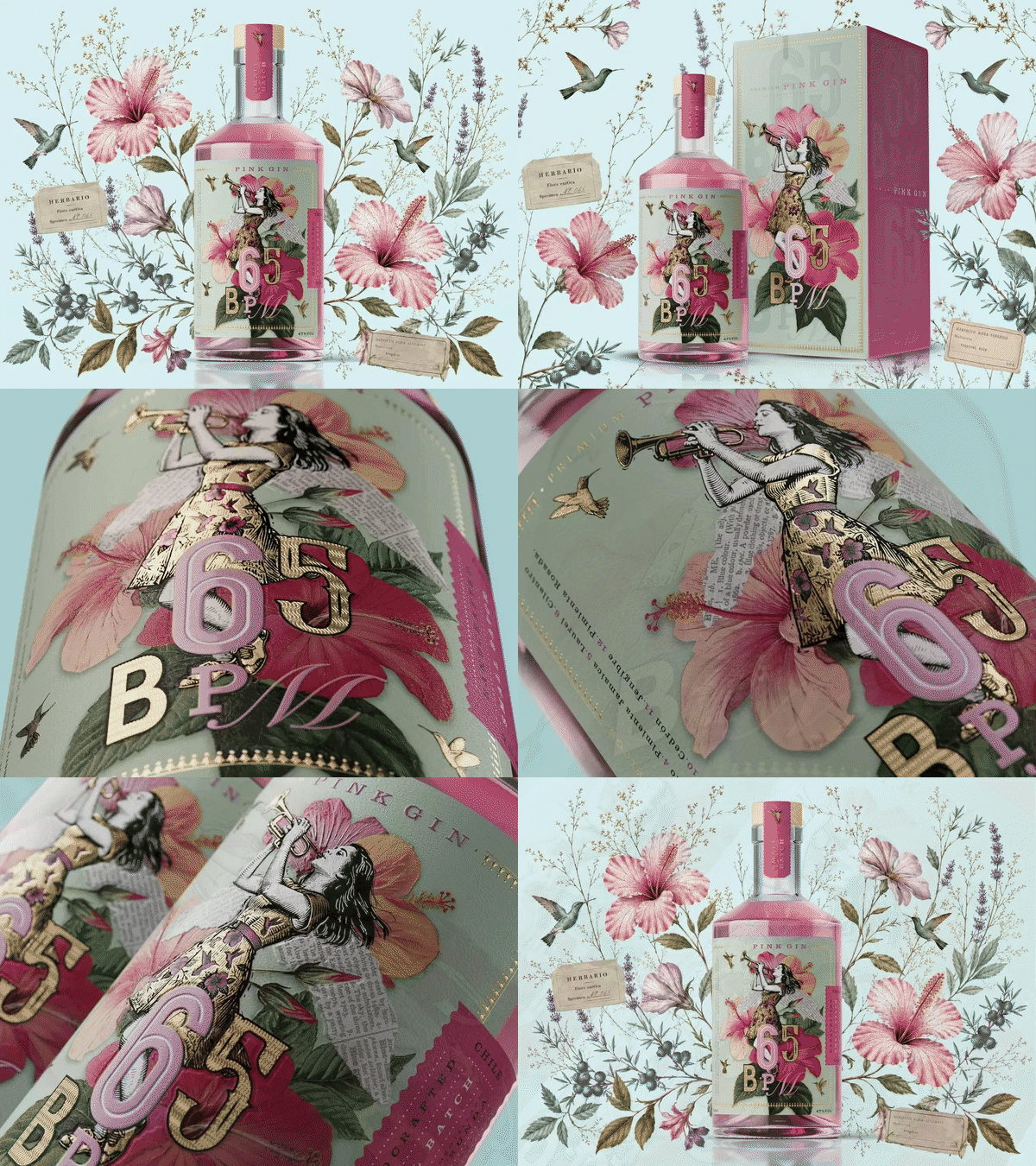
A striking new gin packaging concept, 65 BPM: The Resonance of the Soul, The Woman of Air, has been unveiled as part of PRINT STGO 2026. Created by Ximena Ureta Studio Design, the project blends music, illustration, botany and distillation, transforming slow blues into a rich visual and sensory experience.
A bottle of gin inspired by the tempo of slow blues and the power of breath-driven music is drawing attention in the international design community, demonstrating how packaging can become a storytelling medium that reaches beyond the shelf.
65 BPM: The Resonance of the Soul, The Woman of Air, created by Ximena Ureta Studio Design, has been developed as exhibition packaging for PRINT STGO 2026, the Chilean trade fair dedicated to graphic industry, packaging and visual communication. The project serves as the feminine counterpart to 128 BPM, a gin conceived for the same event in 2024, together forming a unified collection inspired by contrasting rhythms within the blues genre.
The concept takes its name from BPM, or beats per minute, the measure used to define the tempo of music. While 128 BPM explored a faster rhythm, 65 BPM embraces the emotional depth and introspection associated with slow blues. The inspiration comes from acclaimed Catalan musician Andrea Motis, celebrated for her work as a singer, trumpeter, saxophonist and composer.
At the heart of the design is the idea that wind instruments create sound solely through breath and inner air. According to the project’s creators, this process symbolises the transformation of vulnerability into expression, allowing the most delicate emotions to become audible. The resulting theme of “the resonance of the soul” runs throughout the packaging and brand identity.
Visually, the project combines the work of two Argentine artists. A hand-crafted printmaking illustration of a female trumpeter by Juan Bassani forms the central image, while a botanical collage by Eliza Cueto introduces the hibiscus flower, the ingredient responsible for the gin’s distinctive pink colour. Together, the artworks create a dreamlike world where music, nature and emotion intersect.
The design also continues a visual narrative established in 128 BPM. Wings and birds appear throughout both projects, linking the two products as a pair. In the case of 65 BPM, hummingbirds take centre stage because of their natural attraction to hibiscus flowers. Designers further emphasised a visual connection between the flower’s shape and the trumpet’s bell, reinforcing the relationship between nature and music.
Beyond graphics, the project was developed around three core elements: recipe, art and music. Hibiscus provides not only colour but also a defining flavour profile, supported by a blend of 15 botanicals including juniper, lavender, cardamom, coriander, rosemary, ginger, citrus elements and pink peppercorns. The collage approach extends to typography and branding, while an original trumpet composition was specially created for the package, completing its multi-sensory identity.
References to blues legends such as B.B. King, Buddy Guy and Stevie Ray Vaughan helped shape the concept, drawing on the emotional resonance of classic slow blues performances. The result is a packaging design that seeks to be experienced as much as viewed.
Produced using premium materials, gold foil detailing, high-relief screen printing and custom die-cutting, 65 BPM demonstrates how contemporary packaging can blend craftsmanship, music and narrative into a single design statement. As PRINT STGO 2026 approaches, the project stands as an example of how branding can move beyond product presentation to evoke mood, memory and emotion through every element of its creation.
Discover more from Creative Brands Mag
Subscribe to get the latest posts sent to your email.













Leave a comment