


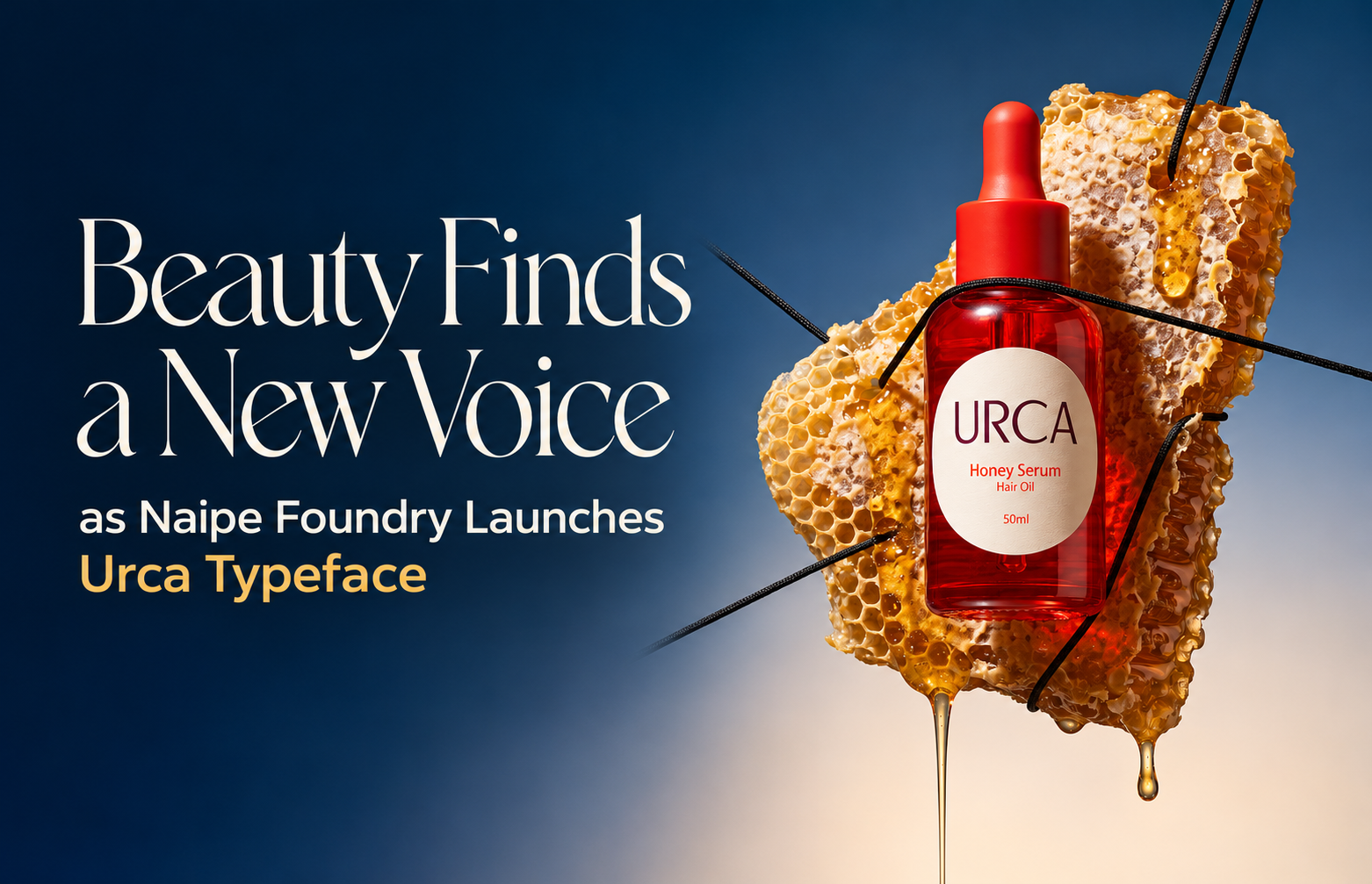
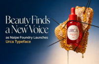
Naipe Foundry has unveiled Urca, a new typeface aimed at beauty, cosmetics and fashion brands seeking a balance between luxury and accessibility. Inspired by Rio de Janeiro’s historic Urca district, the design reflects growing demand for warmer, more distinctive brand identities in an increasingly crowded digital marketplace.
The beauty industry may be known for reinvention, but one of its latest transformations is taking place in a less obvious space: typography.
Naipe Foundry, the Barcelona-based type design studio founded by Brazilian designers Álvaro Franca and Felipe Casaprima, has launched Urca, a new typeface created specifically for beauty, cosmetics and fashion brands navigating changing consumer expectations. At a time when shoppers are demanding authenticity, expertise and accessibility in equal measure, the foundry believes typography can play a crucial role in shaping how brands are perceived.
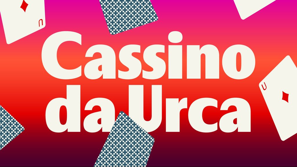
Named after Urca, a picturesque peninsula in Rio de Janeiro celebrated for its enduring mid-century charm, the typeface seeks to bridge the gap between traditional luxury and contemporary approachability. Its high-contrast letterforms evoke the elegance long associated with fashion publishing, while softened curves and rounded details introduce a sense of warmth and personality.
The launch comes as beauty brands increasingly rethink how they communicate with audiences. Consumers now move fluidly between premium and mass-market products, discovering new labels through social media and peer recommendations rather than relying solely on heritage or reputation. As a result, brands face mounting pressure to appear knowledgeable and trustworthy without seeming distant or exclusive.
According to Franca, many visual identities have struggled to keep pace with this shift. The sector has largely oscillated between two design extremes: friendly, rounded typography that can sometimes lack distinctiveness, and minimalist luxury aesthetics that risk feeling cold or impersonal.
“Brands are talking to a younger audience in a more colloquial tone of voice. Communication isn’t top down any more,” says Franca. “A typeface is the visual tone of voice of your brand, and the shape of the letters changes how people read the copy.”
Urca was developed as an alternative to those established visual conventions. Rather than relying on overt luxury cues or casual softness, it aims to strike a middle ground, enabling brands to convey quality and sophistication while remaining relatable.
Its arrival also reflects wider changes in the luxury sector. Over the past decade, many fashion houses adopted pared-back sans serif logos and branding systems, creating a wave of identities criticised for their similarity. Designers are now showing renewed interest in more expressive typography that communicates character and heritage.
“There’s a different way to portray elegance,” Franca explains. “Think beautiful ready-to-wear rather than sharp stilettos.”
The inspiration behind the typeface reaches beyond design trends. Urca itself remains one of Rio’s most distinctive neighbourhoods, with low-rise architecture and streets that preserve much of the atmosphere of the city’s golden age. The district was once home to the legendary Cassino da Urca, a magnet for celebrities, artists and society figures. Entertainers including Carmen Miranda performed there, while filmmaker Orson Welles became one of its many notable visitors.
For Naipe, that blend of glamour and ease became the foundation for a typeface intended to feel timeless rather than exclusive.
As artificial intelligence accelerates content creation and visual assets become increasingly abundant, the foundry argues that distinctive typography may become one of the most valuable tools brands possess. Consistent letterforms used across advertising, packaging, websites and social media can help create recognition in a crowded marketplace.
“AI delivers speed, but it doesn’t deliver consistency,” says Franca. “If you have a unique typography, you have a unique voice.”
Urca is available through Adobe Fonts for Creative Cloud subscribers and directly from Naipe Foundry, positioning itself as a new typographic option for brands searching for elegance on more human terms.
Discover more from Creative Brands Mag
Subscribe to get the latest posts sent to your email.








Leave a comment