


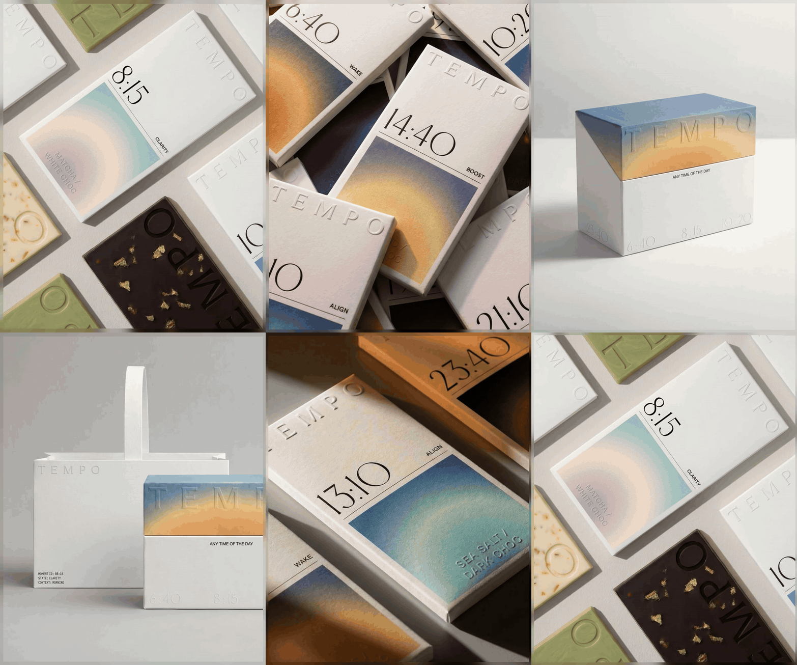
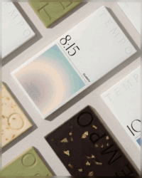
LYM Design Studio has unveiled Tempo, a chocolate packaging system shaped by balance and precision. With soft gradients, embossed details and a restrained composition, the design creates a calm, tactile presence. Tempo reimagines chocolate through the lens of time, rhythm and the body’s daily needs, offering a sensory narrative.
LYM Design Studio’s latest project, Tempo, is a packaging design that seeks to redefine how chocolate is perceived and experienced. Rather than treating packaging as a mere vessel, the studio has crafted a system that embodies rhythm, balance and the subtle interplay of time with the body’s daily cycles.
The design is anchored in precision. Soft gradients flow across the surface, evoking transitions that mirror the passage of hours and the natural ebb and flow of energy. Embossed details add a tactile dimension, inviting touch and reinforcing the idea that packaging can be as much about sensation as sight. This restrained composition avoids excess, instead cultivating calm authority.
Tempo is not simply about aesthetics; it is about reimagining chocolate as part of a broader narrative of wellbeing. By aligning the product with notions of rhythm and daily needs, the design positions chocolate less as indulgence and more as a companion to the body’s tempo. The packaging becomes a visual and tactile metaphor for moderation, balance and harmony.
The studio’s approach reflects a growing movement in design where packaging is treated as an extension of the product’s philosophy. In Tempo, every detail is deliberate. The gradients are not decorative flourishes but signals of transition. The embossing is not ornamental but a reminder of tactility and presence. Together, they create a system that feels composed, measured and attuned to its purpose.
For consumers, the effect is subtle yet profound. Tempo does not shout for attention on the shelf; it whispers, inviting discovery through quiet confidence. Its calm presence contrasts with the often loud, exuberant designs of confectionery packaging, offering instead a moment of pause. In this way, Tempo reflects a shift in consumer desires towards experiences that resonate with mindfulness and rhythm.
LYM Design Studio has demonstrated that packaging can transcend its utilitarian role. Tempo is not just a wrapper but a narrative device, shaping how chocolate is understood in relation to time and the body. It is a design that rewards curiosity, encouraging consumers to engage with chocolate as part of a daily rhythm rather than a fleeting indulgence.
Ultimately, Tempo stands as a testament to the power of restraint in design. By weaving together balance, precision and tactility, LYM Design Studio has created packaging that is both functional and philosophical, reminding us that even the smallest details can carry the weight of rhythm and meaning.
Discover more from Creative Brands Mag
Subscribe to get the latest posts sent to your email.








Leave a comment