


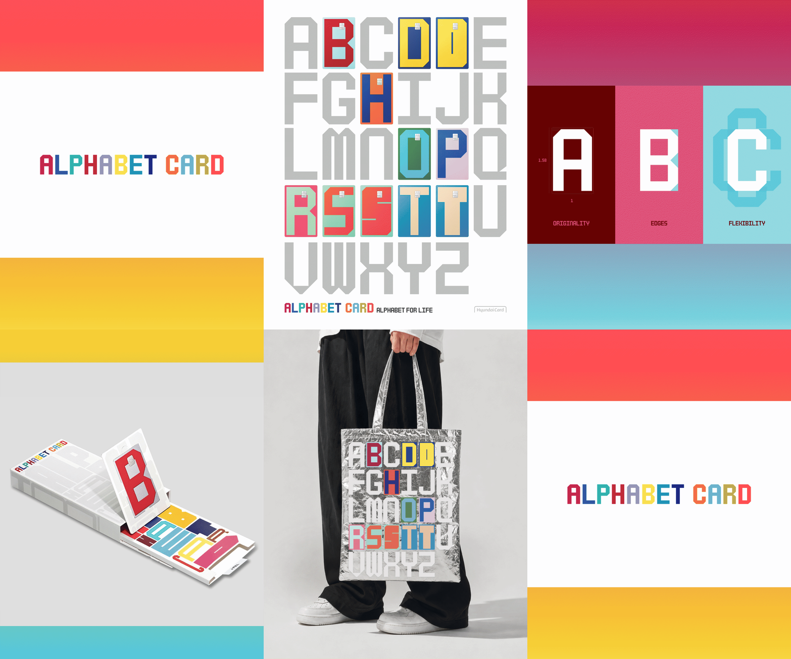
Hyundai Card has unveiled the Alphabet Card as an independent brand ecosystem, uniting typography, packaging, merchandise and card plate design under one cohesive visual language. With Dutch design influences, proprietary typeface and immersive pop-up experiences, the Alphabet Card redefines credit cards as lifestyle symbols, completing Hyundai Card’s long-running identity strategy.
The unveiling of Hyundai Card’s Alphabet Card marks a striking evolution in the company’s two-decade journey of transforming credit cards into cultural artefacts. More than a financial product, the Alphabet Card is conceived as a brand universe, weaving together typography, packaging, merchandise and card plate design into a unified ecosystem.
Hyundai Card first disrupted the market in 2003 with its “M” and “S” cards, which stripped away corporate branding and instead positioned the card itself as a symbol of lifestyle and taste. The Alphabet Card builds on this legacy, reviving the series as an independent brand that embraces individuality while binding diverse lifestyles into a coherent visual language.
At the heart of the Alphabet Card is its minimalist plate design, realised in collaboration with Dutch studio LAVA. Under the slogan “Alphabet for Life,” the plates embody structural beauty and experimental spirit, with Hyundai Card’s name deliberately absent from the front. Instead, the alphabet characters themselves take centre stage, supported by a proprietary typeface applied consistently across the back of the card, packaging and merchandise. Cardholders can choose from three finishes—Metal, Bright and Soft—each offering a distinct tactile and visual mood.
Typography remains central to Hyundai Card’s design philosophy. The new Alphabet Card typeface is built on the credit card’s 1:1.58 ratio, embedding originality into its DNA. Bold edges contrast with rounded corners, while variable font technology allows seamless adaptation across print, digital and spatial environments. This ensures the brand’s identity remains intact whether on signage, advertising or merchandise.
Packaging is treated as the first brand encounter. Plastic and metal formats share proportions but differ in execution: the plastic package adopts a vertical layout for visual flow, while the metal version employs precise 90-degree angles and refined finishes. Every detail, from laminated interiors to V-cut processing, is engineered to make the act of unveiling the card a deliberate brand experience.
The Alphabet Card extends beyond financial utility into lifestyle expression. A pop-up store in Seoul’s Itaewon district immerses visitors in the brand world, offering merchandise such as eco bags, T-shirts, keycaps and card wallets. Interactive zones allow customers to personalise alphabet magnets or create custom keycap chains, reinforcing the brand’s ethos of individuality. Even snacks like Our Chocolate and Our Caramel are integrated into the ecosystem, bringing the Alphabet’s visual language into everyday life.
Discover more from Creative Brands Mag
Subscribe to get the latest posts sent to your email.











Leave a comment