

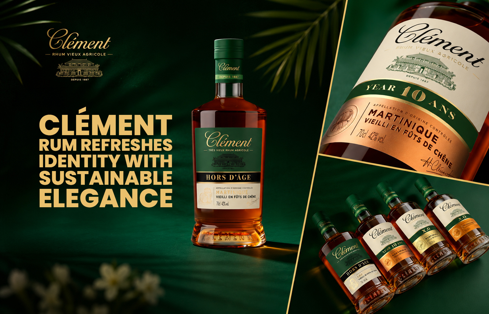
Clément Rum has unveiled a complete redesign of its packaging and bottle structure, evolving its codes while affirming its heritage. The refresh introduces a lighter, eco-friendly bottle, a strengthened brand identity with signature green, and a simplified hierarchy, balancing authenticity with contemporary expectations.
Clément Rum, one of the most respected names in the world of agricole rum, has announced a sweeping transformation of its visual identity and packaging. The redesign represents a bold yet respectful evolution, ensuring the brand remains firmly rooted in its heritage while meeting the demands of today’s consumers.
At the heart of the refresh is a new bottle structure that reduces glass weight by more than 23%. This significant change not only modernises the look and feel of the range but also underscores Clément’s commitment to sustainability. By lightening the bottle, the brand reduces its environmental footprint, aligning with global expectations for eco-conscious packaging without compromising the premium stature of its products.


The packaging overhaul extends across the entire Clément Rum portfolio, creating a more cohesive and contemporary identity. The design team has worked meticulously to preserve the authenticity that has long been the strength of Clément, while introducing elements that sharpen recognition and elevate craftsmanship. The result is a visual language that feels both timeless and forward-looking.
Central to the new identity is the introduction of Clément’s signature green hue, a colour that reinforces brand equity and provides a distinctive presence on shelf. This shade, paired with a more impactful brand block, ensures stronger visibility and consistency across the range. The information hierarchy has also been simplified, making navigation clearer for consumers and enhancing the overall accessibility of the brand.
The redesign is not simply cosmetic; it reflects a deeper ambition to strengthen Clément’s codes while adapting to contemporary expectations. By balancing heritage with innovation, the brand demonstrates how authenticity can coexist with modernity. The refreshed packaging highlights the craftsmanship and excellence that define Clément Rums, while ensuring the brand remains relevant in a competitive global market.
For consumers, the changes promise a more engaging experience. The lighter bottle structure makes handling easier, while the eco-friendly design resonates with growing demand for sustainability. The simplified labelling and strengthened brand cues provide clarity and confidence, reinforcing Clément’s position as a trusted name in premium rum.
For Clément, the refresh marks a confident step forward. It is a declaration of intent: to evolve without losing sight of tradition, to innovate while honouring legacy, and to meet today’s expectations with elegance and responsibility. The new identity ensures that Clément Rums continue to embody excellence, offering a product that is as visually compelling as it is authentically crafted.
With this complete redesign, Clément Rum has reaffirmed its place as a brand that understands the importance of heritage while embracing the future. The refreshed packaging is more than a new look—it is a symbol of resilience, craftsmanship, and a commitment to sustainability that will carry Clément into its next chapter with authority and grace.
Discover more from Creative Brands Mag
Subscribe to get the latest posts sent to your email.


Leave a comment