


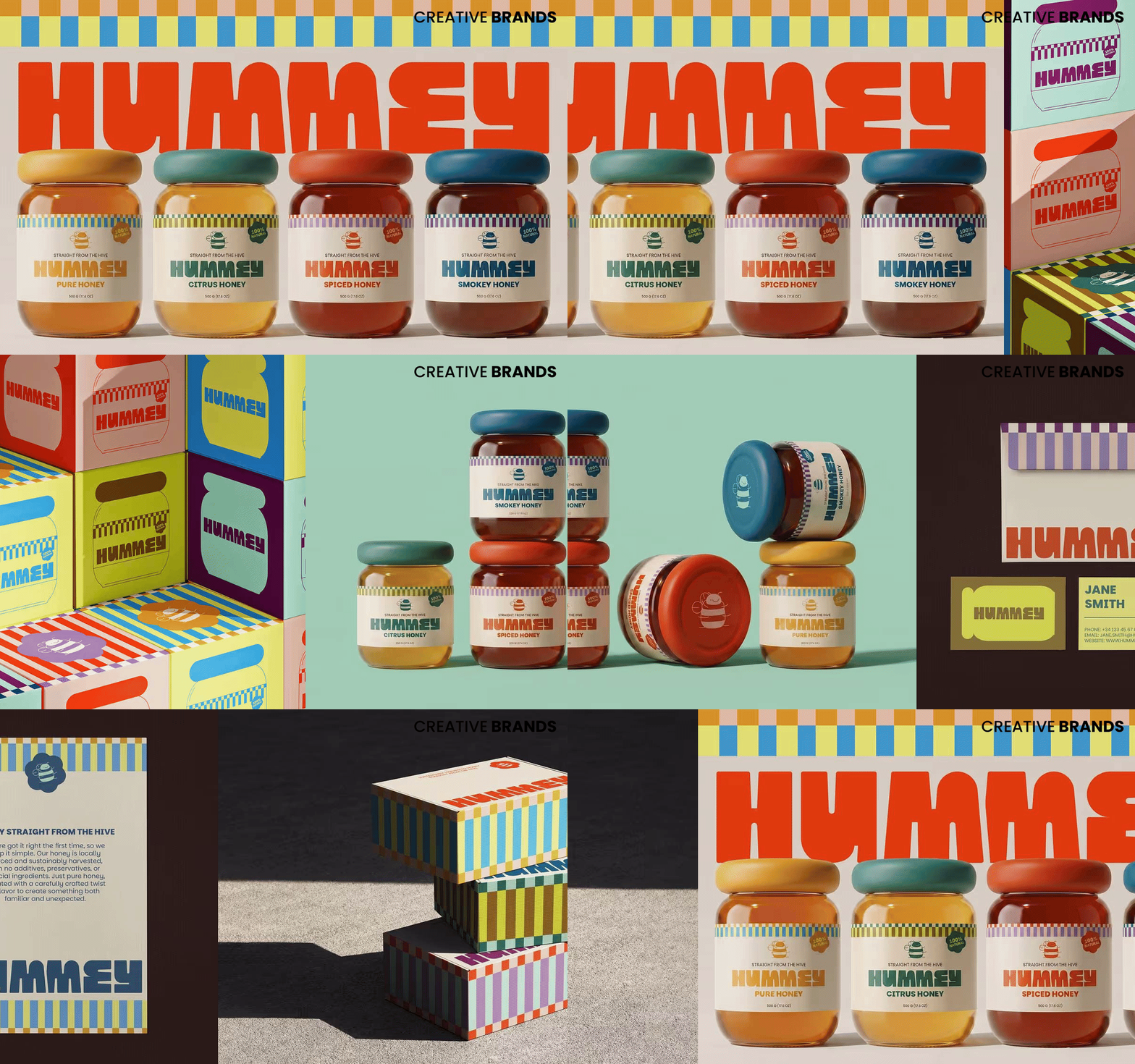
Leyma Design has crafted a vibrant new brand world for Hummey, a modern honey range that blends natural authenticity with expressive packaging. Inspired by the friendly character of bumble bees, the identity combines warmth, structure and bold visual cues to transform everyday honey into a playful, contemporary experience.
Honey has long been celebrated as one of nature’s purest sweeteners, but Hummey’s latest project demonstrates how design can elevate a familiar staple into something fresh and full of personality. Working with locally sourced, sustainably harvested honey, the brand introduces unexpected flavour twists across its Pure, Citrus, Smoky and Spiced varieties, while ensuring the identity feels as approachable and vibrant as the product itself.
The creative direction draws inspiration from bumble bees, balancing softness with structure to create a system that is instantly recognisable yet flexible. The logo cleverly contrasts the rounded silhouette of a bee with the clean geometry of a honeycomb, a visual language that extends seamlessly across the brand. This interplay of curves and lines ensures every element feels connected while maintaining a strong presence.
Packaging plays a central role in the storytelling. A custom mascot, designed with chunky, fluffy proportions reminiscent of bees, became the foundation for the jars’ softer silhouette. This reciprocal relationship between mascot and packaging created a cohesive identity where character and form reinforce one another. The jars, with their rounded contours, stand apart from conventional honey packaging, offering a tactile and memorable experience.
Three graphic elements define the packaging system: the logo, the mascot, and bold stripes inspired by bee markings. Combined with a palette of warm, energetic colours, these elements create a lively collection that is easy to navigate across flavour varieties. Each product retains its individuality while remaining unmistakably part of the Hummey family.
Beyond aesthetics, the identity communicates the brand’s values. Messaging highlights locally sourced honey, responsible harvesting, and the absence of additives or artificial ingredients. Rather than competing with nature, Hummey celebrates it, adding only thoughtful twists to an ingredient cherished for generations.
The result is a brand that invites consumers to rediscover honey through a more playful lens. By merging expressive design with an approachable tone, Leyma Design has transformed Hummey’s range into a memorable experience that feels modern, characterful and deeply connected to nature.
Discover more from Creative Brands Mag
Subscribe to get the latest posts sent to your email.












Leave a comment