


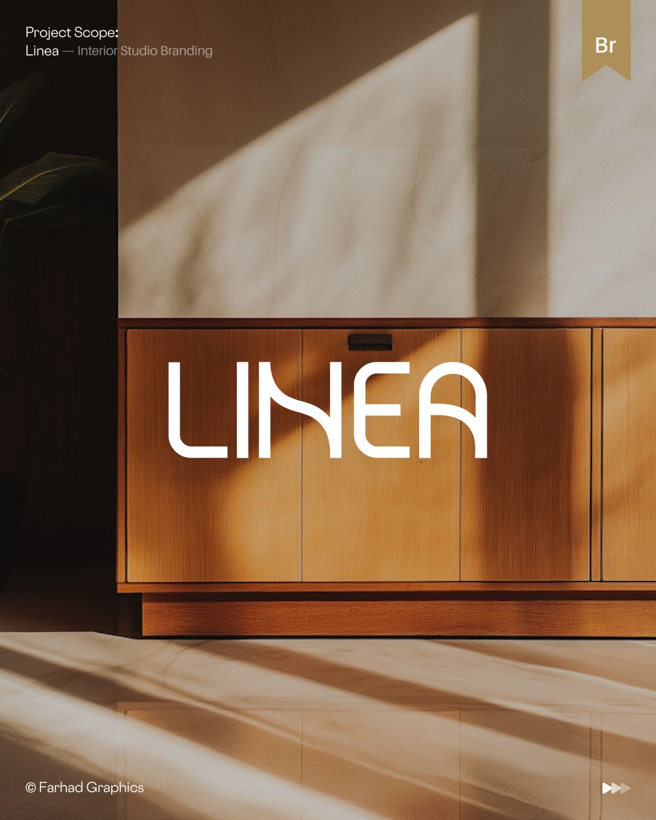
LINEA’s new brand identity blends precise lines, warm minimalism and refined spatial storytelling to create interiors that feel both disciplined and inviting. Defined by geometry, texture and narrative flow, the design positions the brand as a curator of atmosphere, offering a quiet yet expressive vision of contemporary interior identity.
LINEA has introduced a brand identity that embodies the essence of quiet sophistication, built around precise lines, warm minimalism and refined spatial storytelling. The concept positions the interior brand as a study in restraint and clarity, where every detail is carefully considered to create harmony and calm.


The identity is defined by its linear precision, using geometry not as decoration but as a structural language that guides the eye and shapes the experience. This approach allows LINEA to communicate a sense of order and balance, while avoiding the sterility often associated with minimalism. Instead, warmth is introduced through subtle textures, muted tones and an emphasis on spatial flow, ensuring the brand feels human and inviting.
Spatial storytelling lies at the heart of the design. Rather than treating interiors as static environments, LINEA’s identity suggests movement, rhythm and narrative. The lines become pathways, the spaces become pauses, and the overall composition feels like a quiet dialogue between architecture and emotion. This narrative quality elevates the brand beyond functional design, positioning it as a curator of atmosphere and mood.
By combining precision with warmth, LINEA achieves a rare equilibrium: a brand identity that is both disciplined and expressive. It reflects a philosophy where minimalism is not about absence, but about presence—about creating interiors that feel intentional, serene and deeply connected to the people who inhabit them.
Discover more from Creative Brands Mag
Subscribe to get the latest posts sent to your email.














Leave a comment