


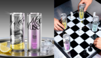
Bloom Büro has unveiled Mad Muse, a bold new brand identity for two tonic-based product lines designed to inspire home mixology. Through striking metallic packaging, expressive visuals and a rebellious narrative, the project reframes tonic from a functional mixer into a creative catalyst encouraging experimentation and self-expression in cocktails.
Bloom Büro has introduced a striking new brand identity for Mad Muse, a concept developed to challenge conventions within the tonic category while tapping into the rising culture of home mixology. Designed to encompass both a core range of flavoured tonics and a limited edition line of ready-to-drink cocktails, the project reframes tonic water not as a background utility but as a source of creative inspiration.
The assignment began with a clear challenge. In retail environments, tonic products often appear visually indistinguishable and are typically perceived as purely functional mixers rather than emotionally engaging beverages. With shelves crowded by similar-looking cans and bottles, consumers frequently make decisions based more on label design than brand storytelling or product differentiation. Bloom Büro set out to disrupt this dynamic by repositioning tonic as a product that encourages experimentation, personality and cultural relevance.
Research conducted during the project revealed a notable shift in drinking habits in recent years. Since the pandemic, the practice of preparing cocktails at home has grown considerably, with consumers increasingly embracing DIY mixology. Within that trend, tonic water has become a versatile base ingredient that allows different spirits and flavours to take centre stage. Many respondents acknowledged that they treat tonic as a neutral “background” element in cocktails.
Rather than resist that perception, the agency decided to build its brand strategy around it. If tonic is traditionally the background of a drink, Bloom Büro reasoned, then the brand itself could become the background that inspires creativity. The idea drew naturally on the cultural concept of a “muse”, a figure associated with artistic inspiration. However, the team deliberately rejected the familiar depiction of a passive or delicate muse. Instead, Mad Muse was conceived as rebellious, expressive and slightly unpredictable — a character that encourages drinkers to experiment without restraint.
This narrative is reflected strongly in the visual identity of the core tonic range. The cans are designed with a metallic finish that functions as a neutral canvas, echoing the role of tonic as a base for cocktails. Across this surface appear abstract “auras”, fluid graphic shapes representing the spark of inspiration that occurs when a new drink idea takes shape. Each aura is unique, emphasising the idea that creativity never repeats itself.
Colour coding plays a practical role as well, helping consumers quickly identify flavours on busy shelves while preserving the overall visual coherence of the brand. The logo itself reinforces the concept of controlled chaos: it combines two distinct typefaces that merge rebellious energy with enough structure to remain recognisable and legible.
While the core line celebrates the act of mixing drinks, the limited edition ready-to-drink cocktail range explores the emotional experience that follows. In this iteration, the brand narrative evolves. Instead of the muse inspiring the consumer, the brand suggests that the drinker can become the muse themselves through self-expression and personal taste.
The design of the cocktail cans continues to echo the metallic elements of the tonic line, ensuring visual continuity across the range. However, the graphics shift towards bolder colour palettes and prominent ingredient illustrations. Strong colour coding allows flavours to be recognised instantly, while short descriptive phrases add personality and emphasise the emotional tone of each drink.
This approach also deliberately challenges the traditional cultural stereotype of the muse as fragile or submissive. In the Mad Muse universe, the muse is confident, expressive and unrestrained, a figure that can represent anyone regardless of gender. The message is clear: creativity belongs to everyone, and the act of making or choosing a drink can be part of that expression.
Through this layered narrative and distinctive visual system, Bloom Büro sought to give tonic packaging a new role within the beverage landscape. Instead of blending into the crowded mixer aisle, Mad Muse aims to stand out as a brand that celebrates experimentation and individuality.
The project ultimately positions tonic not merely as a supporting ingredient but as a cultural trigger for creativity. By transforming the packaging into a canvas for inspiration and framing the product as a companion to self-expression, Mad Muse illustrates how thoughtful branding can reshape consumer perceptions of even the most familiar beverage categories.
For Bloom Büro, the result is a brand designed to break conventions in a market that often favours predictability. Mad Muse’s bold aesthetic and rebellious storytelling suggest that tonic water can be more than a functional mixer — it can become a symbol of creative freedom and a catalyst for discovering new drinking experiences at home.
Discover more from Creative Brands Mag
Subscribe to get the latest posts sent to your email.


Leave a comment