


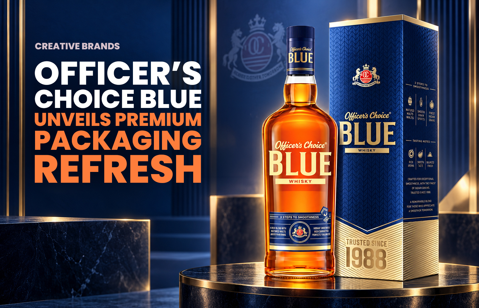
Allied Blenders and Distillers Limited (ABD) has unveiled new packaging for Officer’s Choice Blue, reinforcing its presence in the Premium & Above segment. The refreshed design, created by a leading European firm, introduces a sleeker bottle, transparent label with matte gold foiling, and a “Trusted Since 1988” marker, blending heritage with modernity.
Allied Blenders and Distillers Limited (ABD) has announced a striking new look for Officer’s Choice Blue, one of its most established labels, as part of its strategy to strengthen the brand’s positioning in the Premium & Above (P&A) segment. The refreshed packaging underscores ABD’s commitment to elevating consumer experiences while retaining the trusted identity of a brand that has been a mainstay in its portfolio for decades.
Officer’s Choice Blue, blended with imported Scotch malts and matured in bourbon barrels, has long been recognised for its smooth character and consistent quality. The new packaging seeks to build on this reputation by introducing a more contemporary aesthetic that resonates with evolving consumer preferences. The redesign balances modern sophistication with the brand’s established heritage, ensuring that loyal drinkers continue to feel connected while new audiences are drawn to its premium cues.
The revamped bottle structure is sleeker and more refined, signalling a shift towards a more aspirational positioning. A transparent label, accented with matte gold foiling, adds a touch of understated luxury, while the prominently displayed “Trusted Since 1988” marker reinforces the brand’s legacy and credibility. These elements combine to create a visual identity that is both timeless and forward-looking, reflecting ABD’s ambition to compete more aggressively in the premium spirits category.
The design has been crafted by a leading European firm, bringing international expertise to the project and ensuring that Officer’s Choice Blue aligns with global standards of packaging innovation. By investing in design excellence, ABD is not only refreshing the look of one of its flagship brands but also signalling its intent to strengthen its overall portfolio in a highly competitive market.
Packaging plays a crucial role in consumer perception, particularly in the spirits industry where visual appeal often influences purchase decisions. With this redesign, ABD aims to enhance shelf presence and reinforce Officer’s Choice Blue as a trusted yet contemporary choice for discerning consumers. The combination of heritage markers and modern design cues positions the brand to appeal to both long-standing patrons and younger drinkers seeking premium experiences.
As India’s spirits market continues to evolve, with consumers increasingly trading up to more premium offerings, ABD’s move reflects a broader industry trend towards innovation and premiumisation. Officer’s Choice Blue’s refreshed identity is not merely cosmetic; it is a strategic step in ensuring the brand remains relevant, competitive, and aspirational in the years ahead.
Discover more from Creative Brands Mag
Subscribe to get the latest posts sent to your email.














Leave a comment