

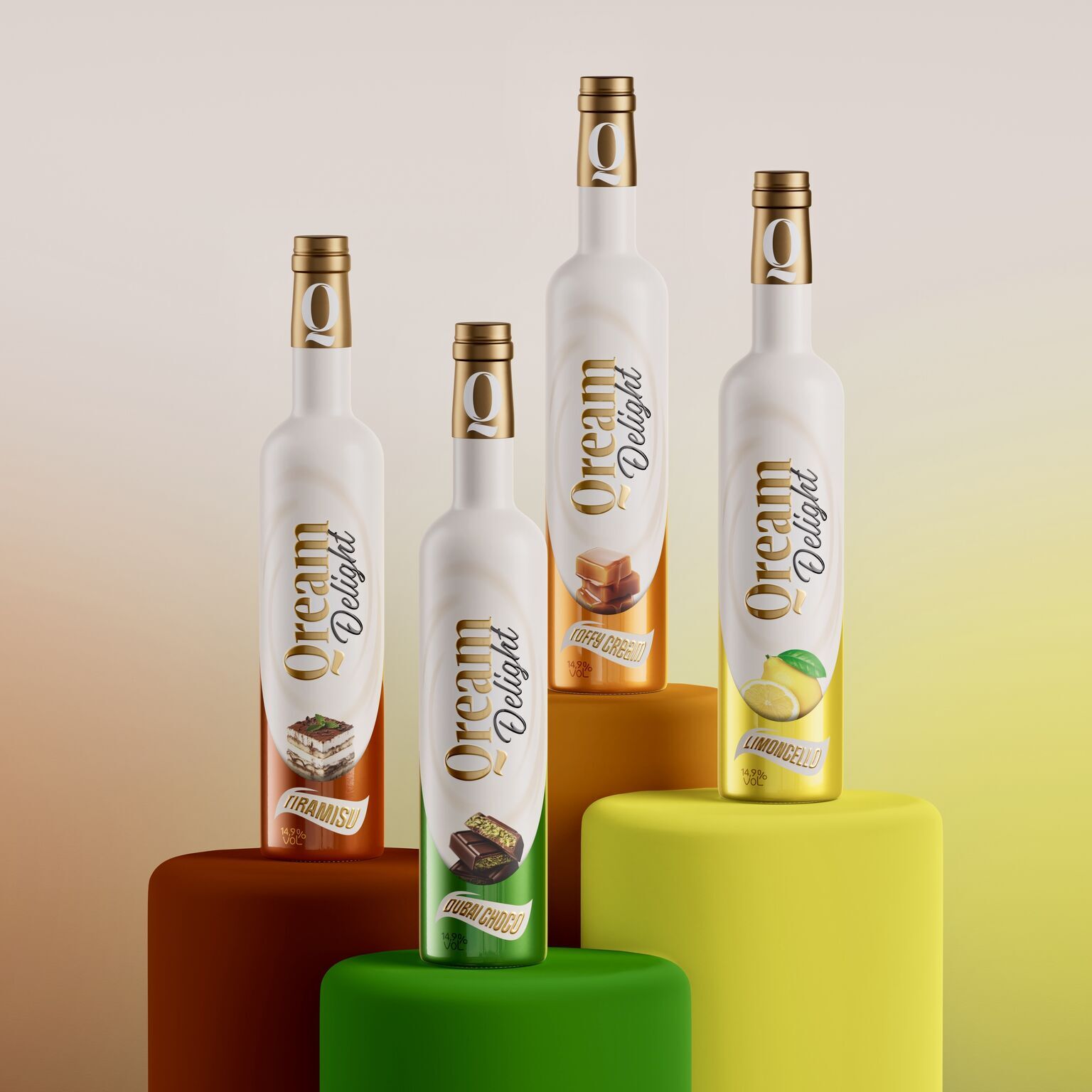
Toorank has revealed striking new packaging for Qream liqueur, crafted by Rob van Heertum’s team using advanced sleeve printing, tactile varnishes, and wrap-around foil. The vibrant designs elevate the cream liqueur category. Visitors can sample Qream Delight at ProWein in Düsseldorf from 15–17 March.
In the world of premium beverages, design is often the silent ambassador of taste. Toorank, the renowned spirits company, has taken this philosophy to heart with the unveiling of a striking new look for its Qream liqueur. The refreshed packaging, created in collaboration with designer Rob van Heertum and his team, is more than a visual update—it is a sensory experience that mirrors the indulgent character of the drink itself.
Qream has long positioned itself as a cream liqueur that celebrates luxury and flavour. Yet, in a category often dominated by traditional cues and predictable aesthetics, Toorank sought to break the mould. The result is packaging that feels as premium as the product inside. By employing advanced sleeve printing techniques and tactile varnishes, the design invites consumers not only to see but to touch, creating a multi-sensory connection with the brand.
The innovation lies in the details. Wrap-around foil adds depth and dimension, catching the light in ways that enhance the bottle’s contours. Each flavour is distinguished by its own vibrant colour world, ensuring that the range is both cohesive and distinctive. The tactile varnishes provide a creamy texture to the touch, echoing the smoothness of the liqueur itself. It is a rare example of packaging that genuinely reflects the product’s essence, making the act of holding the bottle as pleasurable as pouring its contents.
For Rob van Heertum, the project was an opportunity to push boundaries in beverage design. “We wanted to create packaging that doesn’t just sit on the shelf but speaks to the consumer in a language of texture, colour, and emotion,” he explained during the launch. His team’s approach was rooted in the belief that design should elevate the drinking experience, making Qream not just a liqueur but a lifestyle statement.
The collaboration between Toorank and van Heertum has been widely praised within the industry. By marrying technical innovation with creative flair, they have delivered a product that stands out in a crowded market. It is a reminder that packaging is not merely functional but a powerful storytelling tool. In Qream’s case, the story is one of indulgence, sophistication, and delight.
This bold new look will make its public debut at ProWein, the international trade fair for wines and spirits, held in Düsseldorf from 15 to 17 March. Visitors to the Toorank stand will have the chance to experience Qream Delight firsthand. Beyond admiring the design, they will be invited to taste the liqueur, exploring its award-worthy flavours in person. The event promises to be a celebration of both craftsmanship and creativity, offering industry professionals and enthusiasts alike a glimpse into the future of premium beverage branding.
ProWein has long been a stage for innovation, and Qream’s presence this year underscores Toorank’s commitment to pushing boundaries. The company is not only showcasing a product but also making a statement about the role of design in shaping consumer perception. In an age where visual identity can be as influential as taste, Qream’s new look is poised to capture attention and spark conversation.
Ultimately, the refreshed packaging is more than a marketing exercise. It is a testament to Toorank’s belief that design and flavour are inseparable. By investing in a look that tastes as good as it feels, the company has created a product that resonates on multiple levels. For consumers, it is an invitation to indulge in a liqueur that delights the senses. For the industry, it is a benchmark of what can be achieved when creativity and innovation converge.
As ProWein approaches, anticipation builds for Qream’s showcase. Whether admired for its vibrant aesthetics or savoured for its creamy richness, Qream Delight is set to leave a lasting impression. In Düsseldorf, design and taste will meet in perfect harmony, reminding the world that true luxury lies in the details.
Discover more from Creative Brands Mag
Subscribe to get the latest posts sent to your email.


Leave a comment