

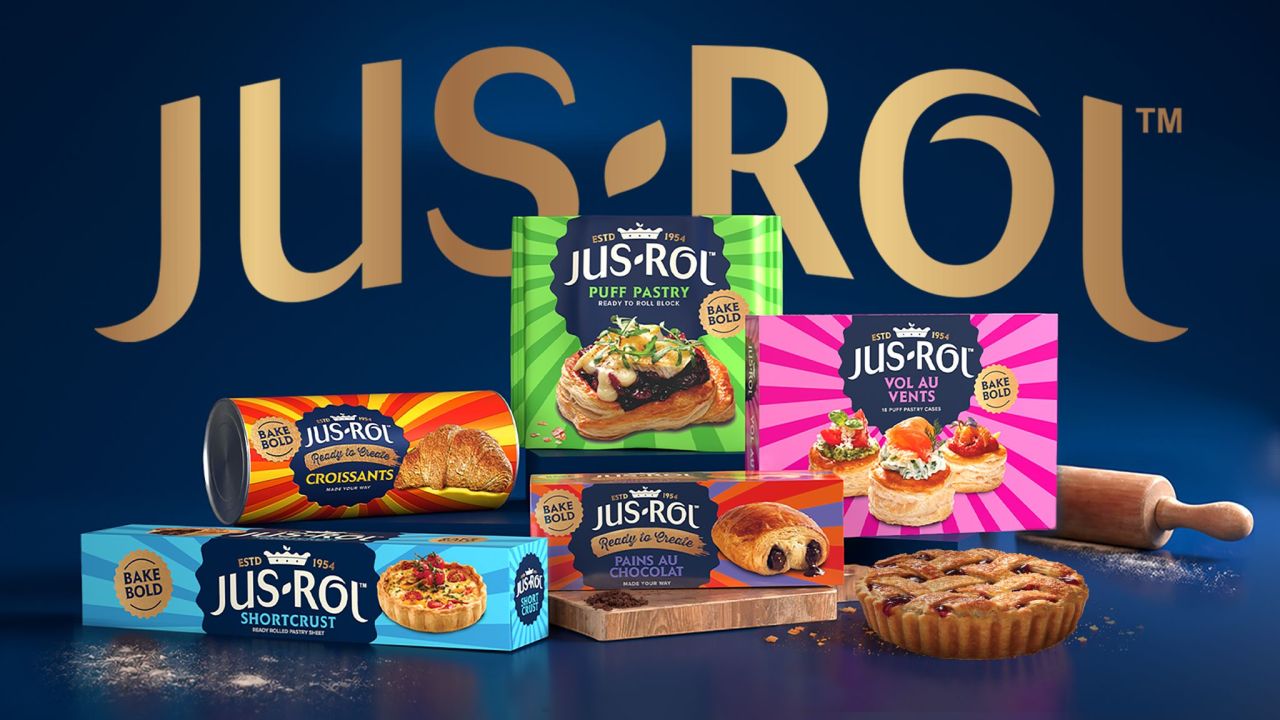
Jus-Rol, Ireland and the UK’s leading pastry dough brand, has unveiled a refreshed packaging design created with Brandon. The new identity modernises the heritage brand, unifies its chilled, frozen, and ‘Ready to Create’ ranges, and introduces bold colour, typography, and playful graphics to elevate shelf impact and consumer preference.
Jus-Rol, the pastry giant synonymous with home baking across Ireland and the UK, has revealed a striking new packaging identity set to roll out this June. The redesign, developed in partnership with brand design agency Brandon, represents a significant evolution for the market leader, balancing modernisation with respect for its heritage.


The brief to Brandon was clear: modernise the brand, simplify navigation across its extensive range, and encourage stronger consumer preference. In response, Brandon’s strategy and design teams restructured Jus-Rol’s brand architecture and created a packaging system that unites existing products while providing flexibility for future innovation.
The refreshed packs feature a host of new design elements. A bold “BAKE BOLD” rosette now sits proudly on pack, alongside a gold swoosh inspired by the stroke of a pastry brush. Food-centred product photography ensures appetite appeal, while hand-illustrated icons add a playful, approachable touch. Typography has been updated to sharpen recognition and deliver a contemporary edge.
Rachel Griffiths, design director at Brandon Consultants, explained the creative thinking: “At the heart of the new brand is our sunburst graphic device. Representing the fun in home baking and the enjoyment of the process, we’ve designed it to bring a positive, energetic and uplifting feel to the brand.”
Colour plays a pivotal role in the redesign. In a category often dominated by muted tones, Jus-Rol’s new palette is bold and vibrant, balancing familiar cues with distinctive brand equity. The result is packaging that stands out across chilled and frozen aisles, elevating Jus-Rol’s presence wherever it appears.
The project demonstrates how a heritage brand can evolve without losing its essence. Jus-Rol’s values of transparency and sourcing integrity remain visible, but are now wrapped in a personality that feels celebratory rather than purely functional. By combining clarity with character, the new identity positions Jus-Rol to strengthen loyalty and attract new audiences in a competitive category.
Rolling out across Ireland and the UK this month, the redesign underscores Jus-Rol’s ambition to lead not just in sales but in brand experience. For consumers, the new look promises easier navigation, stronger recognition, and a more joyful connection to home baking. For Jus-Rol, it marks a confident step into the future while honouring the traditions that made it iconic.
Discover more from Creative Brands Mag
Subscribe to get the latest posts sent to your email.


Leave a comment