


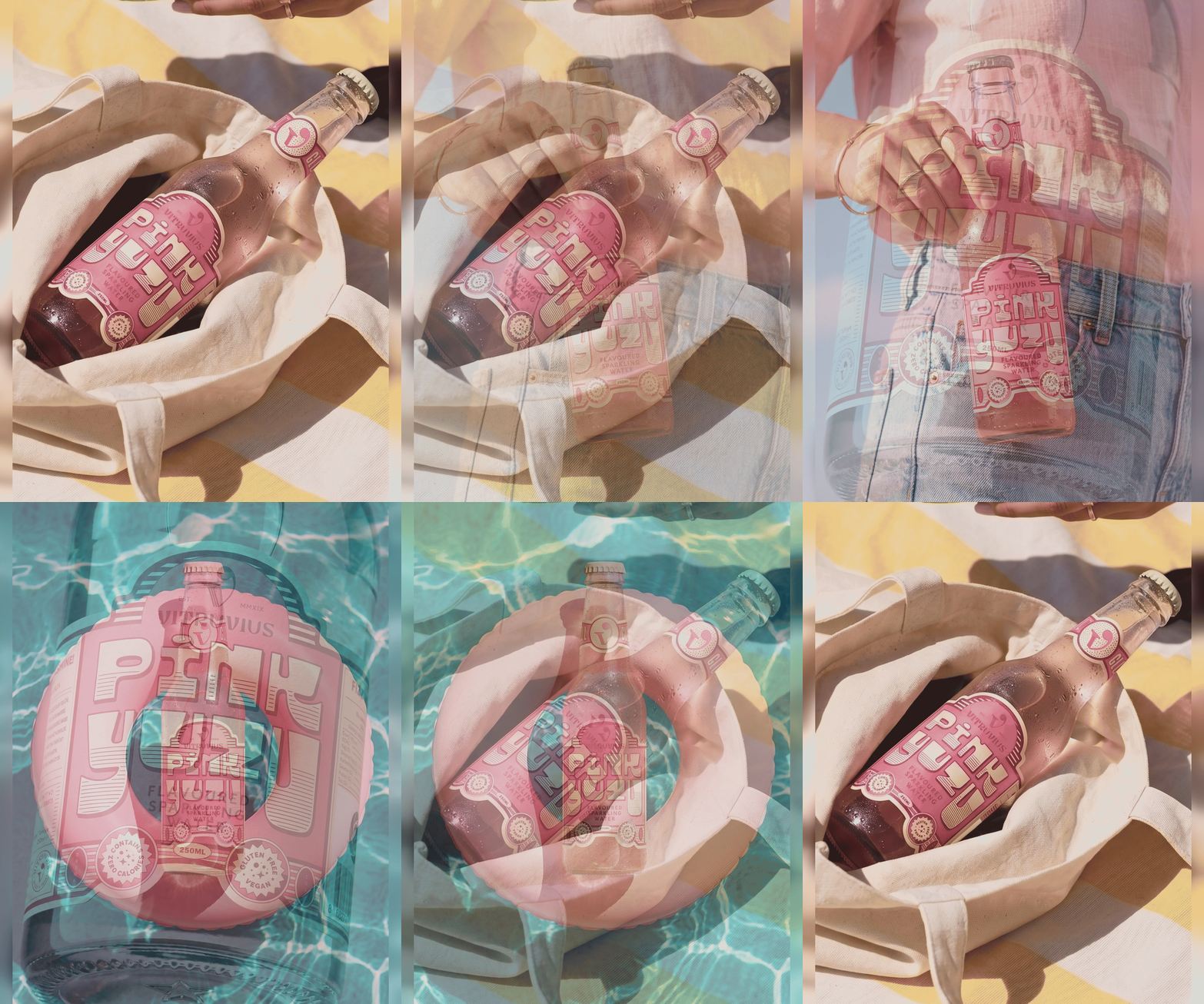
Flama Design House has created a vibrant packaging design for Vitruvius Pink Yuzu, inspired by vintage refreshment labels but amplified with oversized lettering, playful seals and a bold pink palette. The bottle exudes brightness and personality, ensuring strong shelf presence and positioning the drink as a lifestyle statement as well as a refreshment.
Flama Design House has unveiled a striking packaging design for Vitruvius Pink Yuzu, a bottle that radiates brightness and charm. Drawing inspiration from vintage refreshment labels, the design amplifies nostalgia with oversized lettering, whimsical seals and a bold pink palette that makes the rest of the fridge look understated.
Flama Design House has brought a sense of exuberance to the beverage aisle with its latest creation for Vitruvius Pink Yuzu. The design is built around the idea that packaging should not only contain but also embody the spirit of what lies within. In this case, the bottle is made to feel every bit as bright as the citrusy, refreshing character of the drink itself.
The creative team leaned into the heritage of old-school refreshment labels, borrowing their familiar cues of bold typography and decorative seals. Yet rather than simply replicating nostalgia, they turned the volume up. Oversized lettering dominates the label, ensuring instant recognition and a confident shelf presence. Playful seals add a touch of whimsy, while the unapologetic use of pink transforms the bottle into a statement piece.
Colour is central to the design’s impact. The vivid pink palette not only reflects the product’s name but also injects a sense of fun and vibrancy into the category. In a fridge full of muted tones and conventional branding, Vitruvius Pink Yuzu stands out as deliberately flamboyant, making its neighbours look slightly underdressed. This boldness is not accidental; it is a calculated move to ensure memorability and consumer engagement.
The design philosophy behind the project highlights Flama Design House’s ability to balance tradition with modernity. By referencing vintage refreshment aesthetics, the bottle taps into a collective memory of simpler times, while its exaggerated elements speak to contemporary tastes for boldness and individuality. The result is packaging that feels both familiar and fresh, bridging generations of design sensibilities.
Strategically, the new look positions Vitruvius Pink Yuzu as more than just a beverage—it becomes a lifestyle accessory. The oversized typography and playful seals lend themselves to digital storytelling, making the bottle highly shareable across social platforms. In an era where visual identity is as important as flavour, the design ensures that Vitruvius Pink Yuzu resonates with younger audiences seeking products that reflect personality and joy.
Flama Design House’s work underscores the growing importance of packaging as a brand’s frontline communicator. By crafting a bottle that radiates brightness and confidence, the studio has elevated Vitruvius Pink Yuzu into a design-led experience. It is not merely about refreshment; it is about making a statement every time the fridge door opens.
Discover more from Creative Brands Mag
Subscribe to get the latest posts sent to your email.












Leave a comment