


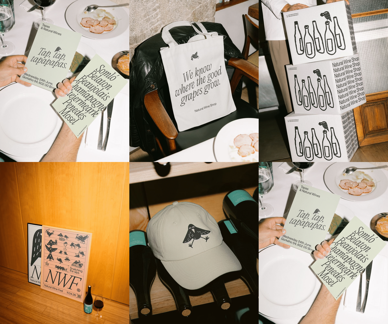
Studio L-AB has created a distinctive branding and packaging identity for Natural Wine Shop and Natural Wine Festival, linking the two ventures through a shared starling-inspired symbol. Illustrated by Bára Růžičková, the character evolves from a packaging mark into a dynamic flock, celebrating producers and the spirit of natural wine.
A watchful starling with a strikingly human eye has become the centrepiece of a new visual identity created by Studio L-AB for Natural Wine Shop and Natural Wine Festival, bringing two closely connected businesses together under a single, memorable brand.
The project demonstrates how a simple narrative can unify different experiences while remaining flexible enough to adapt across packaging, signage and event communications. At its heart is the starling, a bird chosen for its instinctive ability to locate the ripest grapes, a characteristic that mirrors the careful selection and discovery associated with natural wine.
Studio L-AB developed the branding as a shared identity for both the retail and festival sides of the business. Rather than creating separate visual systems, the design team sought a common thread capable of expressing the values of each venture while reinforcing their connection. The result is a symbol that functions equally well on a bottle package as it does within the lively atmosphere of a wine festival.
The starling itself was illustrated by artist Bára Růžičková, whose interpretation gives the bird an unusual and captivating appearance. Its most distinctive feature is a human eye, an element that introduces personality, curiosity and a sense of intelligence. The unexpected detail transforms the bird from a simple mascot into a character that invites closer inspection and encourages engagement with the brand.
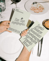
For Natural Wine Shop, the starling acts as a consistent visual marker throughout the customer journey. It appears across packaging materials, adhesive tape and branded touchpoints, creating a recognisable signature that helps establish continuity and strengthen brand recognition. The simplicity of the illustration allows it to remain effective regardless of scale, whether wrapping parcels or appearing on printed materials.
The identity becomes more playful when translated to Natural Wine Festival. Here, the solitary bird expands into a lively flock, reflecting the communal and celebratory nature of the event. Rather than repeating the same illustration, the design introduces variation by assigning individual poses to represent different wine producers. The approach injects movement and character into the festival branding while providing a visual way to acknowledge the diversity of participants.
This evolving flock creates a richer and more dynamic expression of the original concept without losing the coherence of the overall identity. Each bird remains instantly recognisable as part of the same family, yet its unique posture offers a subtle reference to the individual producer it represents.
By combining storytelling, illustration and strategic branding, Studio L-AB has crafted an identity that balances consistency with adaptability. The project shows how a single symbol can move seamlessly between commerce and celebration, transforming from a practical packaging device into a vibrant cast of characters. In doing so, the studio has given Natural Wine Shop and Natural Wine Festival a shared voice, united by the keen eye of a starling always searching for the finest grapes.
Discover more from Creative Brands Mag
Subscribe to get the latest posts sent to your email.





Leave a comment