


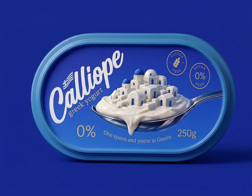
Atyan Design has unveiled the packaging for Calliope, a Greek yogurt brand that blends cultural storytelling with visual purity. Inspired by the Aegean Sea and Santorini’s whitewashed houses, the design conveys freshness, tradition and simplicity, turning each spoonful into a sensory journey that connects consumers with Greece’s maritime heritage.
Atyan Design has shaped Calliope into a Greek yogurt brand that embodies the essence of Greece through light, purity and cultural storytelling. The packaging is conceived not merely as a container but as a narrative device, evoking the maritime culture of the Aegean and the timeless simplicity of traditional yogurt-making.
At first glance, the deep blue palette establishes trust and freshness, instantly recalling the sea and sky. This colour choice contrasts vividly with the white of the yogurt, reinforcing its naturalness and quality. The logo, with its soft, flowing lines, mirrors the creamy texture of the product, while its feminine elegance ensures memorability and brand recognition.


The most striking visual element is the white village formed on a spoon, a clever nod to Santorini’s iconic houses with blue roofs. This imagery transforms the product into a landscape, making each spoonful a miniature journey. It is storytelling without words, inviting consumers to experience Greece’s culture and taste simultaneously.
Minimalist text elements, such as the prominent “0%” mark, highlight health and simplicity, while the slogan “One spoon and you’re in Greece” encapsulates the brand’s promise. Rounded corners and a comfortable grip structure add functionality, ensuring the design is as practical as it is beautiful.
Beyond aesthetics, the packaging conveys a lifestyle. It suggests mornings by the Aegean, where families prepare yogurt with care and tradition. Each spoonful is positioned as a reminder that true pleasure lies in simplicity, purity and authenticity. Calliope is presented not just as food, but as an experience—an emotional connection to a place where time slows and natural taste prevails.
By merging cultural resonance with modern design, Atyan Design has created a brand identity that elevates Calliope from a dairy product to a sensory journey. It is a story of sea light, tradition and simplicity, captured in packaging that promises both nourishment and nostalgia.
Discover more from Creative Brands Mag
Subscribe to get the latest posts sent to your email.










Leave a comment