


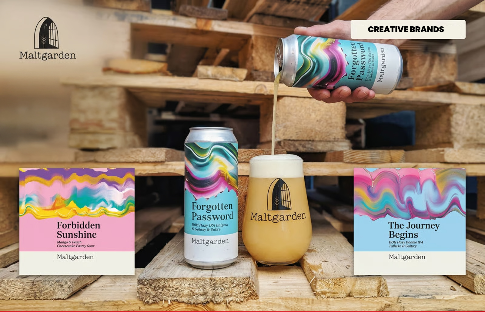
Warhol’s soup cans blurred art and commerce in 1962. Six decades later, packaging designers embrace that fusion, turning supermarket shelves into exhibition spaces. Polish brewery Maltgarden exemplifies the trend with collectible can artwork. Research shows design drives purchase, making packaging both cultural canvas and commercial catalyst in categories like craft beer and wine.
When Andy Warhol lined up his Campbell’s Soup Cans at the Ferus Gallery in Los Angeles in 1962, he blurred the boundary between supermarket shelf and gallery wall. The provocation lay in asking whether the can had been elevated by art, or whether art had simply overlooked it. Sixty years later, packaging designers are revisiting that question with sharper print technology and far less irony.




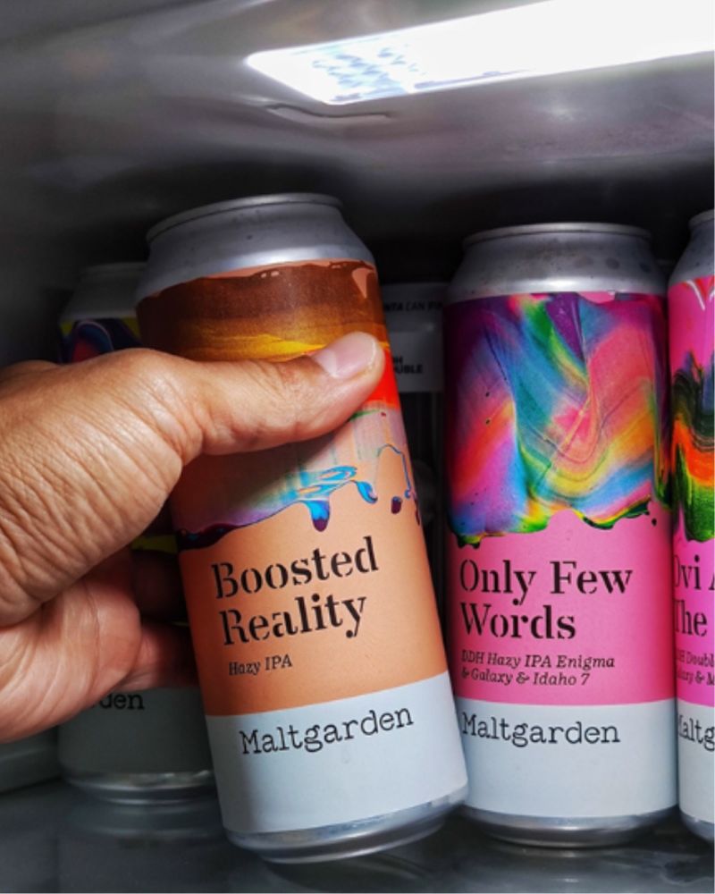

The distinction between fine art and commercial design that made Warhol’s gesture radical has largely dissolved. Today, designers move fluidly between editorial commissions, gallery exhibitions and packaging briefs. Beer cans carry abstract paintings, wine labels commission artists season after season, and beauty packaging borrows the language of contemporary printmaking. The supermarket has become an exhibition space, where the admission price includes the product itself.
Maltgarden, a Polish craft brewery, embodies this shift. Its identity rests on treating the label as a canvas rather than a noticeboard. With 20 to 30 new releases each year, each can carries original handmade artwork, unified by a restrained typographic system. The result feels less like a product line and more like a rolling collection—collectible and drinkable, a kind of “Liquid Pollock.”
That collectability has commercial weight. Limited-edition artwork encourages repeat purchase, as consumers begin collecting releases rather than simply buying beer. The mechanism resembles vinyl records, exhibition prints or trading cards more than conventional FMCG loyalty. Research confirms packaging as one of the strongest purchase drivers, especially in categories such as craft beer and wine where design signals quality, personality and value before taste ever enters the equation.
Packaging, once dismissed as mere surface, now functions as cultural artefact, commercial tool and creative language. Warhol’s soup cans may have asked whether the supermarket could be a gallery. Today, the answer is clear: the gallery has moved to the supermarket shelf.
Discover more from Creative Brands Mag
Subscribe to get the latest posts sent to your email.














Leave a comment