

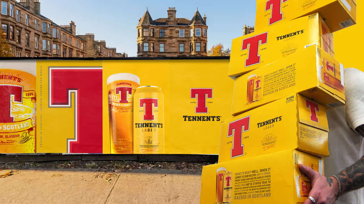
Tennent’s has partnered with Thirst to refresh its visual identity and reposition itself for a new generation. Amplifying its iconic red ‘T’ and introducing innovations like Bavarian Pilsner and Tennent’s Tops, the brand balances heritage with modern relevance, restoring pride and presence while reconnecting with today’s drinkers.
Tennent’s, Scotland’s most iconic lager, has unveiled a bold new chapter in partnership with creative agency Thirst, repositioning itself as a culturally relevant beer brand for today’s drinkers. The collaboration has refreshed the brand’s visual identity while introducing a pipeline of innovations designed to balance heritage with modern appeal.


Originally tasked with updating the core brand identity, Thirst faced the challenge of ensuring Tennent’s remained recognisable yet progressive. While the lager has long been a national icon, younger audiences increasingly saw it as traditional rather than fresh. At a time when heritage brands are finding renewed resonance, the opportunity was not to reinvent Tennent’s but to evolve it.
Central to the redesign is the amplification of the brand’s most recognisable asset, the red ‘T’. Given greater scale, depth and confidence, it now anchors a richer colour palette, refined typography and enhanced craft cues. The result is a visual system that restores pride and presence, both on shelf and in hand, while signalling confidence in the brand’s future.
Building on this foundation, Thirst worked closely with Tennent’s to introduce new innovations that demonstrate how the lager can evolve without losing its roots. The launch of Tennent’s Bavarian Pilsner, a limited-edition inspired by founder Hugh Tennent’s pioneering spirit, fuses Glaswegian grit with Bavarian brewing tradition. Alongside it, Tennent’s Tops offers a zesty twist on the classic recipe, designed to appeal to new occasions and audiences this summer.
The impact has been immediate, with strong social engagement and positive consumer reaction placing Tennent’s firmly back in the cultural conversation. Hazel Alexander, Senior Brand Manager for Tennent’s Lager, praised the collaboration: “They’ve helped us evolve the brand visual identity in a way that feels both progressive and authentic to who we are. The quality of thinking, creativity and design throughout has been fantastic.”
For Thirst’s founders, the project represents both a personal and strategic milestone. Chris Black described working on Tennent’s as “genuinely special,” highlighting the chance to reconnect a new generation with a brand that means so much to Scottish culture. Matt Burns emphasised the power of incremental design, noting that “the smallest changes carry the most weight” in unlocking bigger opportunities for iconic brands.
Together, Tennent’s and Thirst have demonstrated how heritage can be reimagined for modern relevance. By refining rather than reinventing, the lager has been given the confidence to move forward, ensuring it remains not just a familiar staple but an active part of contemporary drinking culture.
Discover more from Creative Brands Mag
Subscribe to get the latest posts sent to your email.


Leave a comment