

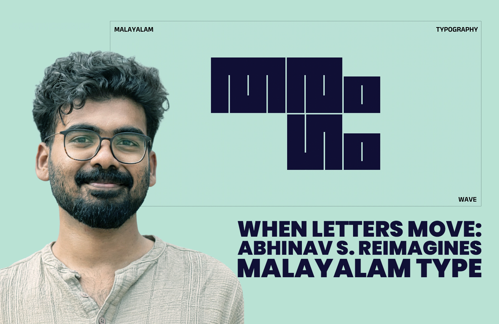
Communication designer Abhinav S. is redefining Malayalam typography through an experimental motion series that blends design, rhythm, and storytelling. Using digital tools, he transforms static letterforms into dynamic visual experiences, pushing regional language design into contemporary, expressive territory while exploring new emotional and aesthetic possibilities in typographic communication.
Visual communication is increasingly shaped by motion and interactivity. Communication designer and illustrator Abhinav S. is quietly carving out a distinctive space by turning the Malayalam script into a living, breathing design language. His ongoing project, titled Malayalam Typographic Motion Exploration, is not merely an artistic experiment but a thoughtful reimagining of how language itself can be experienced.
With a background that bridges rigorous academic training and creative exploration—having studied at premier institutions such as the National Institute of Design and IIT Bombay—Abhinav brings both conceptual clarity and technical finesse to his work. His practice revolves around building meaningful brand identities and visual systems, but this latest project moves beyond conventional client-driven design into a more personal, exploratory realm.
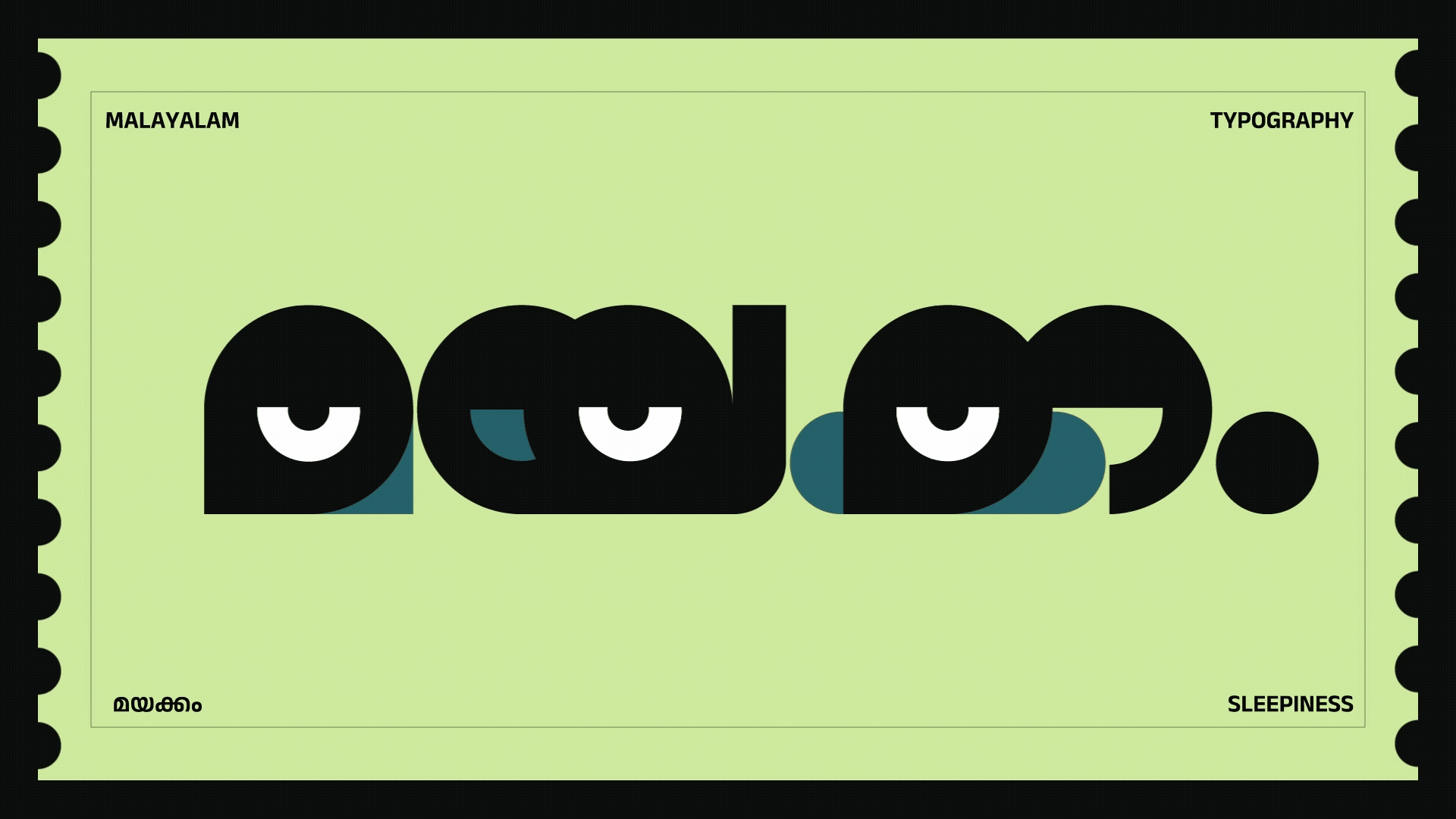
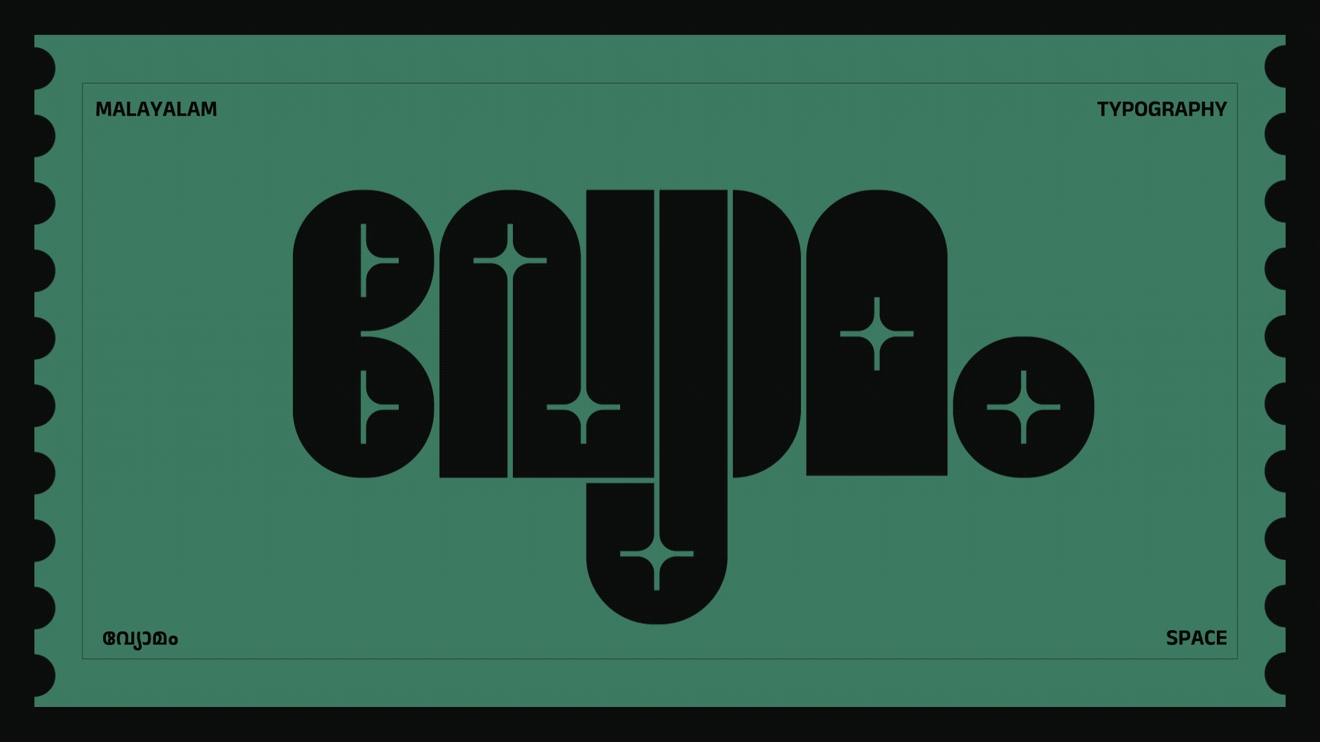
At the heart of the series lies a simple yet powerful idea: what if words could move, feel, and resonate beyond their literal meaning? Each piece in the project takes a Malayalam word and transforms it into a kinetic composition, where letterforms are animated to express rhythm, emotion, and texture. Geometry, motion, and timing become as crucial as the script itself, allowing the words to unfold like visual narratives rather than static text.
The project reflects a growing global interest in kinetic typography, yet it remains deeply rooted in regional identity. Malayalam, with its inherently fluid and curvilinear script, lends itself naturally to motion. Abhinav’s work taps into this potential, amplifying the script’s organic qualities while introducing a contemporary visual language that feels both experimental and accessible.
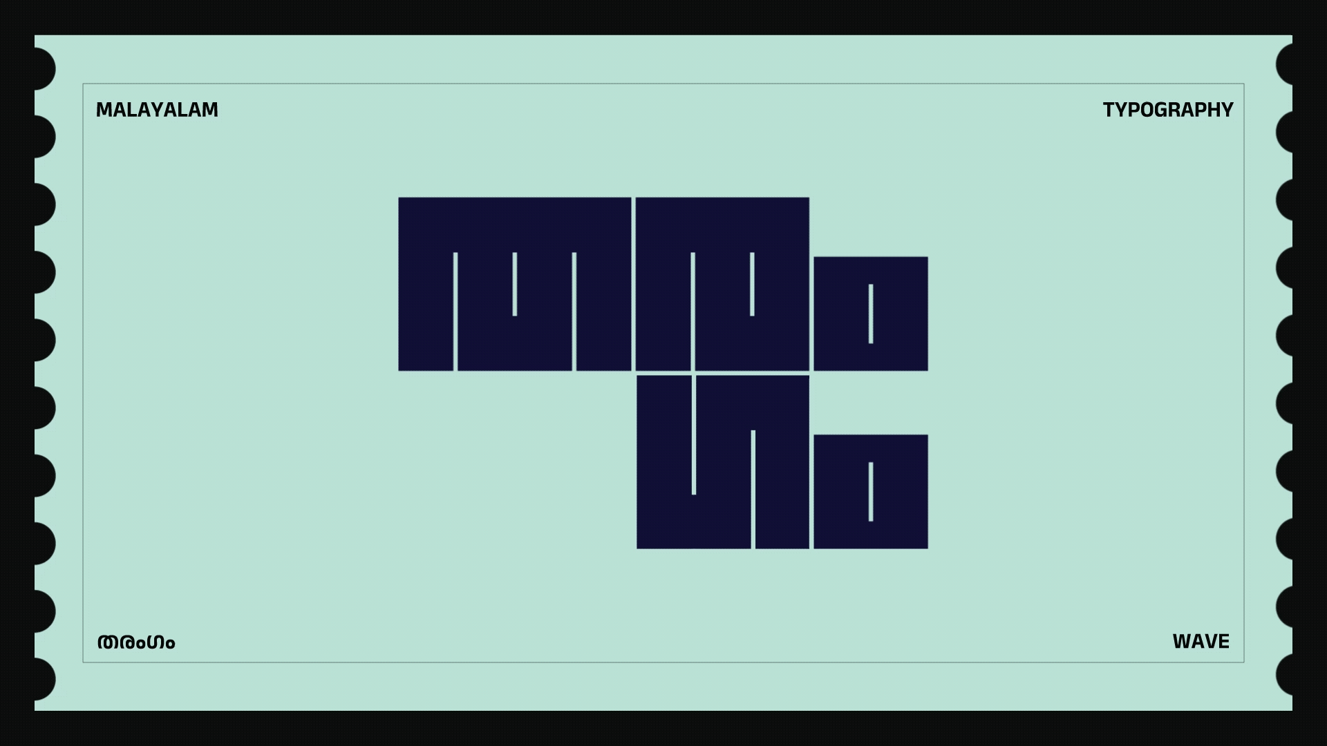
Using tools such as Adobe After Effects and Illustrator, he constructs intricate motion sequences where each curve and stroke is carefully choreographed. The results are not just aesthetically striking but conceptually layered, as the movement often echoes the meaning or emotional tone of the word itself. In this way, the project bridges the gap between language and visual storytelling, turning typography into an immersive experience.
Abhinav describes the series as an ongoing exploration, with each new word offering a fresh opportunity to experiment with form and rhythm. This iterative approach allows the project to evolve organically, building a growing archive of animated expressions that collectively push the boundaries of Malayalam typography. It is as much a study of language as it is of motion design.
How was it conceived?
This project started as an ongoing exploration of form, rhythm, and motion through Malayalam letterforms. I’ve always been interested in how expressive the script is, and I wanted to see how it could go beyond being read and start being felt. It became a way to reimagine words as moving visuals that carry emotion and meaning.
The process
Each piece begins with a Malayalam word and its underlying idea or emotion. I break down the letterforms and study their structure, then explore how they can move in a way that reflects that meaning. The process involves sketching, experimenting with geometry and texture, and refining motion until it feels natural and expressive, while still staying true to the script.
Typography innovations
The exploration focuses on bringing life to typography through motion. By combining geometry, texture, and animation, the letterforms are pushed beyond static visuals to express moods, natural elements, and abstract ideas. It’s about using movement as a layer of meaning, while still respecting the integrity of the Malayalam script.
NID experiences
My journey at NID started in Furniture Design, but my interest was always leaning towards communication and storytelling. That eventually led me to pursue my Master’s in Communication Design at IIT Bombay.
NID gave me a strong base in understanding form, structure, and making, which still influences how I approach typography today, especially when breaking down and rebuilding letterforms.
AI innovations in Design
AI is opening up new ways to explore ideas quickly, especially in motion and visual experimentation. I see it as a tool that can support the process, but not replace the thinking behind it. The intent, cultural context, and emotional depth still come from the designer.
Future Plans
As a Communication Designer, I want to focus on storytelling through visuals, especially through typography, motion, and illustration. I’m interested in creating work where form, rhythm, and emotion come together to communicate ideas in a more expressive way. At the same time, I see branding as another space for storytelling, where ideas and narratives can be built into cohesive visual systems. Alongside this, I plan to continue exploring regional languages and pushing how they can be experienced visually, not just read.
The significance of his work extends beyond its visual appeal. In a digital landscape dominated by English and a handful of global scripts, regional languages often struggle to find representation in contemporary design practices. By bringing Malayalam into the realm of motion graphics and experimental typography, Abhinav is contributing to a broader cultural shift—one that recognises the importance of linguistic diversity in modern visual communication.
His work also resonates with younger designers and audiences who are increasingly drawn to content that is dynamic, expressive, and culturally rooted. By making Malayalam typography feel “alive,” the project challenges preconceived notions of regional scripts as static or traditional, instead positioning them as adaptable and future-facing.
As the series continues to grow, it hints at wider possibilities—from digital storytelling and branding to interactive media and education. The idea that language can be experienced visually, emotionally, and kinetically opens up new avenues for designers working across mediums.
For Abhinav S., this is not just a creative exercise but a deliberate step towards expanding the visual vocabulary of Malayalam. In his hands, letters are no longer confined to the page; they move, breathe, and speak in ways that invite viewers to see—and feel—language differently.
Discover more from Creative Brands Mag
Subscribe to get the latest posts sent to your email.


Leave a comment