

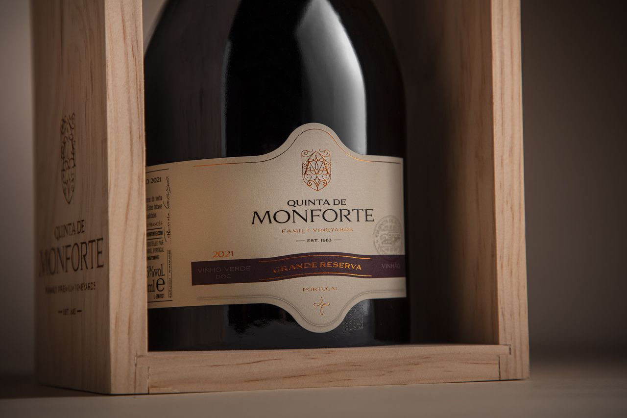
M&A Creative Agency has unveiled a refined packaging system for Quinta De Monforte Grande Reserva Special Edition, combining metallic detailing, embossing and structured typography. The redesign balances heritage and sophistication, using proportion, texture and light to create a premium visual identity that reinforces the wine’s quality and timeless appeal.
In the increasingly competitive premium wine market, packaging has become as crucial to storytelling as the vintage itself. The newly unveiled design for Quinta De Monforte Grande Reserva Special Edition by M&A Creative Agency demonstrates how restraint, craftsmanship and material sophistication can shape consumer perception long before the bottle is opened.
The redesign introduces a carefully composed visual system that leans into classic elegance while embracing contemporary refinement. Rather than relying on excessive ornamentation, the label design focuses on balance, structure and tactile detail, creating a presentation that feels both timeless and authoritative.


At the heart of the redesign is a distinctive label silhouette that immediately sets the bottle apart. The shape appears meticulously studied, drawing attention through proportion and subtle architectural influence rather than dramatic visual excess. This measured approach gives the packaging a sense of permanence and heritage, qualities closely associated with reserve wines and collector editions.
Metallic foil detailing plays a central role in the identity. Applied with precision, the foil catches and reflects light in understated ways, creating shifting highlights that enhance the bottle’s premium character. The effect is not loud or ostentatious; instead, it delivers a controlled visual richness that rewards closer inspection. Combined with embossing techniques, the surface of the label gains physical depth and texture, turning the bottle into a tactile object as much as a visual one.
Such finishing methods have become increasingly significant in luxury packaging design, particularly in the wine and spirits industry, where consumers often associate texture and craftsmanship with authenticity and quality. By integrating embossing and metallic accents with restraint, the design succeeds in communicating sophistication without compromising clarity.
Typography has also been treated with notable discipline. The lettering is precise, composed and highly structured, allowing the hierarchy of information to emerge naturally. Brand name, designation and supporting details are presented with confidence, avoiding clutter while maintaining a strong sense of identity. The result is a label that feels deliberate and assured, reinforcing the prestige associated with the Grande Reserva category.
This emphasis on hierarchy and readability reflects broader trends in contemporary luxury branding, where simplicity and confidence increasingly replace decorative overload. Consumers, especially in premium categories, are often drawn to packaging that communicates heritage and exclusivity through refinement rather than spectacle.
The Quinta De Monforte Grande Reserva Special Edition packaging also highlights the growing role of design agencies in shaping the commercial and cultural value of wine brands. Beyond aesthetics, modern packaging systems must convey authenticity, craftsmanship and differentiation in crowded retail and hospitality environments. In this context, M&A Creative Agency’s work functions not merely as decoration but as strategic brand positioning.
The bottle’s visual identity appears designed to resonate across multiple touchpoints, from fine dining tables and specialist wine retailers to social media photography and collector displays. Metallic detailing and embossed textures naturally create a sense of depth and luxury in both physical and digital environments, an increasingly important consideration in today’s image-driven marketplace.
Importantly, the redesign avoids abandoning the traditions commonly associated with reserve wines. Instead, it modernises those cues with greater precision and restraint. The result is a packaging system that honours heritage while presenting the brand with renewed confidence for contemporary audiences.
As wine producers continue investing in premiumisation strategies, packaging design remains one of the most immediate and influential forms of communication between brand and consumer. Quinta De Monforte Grande Reserva Special Edition demonstrates how thoughtful structure, typography and material execution can elevate perception, transforming a bottle into a carefully curated luxury experience before the first pour is ever served.
Discover more from Creative Brands Mag
Subscribe to get the latest posts sent to your email.


Leave a comment