

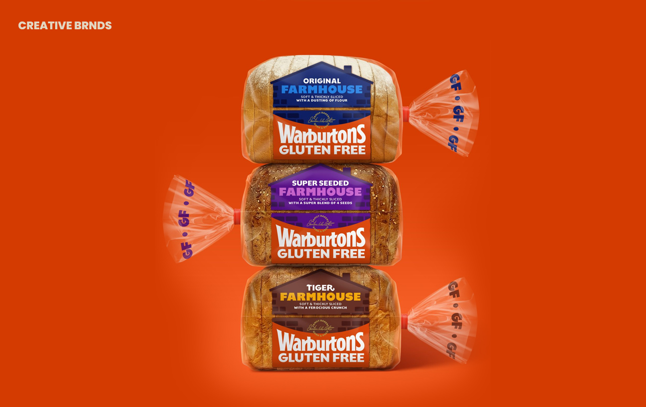
Warburtons Gluten Free celebrates 15 years with a bold redesign by Taxi Studio, extending the bakery’s wider portfolio refresh into a category where clarity and trust are paramount. The new system unifies products under a family feel, balancing recognition with individuality while reinforcing taste and credibility.
Warburtons Gluten Free, a category leader in the UK bakery sector, has marked its 15th anniversary with a striking redesign led by Taxi Studio. The project extends the company’s broader portfolio refresh into a segment where consumer trust, clarity, and ease of navigation are critical. By carrying the core visual system across the gluten-free range, the redesign ensures consistency while allowing each product to retain its personality.


At the heart of the new look is the brand’s iconic Baked Orange, a colour cue that has become synonymous with Warburtons Gluten Free. Taxi Studio has built on this recognisable asset, pairing it with bespoke typography and a shelf-first architecture that prioritises visibility and coherence. The result is packaging that strengthens recognition across the category without compromising on taste or individuality.
The challenge of gluten free branding lies in balancing reassurance with appeal. Consumers in this category often seek clarity and trust, but they also want products that feel vibrant and appetising rather than clinical. Taxi Studio’s approach delivers on both fronts, creating a family feel that unites the range while celebrating the distinct qualities of each SKU. From loaves to wraps, the refreshed packaging communicates confidence and warmth, positioning Warburtons Gluten Free as both reliable and enjoyable.
This redesign is also a demonstration of how a flexible brand world can scale across every touchpoint. By applying a cohesive visual system, Taxi Studio has ensured that Warburtons Gluten Free can confidently extend its presence across retail environments, marketing communications, and digital platforms. The consistency reinforces brand equity, while the adaptability allows for product-specific storytelling.
For Warburtons, the refresh is more than a cosmetic update; it is a strategic move to strengthen its leadership in a competitive category. Gluten free continues to grow as a segment, with consumers increasingly demanding products that combine dietary reassurance with mainstream appeal. By investing in design that prioritises clarity, trust, and shelf impact, Warburtons is positioning itself to meet those expectations while celebrating 15 years of innovation in the space.
Taxi Studio’s work underscores the importance of design in shaping consumer perception. In a category where packaging often serves as the first point of reassurance, the new Warburtons Gluten Free identity delivers confidence, coherence, and character. It is a celebration of both heritage and progress, marking a milestone with a design system built to last.
Discover more from Creative Brands Mag
Subscribe to get the latest posts sent to your email.


Leave a comment