

Le Buro Agency has created a minimalist packaging system for Vegetal Cold Pressed Oils, rooted in ingredient-first branding. Each oil is distinguished by seed, colour and character, with macro photography and botanical illustration grounding the design. The result is a crafted identity that conveys authenticity, clarity and sensory appeal.
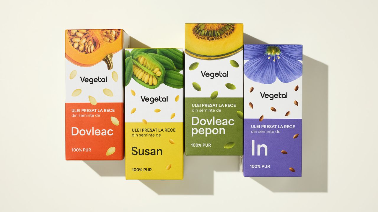
Le Buro Agency has unveiled a packaging design system for Vegetal Cold Pressed Oils that places the ingredient at the heart of the brand. Each oil is distinguished by its source seed, colour and character, with design cues that make these differences instantly legible.


Colour acts as a visual signature, ensuring each variant is recognisable at a glance. Macro photography brings the raw seed into sharp focus, grounding the product in its natural origin before pressing or processing. This direct connection to source material reinforces the brand’s commitment to authenticity and transparency.
Botanical illustration adds a layer of warmth and craftsmanship, bridging precise ingredient information with the sensory world the brand inhabits. The interplay of photography and illustration creates a dialogue between science and artistry, positioning the oils as both functional and evocative.
The minimalist system strips away excess, allowing the ingredient to speak for itself. By rooting the design in the seed, Le Buro Agency has crafted packaging that is not only visually distinctive but also narratively rich. It tells the story of each oil’s journey from seed to bottle, ensuring consumers engage with the product on both rational and emotional levels.
This approach exemplifies ingredient-first branding, where clarity and character are prioritised over decorative distraction. The result is a packaging identity that feels immediate, honest and crafted, elevating Vegetal Cold Pressed Oils into a category defined by purity and design intelligence.
Discover more from Creative Brands Mag
Subscribe to get the latest posts sent to your email.


Leave a comment