


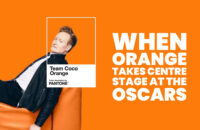
As the Oscars bask in their trademark gold, a different hue is drawing attention: Conan O’Brien’s signature orange. First formalised by Pantone in 2019 as “Team Coco Orange”, the colour reflects the comedian’s spirited persona and enduring cultural imprint as he prepares to host this year’s ceremony.
While gold has long symbolised prestige on Hollywood’s most glittering night, a more playful and unconventional shade is quietly stealing attention this year. As Conan O’Brien steps into the spotlight to host the Academy Awards, it is not just his wit that has audiences anticipating the evening, but also the unmistakable identity he brings with him—one vividly captured in a colour.
Orange, specifically “Team Coco Orange”, has become synonymous with O’Brien’s public persona, a visual shorthand for his brand of self-aware, energetic humour. The association is no accident. In 2019, the globally recognised colour authority Pantone, through its Pantone Color Institute, collaborated with O’Brien’s media venture to formalise the hue as a bespoke signature shade.
The creation of “Team Coco Orange” marked a rare moment where a personality, rather than a product or trend, inspired a proprietary colour. Drawing from the comedian’s famously bright hair and the vibrant tone embraced by his fan community, the shade was designed to encapsulate his comedic ethos—bold yet approachable, eccentric yet warm. It was, in essence, a chromatic embodiment of O’Brien himself.
Colour has long played a subtle yet powerful role in shaping public perception, particularly in the entertainment industry. From the red carpets that signal glamour to the black tuxedos that convey timeless sophistication, hues are laden with meaning. In this context, O’Brien’s orange stands apart, rejecting convention in favour of individuality. It mirrors his career trajectory, which has consistently defied traditional expectations of late-night television.
Hosting the Oscars places O’Brien within a lineage of performers tasked with balancing reverence for cinema with the unpredictability of live entertainment. Yet, his presence also signals a shift towards a more relaxed and personality-driven approach to the ceremony. The symbolic resonance of his signature colour reinforces this shift, suggesting an evening that may lean as much on humour and relatability as on grandeur.
The decision by Pantone to immortalise “Team Coco Orange” also underscores the evolving relationship between branding and identity in contemporary media. In an era where personalities function as multi-platform brands, the codification of a colour becomes an extension of storytelling. It allows audiences to instantly recognise and connect with a figure, even in the absence of words.
As the ceremony unfolds, the dominance of gold statuettes and shimmering gowns will remain unquestioned. Yet, the quiet presence of orange—whether in subtle design elements, promotional material, or simply in the collective imagination of viewers—serves as a reminder that cultural impact is not always measured in tradition. Sometimes, it is found in the unexpected.
For O’Brien, “Team Coco Orange” is more than a novelty; it is a testament to a career built on standing out while inviting audiences in. As he takes the stage, the colour that once began as a playful nod to his appearance now carries the weight of a carefully crafted identity, one that continues to evolve while remaining instantly recognisable.
In a night defined by legacy and achievement, the rise of an unconventional hue offers a different kind of narrative—one that celebrates creativity not just in film, but in the ways personalities shape and colour the cultural landscape.
Discover more from Creative Brands Mag
Subscribe to get the latest posts sent to your email.


Leave a comment