


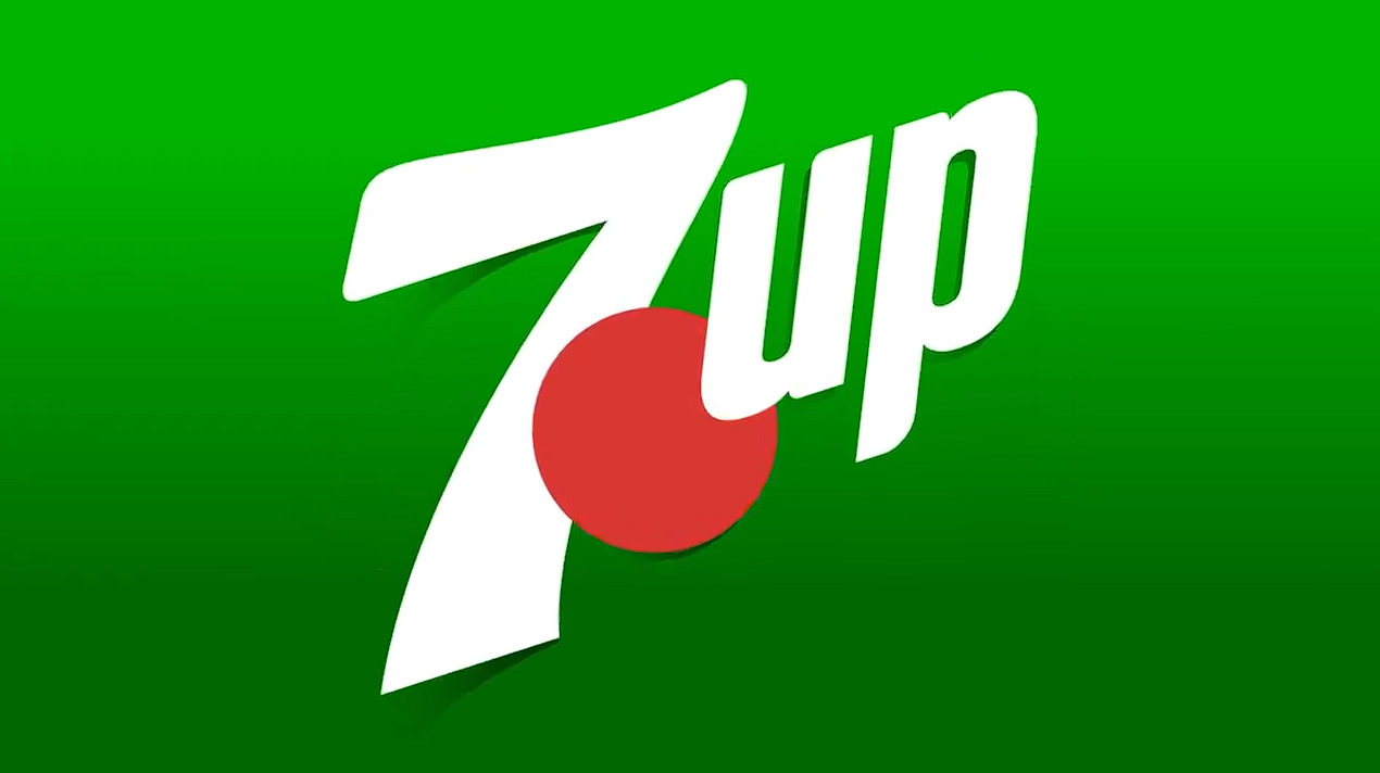
7UP has unveiled a striking new packaging system created by Deutsch, designed to make the brand unmistakable on shelf. Centred on a reimagined red dot disrupting a vivid green backdrop, the design embodies 7UP’s “Whatever the world expects, 7UP ‘Un’s it” spirit with playful, unexpected energy.
7UP has taken a daring leap in its latest packaging redesign, developed in collaboration with Deutsch, to ensure the brand stands out in a crowded marketplace. The brief was clear: make 7UP unmistakable on shelf while bringing its irreverent “Whatever the world expects, 7UP ‘Un’s it” ethos to life. Rather than opting for a simple refresh, the creative team sought to remix the brand’s most recognisable equities into something bold, playful and unexpected.
At the heart of the new design system lies the iconic green and red dot, a familiar piece of 7UP heritage now reimagined as a powerful disruption cue. The red dot bursts through a vivid new green, injecting energy and dynamism into the pack. In a category where green has become the default, this striking interplay of colours ensures 7UP commands attention while simultaneously honouring its legacy. The design even flips the familiar Lemon Lime to Lime Lemon, a cheeky inversion that underscores the brand’s commitment to “UN” the expected.
This redesign is more than a cosmetic update; it is a strategic move to reinforce 7UP’s identity as a brand that thrives on surprise and delight. By reworking its equities rather than abandoning them, 7UP has created a visual language that feels both familiar and fresh. The boldness of the red dot against the green backdrop conveys a sense of disruption, aligning perfectly with the brand’s positioning as a challenger in the soft drinks category.
The packaging’s playful energy also speaks to younger audiences who value brands that break conventions and inject personality into everyday experiences. In a retail environment where shelf space is saturated with similar hues and cues, 7UP’s new look offers a refreshing jolt of individuality. The design’s simplicity belies its sophistication, with the red dot acting as a focal point that draws the eye and communicates the brand’s spirit in an instant.
Strategically, the redesign reflects a broader ambition to make packaging an extension of the brand’s storytelling. It is not just about containing a beverage but about communicating an attitude. By embedding the “UN” philosophy into the very fabric of the design, 7UP ensures that its packaging becomes a conversation starter, a visual shorthand for its playful defiance of expectations.
As the new packs roll out, they are set to redefine how consumers perceive 7UP on shelf. The bold green, the disruptive red dot and the cheeky inversion of Lemon Lime to Lime Lemon together create a system that is unmistakably 7UP yet refreshingly new. In doing so, the brand has achieved its goal: to remix heritage into a design that feels vibrant, unexpected and impossible to ignore.
Discover more from Creative Brands Mag
Subscribe to get the latest posts sent to your email.










Leave a comment