

Warburtons, Britain’s most chosen FMCG brand, has unveiled a refreshed identity by Taxi Studio. The redesign unifies its 70-strong product portfolio with a bold orange palette, bespoke typeface, and heritage-inspired roundel. Anchored by the iconic “smile”, the system strengthens shelf presence and ensures instant recognition across categories.
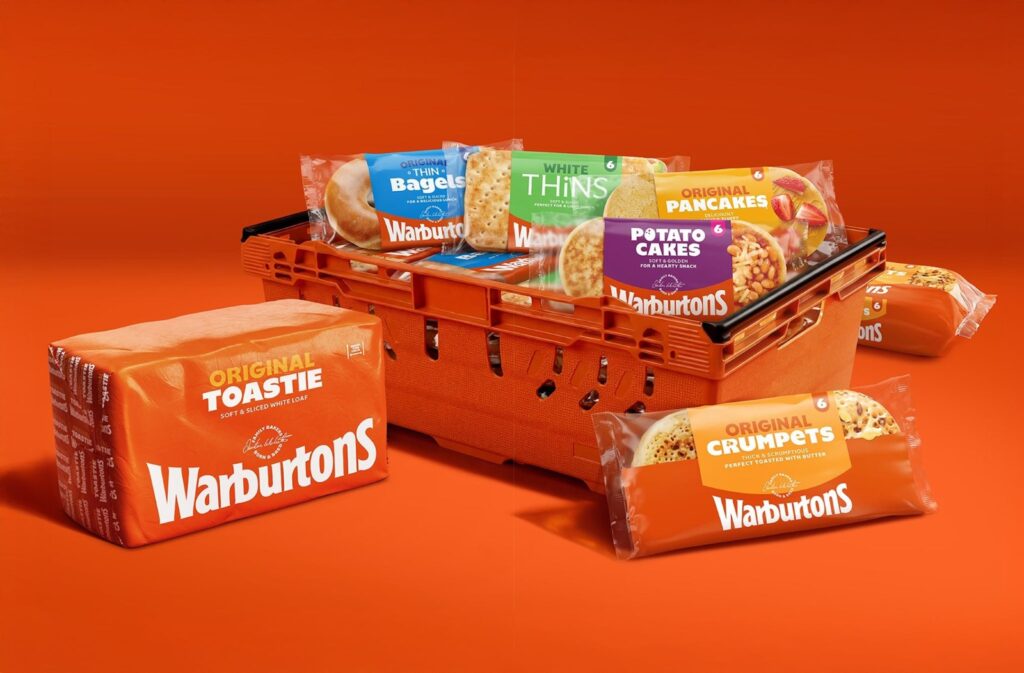
Warburtons, the family-run bakery brand that has become Britain’s most chosen FMCG name, has taken a decisive step in redefining its visual identity. With more than 70 products spanning multiple categories, the challenge was clear: how to unify such a vast portfolio while ensuring the brand remains instantly recognisable in an increasingly crowded retail environment.
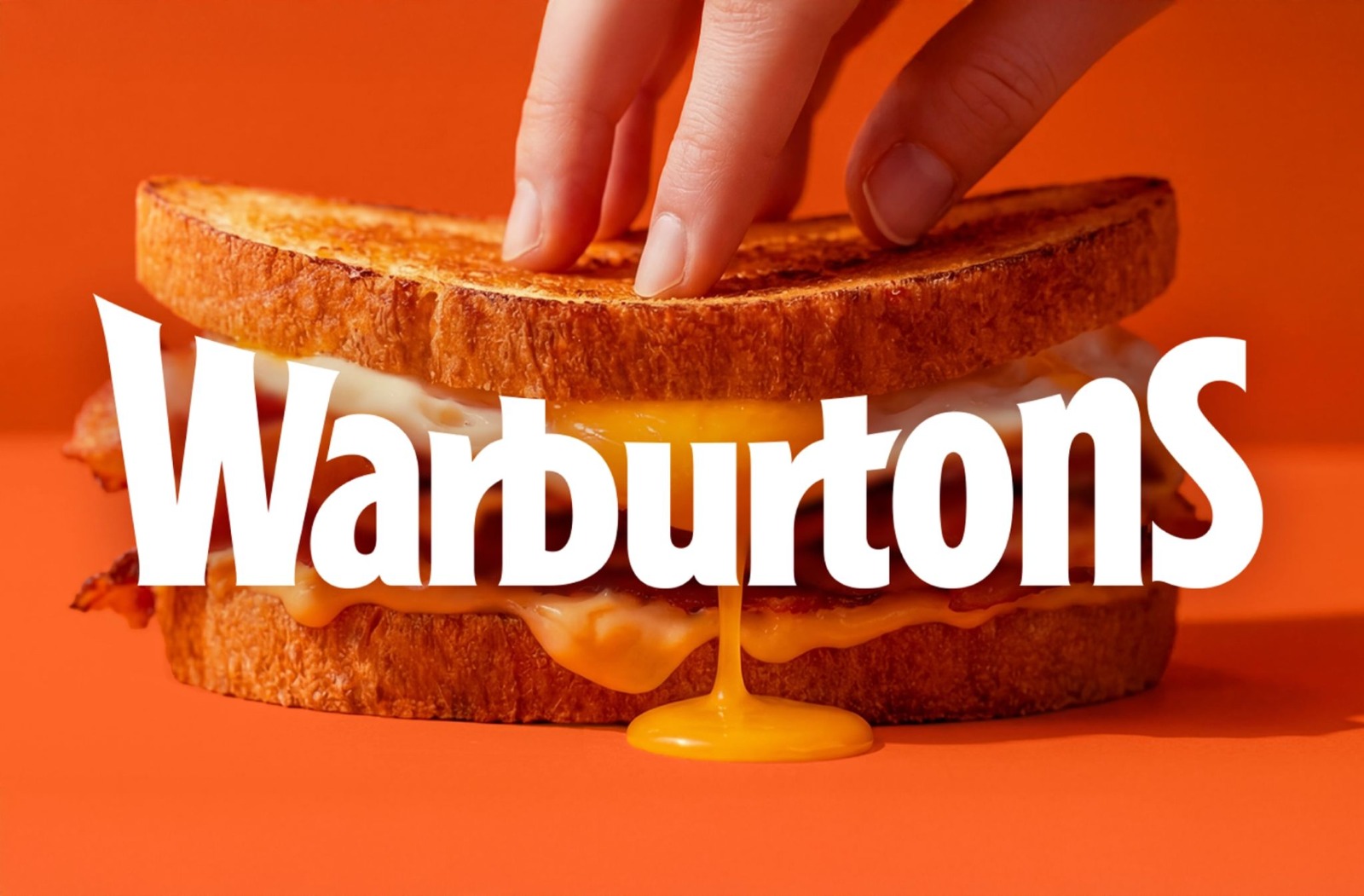
Taxi Studio, the Bristol-based design agency, was tasked with creating a system that would not only strengthen Warburtons’ shelf presence but also celebrate its heritage. The solution is a cohesive pack architecture built around the brand’s most enduring symbol: the smile. Inspired by the curve of the wordmark, the smile becomes the central motif, anchoring the design and providing a sense of warmth and familiarity.
Colour plays a vital role in the new identity. A bold use of Baked Orange dominates the packaging, ensuring visibility across formats and categories. This vibrant hue is not only distinctive but also deeply associated with Warburtons, making it a powerful tool for instant recognition. By applying it consistently, the brand achieves a striking presence that cuts through the clutter of supermarket shelves.
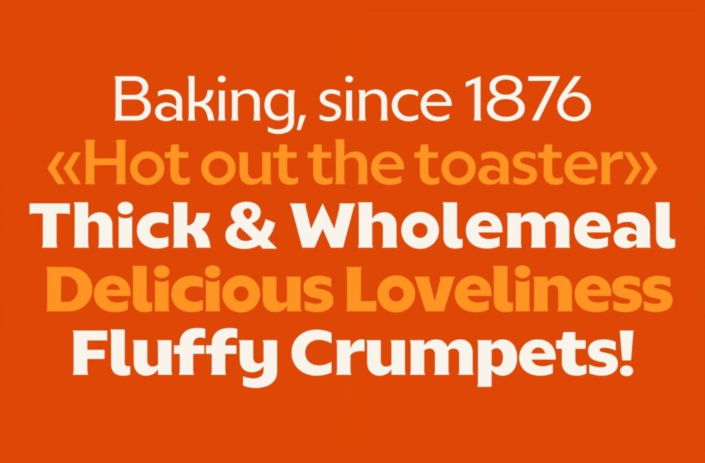
Typography has also been carefully considered. A bespoke typeface, developed in collaboration with Studio Drama, provides a consistent visual voice across the portfolio. It balances modernity with approachability, ensuring that the brand feels contemporary while retaining its family-friendly character. The typeface works seamlessly with the smile motif, reinforcing the sense of unity across products.
Adding to this system is a signature roundel, a design element that conveys heritage and warmth. It acts as a seal of authenticity, reminding consumers of Warburtons’ long-standing reputation for quality and trust. Together, these elements form a brand system that is both unified and highly impactful, capable of flexing across categories without losing coherence.
For Warburtons, the redesign is more than cosmetic. It is a strategic move to safeguard its position as Britain’s most chosen FMCG brand, ensuring that its products remain instantly identifiable in a competitive marketplace. By blending heritage with bold modernity, Taxi Studio has delivered a system that not only strengthens shelf presence but also reinforces the emotional connection consumers have with the brand.
In a sector where visibility and recognition are paramount, Warburtons’ smile now shines brighter than ever.
Discover more from Creative Brands Mag
Subscribe to get the latest posts sent to your email.


Leave a comment