

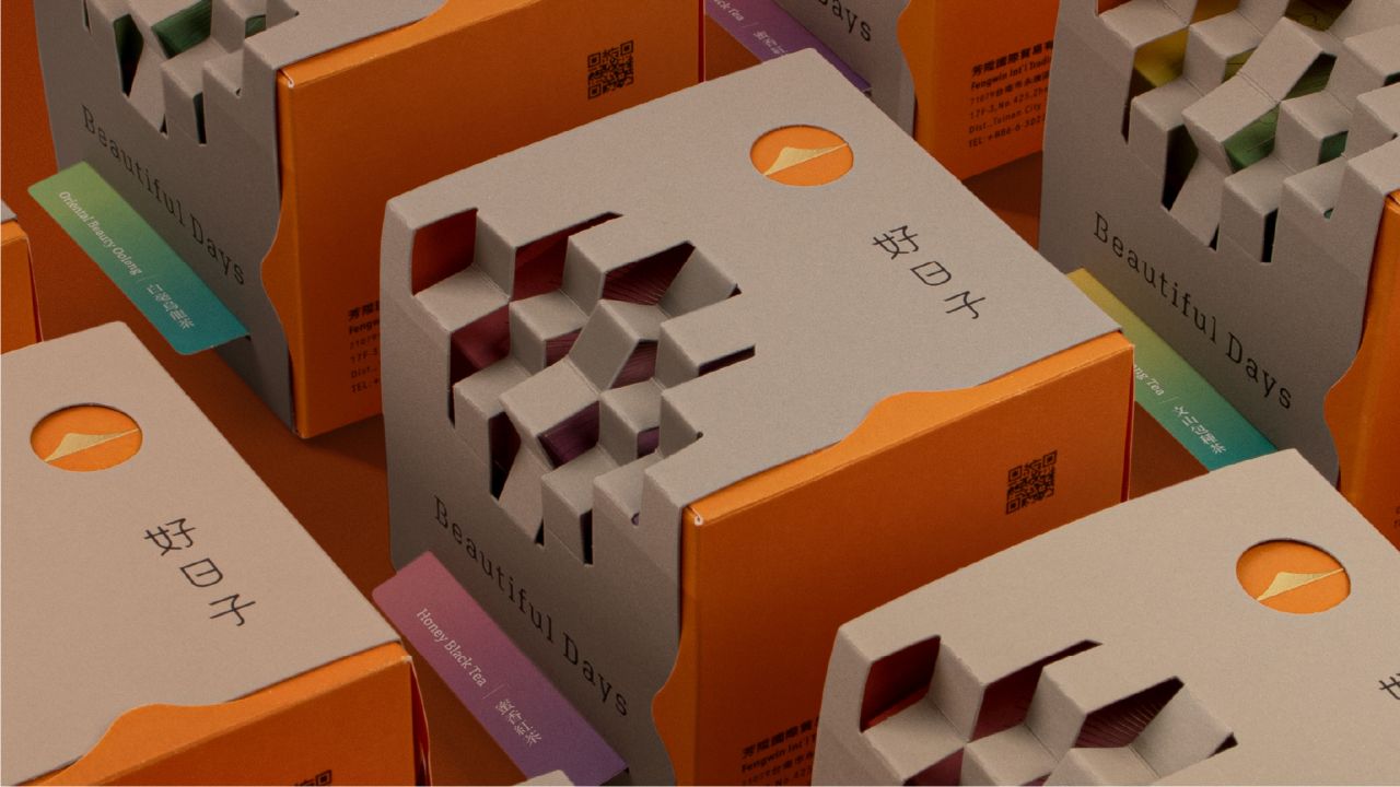
Sump Design has created the brand identity and packaging for Beautiful Days tea, inspired by the idea that mornings bring renewal. A sun motif, rice grey and warm orange palette, plus gold-foil textures distinguish varieties. The design reflects mountain origins and daily rituals, positioning tea as a serene, uplifting experience.
Sump Design has unveiled the brand identity and packaging for Beautiful Days, a tea brand built around the concept that “Beautiful Days begin at dawn.” The identity translates the sun into a central motif, with a logo referencing mountains, roof tiles and morning light to evoke both the tea’s mountain-grown origin and the calm ritual of starting a new day.


The design palette of rice grey and warm orange establishes a clean, approachable tone, while colour coding and gold-foil textures distinguish tea varieties and create a consistent hierarchy across the range. This careful balance of symbolism and materiality ensures that the brand feels both grounded in nature and elevated in presentation.
By embedding the imagery of dawn into its visual language, Sump Design has crafted an identity that resonates with the rhythm of daily life. The interplay of light, texture and colour positions Beautiful Days as more than a beverage—it becomes a ritual of renewal, a reminder that each morning offers a fresh beginning.
The project demonstrates how thoughtful design can transform packaging into storytelling. With its harmonious blend of cultural cues and contemporary aesthetics, Beautiful Days captures the essence of serenity and optimism, inviting consumers to embrace the calm promise of a new day with every cup.
Discover more from Creative Brands Mag
Subscribe to get the latest posts sent to your email.


Leave a comment