


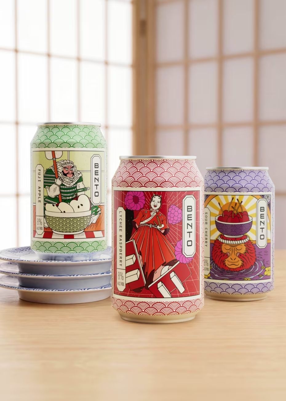
Kamon, Japan’s ancient family crests, embody timeless design principles that continue to shape modern branding. From Japan Airlines’ crane to Mitsubishi’s emblem, their influence endures. Bento’s wine identity, created by Denomination, draws on Japanese visual language rather than borrowed motifs, proving coherence and cultural respect matter more than superficial symbolism.
Walk into almost any Japanese restaurant and you’ll spot them. Small circular marks on menus, doorways, sake bottles and shopfronts. Easy to miss until you know what you’re looking at, then suddenly they’re everywhere. These are kamon, family crests dating back to the 8th century, carrying more meaning in a handful of lines than many modern logos manage after a complete rebrand.


There are more than 26,000 of them, built from cranes, mountains, temples, blossoms and leaves. Every line has a purpose. Every unnecessary detail has already been removed. That economy of form is precisely why they still work centuries later.
Japan Airlines built decades of recognition around its red‑crowned crane, retired it, then brought it back in 2011 as part of its recovery. Mitsubishi still uses a mark derived from the Iwasaki family crest. Sogo has carried its emblem since opening as a kimono merchant in 1830. Even the visual thinking behind the Tokyo 2020 identity owes something to the same tradition. These examples show how kamon are not relics but living design systems, capable of anchoring brands in cultural continuity while remaining visually powerful in contemporary contexts.
Yet many brands borrow Japanese symbols without understanding the thinking behind them. A crane, a rising sun or a brushstroke doesn’t make something Japanese any more than a baguette makes something French. The difference lies in the discipline: kamon are not decorative flourishes but distilled ideas, stripped of excess until only the essence remains.
Bento, created by Denomination for Fourth Wave Wines, approached the challenge differently. Rather than lifting motifs, the identity was developed around Japanese visual language itself. Illustrated characters set the tone, the logotype runs vertically, and a seal inspired by “Specialty of the House” works like a traditional stamp of approval. Capsule colours reference ceramics, while varietal information sits inside vertical lozenges stacked like Japanese text.
None of these details exists in isolation. Together they create a coherent identity rather than a collection of borrowed references. The system feels authentically Japanese not because it uses familiar icons, but because it respects the underlying logic of Japanese design: clarity, rhythm, and cultural resonance.
In a global market where brands often chase novelty, the lesson of kamon is permanence. Their survival across centuries demonstrates the power of reduction, symbolism and cultural rootedness. For Bento, the result is a wine identity that avoids cliché and instead channels the same visual intelligence that has kept kamon relevant for more than a millennium.
Discover more from Creative Brands Mag
Subscribe to get the latest posts sent to your email.














Leave a comment