


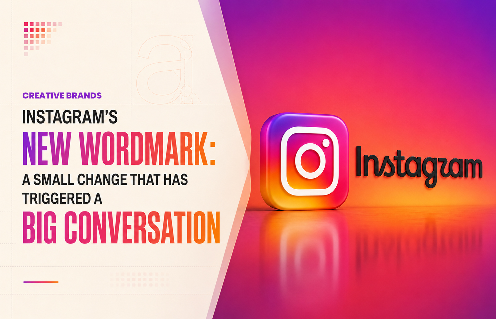
Instagram has refreshed its wordmark for the first time in nearly a decade, introducing a sharper, more compact type treatment while retaining its familiar camera icon. Designed to modernise the platform’s visual identity, the change has nevertheless prompted debate over readability, with users quickly turning the redesign into an internet meme.
Instagram has changed one of the most recognisable elements of its visual identity, unveiling a redesigned wordmark after almost ten years. The update does not replace the familiar Instagram camera icon that millions of users recognise on their phone screens. Instead, it changes the way the word “Instagram” itself is written, marking a relatively subtle but significant shift in the platform’s branding.
The new wordmark was introduced on August 13, with Instagram head Adam Mosseri describing the refreshed design as sharper and more modern while retaining a connection with the platform’s original visual language. The redesign follows the previous major identity change in 2016, when Instagram moved away from its earlier skeuomorphic camera design and embraced the now-familiar colourful gradient icon.
At first glance, the change may appear minor. The new lettering is more compact and carries stronger, flowing curves, particularly around letters such as “s”, “r” and “g”. The intention is to create a contemporary wordmark that can work comfortably across the growing number of digital environments in which Instagram appears. For a platform that has evolved dramatically over the past decade, the typography is being asked to reflect that transformation.
Yet branding is rarely just about appearance. For a global platform, even a small alteration to a familiar typeface can become immediately noticeable. Instagram’s previous wordmark had been part of the visual landscape for a decade, giving it considerable familiarity. Changing it therefore means asking billions of users to accept something that may initially look slightly unfamiliar.
The reaction has been swift and, as is often the case with changes to major technology brands, highly opinionated. Some users have welcomed the cleaner and more contemporary appearance. Others have questioned whether the new lettering is sufficiently clear. One particular criticism has centred on the appearance of the letter “r”, which some people believe can resemble a “z” at first glance. That has led to jokes online referring to the platform as “Instagzam”.
The irony is that the controversy may demonstrate precisely how powerful the Instagram brand has become. People are not merely noticing a new typeface; they are comparing individual letters with an image stored in their memory after years of exposure. When a brand is seen every day, even tiny changes can become subjects of public discussion.
There is also an important distinction between Instagram’s “new logo” and its new wordmark. The colourful camera icon remains unchanged. That icon is arguably the more valuable part of the identity because it functions at extremely small sizes and is immediately recognisable without the need to read anything. The wordmark, by comparison, plays a more supporting role across the app, website, advertising and other brand communications.
This makes the decision to update only the lettering particularly interesting. Instagram can refresh its identity without forcing users to relearn the symbol they associate with the service. It is a comparatively low-risk way of signalling change while preserving one of its strongest visual assets.
The timing is significant too. Instagram in 2026 bears little resemblance to the Instagram of 2016. What began primarily as a photo-sharing service has become a sprawling platform for short-form video, creators, messaging, commerce and personalised discovery. Reels has become a central part of the experience, while the platform continues to expand its role in entertainment and communication. Meta’s own updates in 2026 show Instagram continuing to develop new features and experiences across different screens and formats.
A visual identity designed a decade ago therefore faces a different technological environment. Screens have changed, interfaces have become more complex and brands increasingly need typography that can work consistently across mobile applications, websites, advertising, video and other digital experiences.
That is why the new wordmark should not necessarily be viewed simply as a cosmetic alteration. It is part of the wider challenge facing technology brands: how to remain recognisable while avoiding the impression of becoming visually frozen in time.
There is another lesson in the immediate response. In an age when audiences are accustomed to commenting on every brand decision almost instantly, a redesign is no longer something that can quietly enter the market. Social media itself has become the focus group. A new typeface can be examined, mocked, defended and transformed into memes within hours.
For Instagram, that process has already begun. The debate over whether the new lettering is more modern or less readable has become part of the redesign story itself. Such reactions are not necessarily evidence of failure. Familiarity often makes any major brand change uncomfortable at first. What looks unusual today can become normal surprisingly quickly.
The more important question is whether the new wordmark works consistently in real-world use. A brand identity has to function not only in a large presentation but also in tiny mobile interfaces, advertisements, videos, websites and different screen conditions. It has to remain recognisable without demanding too much attention from the audience.
Instagram’s decision to preserve its camera icon suggests that the company understands the value of continuity. The wordmark can evolve while the symbol remains a familiar anchor. In that sense, the redesign is less a revolution than a carefully measured adjustment.
The new Instagram wordmark may ultimately become invisible to the people who use the platform every day. That is often the mark of a successful rebrand. Once the unfamiliar becomes familiar, users stop noticing the letters and return to noticing the content.
For now, however, Instagram has discovered an unavoidable truth about modern branding: when a company has billions of users, even changing a few curves in a word can become global news.
Discover more from Creative Brands Mag
Subscribe to get the latest posts sent to your email.














Leave a comment