


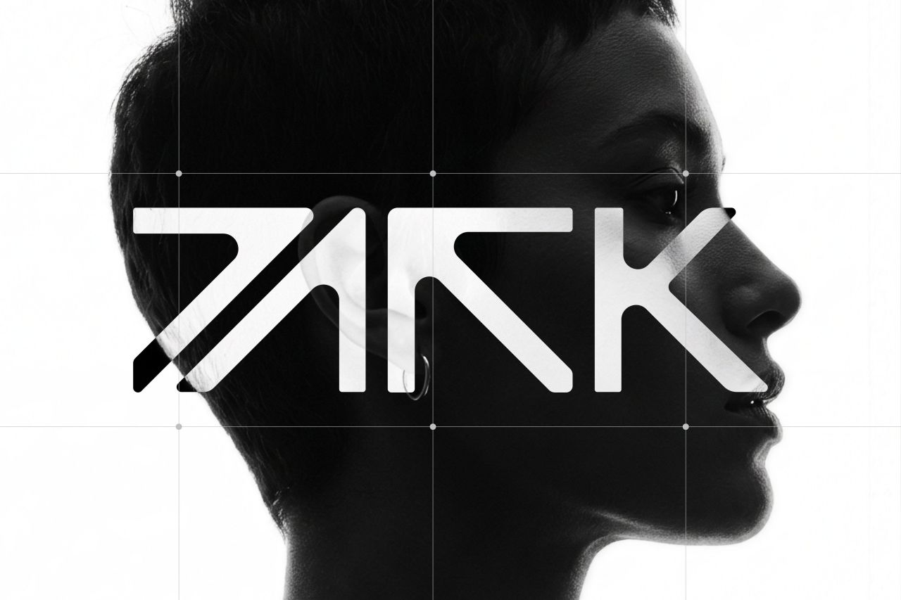
Stuttgart’s iconic Perkins Park has re-emerged as PARK, unveiling a bold new identity crafted by local studio Hochburg. With a stripped-back symbol designed to be decoded and remembered, the club enters a new era of house and techno, international bookings, and large-scale nights for a fresh generation of audiences.
For more than four decades, Perkins Park stood as a cornerstone of Stuttgart’s nightlife, a venue synonymous with late nights, eclectic crowds and a cultural rhythm that shaped the city’s social scene. In 2026, the club embraced a new chapter, shedding its long-held name to become PARK, a transformation that signals both continuity and reinvention.
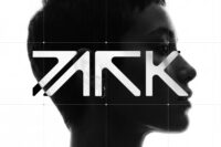
The rebrand was entrusted to Stuttgart-based design studio Hochburg, whose collaboration with club operator Denis Gugac has spanned years. Hochburg’s Creative Director Florian Boyd describes the new identity as “a symbol you decode once and then recognise.” The design strips the four letters of PARK down to their essence, arranged on a tight, almost square grid. At first glance, the name appears abstract, almost unreadable, but once deciphered it becomes a mark of recognition—an emblem of belonging for those who step inside.


This deliberate ambiguity reflects the club’s ambition to move beyond mere typography and into the realm of cultural iconography. The identity is not simply a logo but a visual experience, one that mirrors the club’s shift towards a programme defined by house and techno, international bookings and nights designed for scale. PARK is no longer just a venue; it is a decoded symbol of Stuttgart’s evolving nightlife.
The decision to rename Perkins Park was not taken lightly. Since 1980, the club had been a fixture, its name carrying decades of memories for generations of partygoers. Yet the new identity acknowledges that nightlife itself is in constant flux. By adopting PARK, the club positions itself as a space for renewal, a place where tradition meets the demands of a new audience hungry for immersive experiences.
Hochburg’s design approach underscores this transition. The stripped-back geometry of the wordmark is both modern and timeless, a visual metaphor for the club’s ability to adapt while retaining its essence. The square grid structure suggests stability, while the act of decoding the symbol mirrors the discovery inherent in nightlife—the thrill of entering a space that reveals itself only once you are inside.
For Gugac, the operator behind the transformation, the collaboration with Hochburg represents more than a design exercise. It is a statement of intent: PARK is built to host larger-scale nights, to welcome international talent, and to redefine Stuttgart’s place on the European clubbing map. The new identity is the visual anchor for this ambition, a mark that will live on posters, tickets, digital platforms and, most importantly, in the memories of those who dance beneath its lights.
As Stuttgart’s nightlife continues to evolve, PARK stands as both a tribute to its past and a bold step into its future. The decoded symbol, once mysterious, now becomes a beacon—an invitation to gather, to celebrate, and to experience the rhythm of a city that never stops reinventing itself.
Discover more from Creative Brands Mag
Subscribe to get the latest posts sent to your email.







Leave a comment