

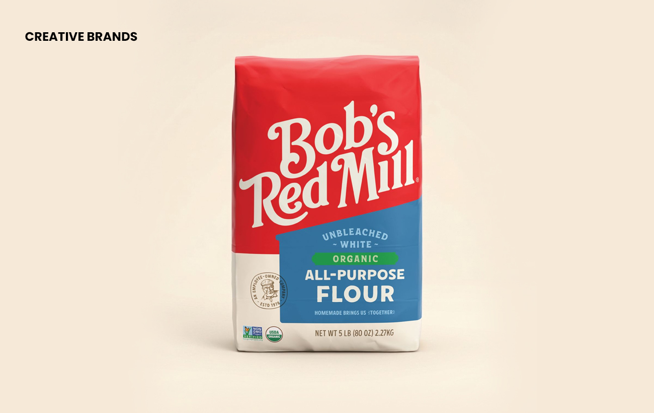
Bob’s Red Mill has completed a three‑year rebrand to unify its sprawling portfolio of more than 200 products. Founded in 1978 by Bob and Charlee Moore, the company’s packaging had grown cluttered and inconsistent. The new identity restores clarity, reinforces heritage and strengthens shelf presence while spotlighting its wholesome mission.
Bob’s Red Mill, the beloved whole-grain pioneer founded in 1978 by Bob and Charlee Moore, has unveiled a comprehensive three‑year rebrand designed to bring clarity and cohesion to its sprawling portfolio of more than 200 products. The overhaul seeks to restore the company’s founding story and sharpen its shelf presence.
For decades, Bob’s Red Mill has been a grocery staple, but its packaging had become fragmented and inconsistent. As new products were introduced, each line developed its own look, leaving cereals, beans and oats appearing disconnected from the brand’s core flour range. Even the flagship five‑pound flour bag carried a design that, while quaint, was cluttered and confusing—likened more to a bottle of Dr. Bronner’s soap than a baking essential.


Creative director Margret Brown explained that the redesign was about returning to the brand’s origins: a red mill run by a husband‑and‑wife duo with a mission to bring wholesome grains into everyday diets. That mission, she noted, is more relevant than ever as consumers increasingly seek alternatives to ultra‑processed foods. The new identity unites all products under one cohesive system, ensuring they feel part of the same family while still allowing for differentiation across categories.
The refreshed packaging emphasises clarity, readability and impact on crowded grocery shelves. By consolidating the brand’s diverse offerings under a single visual roof, Bob’s Red Mill aims to strengthen recognition, highlight its heritage and reaffirm its commitment to quality ingredients. The rebrand is not just cosmetic—it is a strategic move to reconnect shoppers with the company’s authentic story and to position the brand for continued growth in a competitive market.
Discover more from Creative Brands Mag
Subscribe to get the latest posts sent to your email.


Leave a comment