


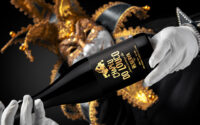
M&A Creative Agency has introduced a striking visual identity for Chapéu do Louco, a label inspired by the fine line between logic and imagination. Through high-contrast colours, elliptical patterns, and bold typography, the design transforms the idea of “healthy madness” into a visual experience celebrating creativity, perception, and emotional intensity.
M&A Creative Agency has unveiled a visually arresting identity for Chapéu do Louco, a label conceived as a tribute to the mysterious territory where rational thought gives way to imagination. With a design language rooted in contrast, symbolism, and movement, the agency has crafted packaging that seeks to embody what it describes as the “healthy madness” that exists within every creative mind.
At the centre of the concept is the belief that madness is not simply disorder or chaos but a form of liberation. Chapéu do Louco explores the fragile boundary between clarity and creative disruption, presenting madness as the courage to perceive the world differently and to experience emotions more intensely. Rather than portraying irrationality as something to fear, the brand reframes it as a powerful engine of discovery, where intuition and curiosity push beyond the limits of conventional thinking.
The visual identity reflects this philosophy through a distinctive elliptical pattern that radiates across the label. The pattern is designed to evoke the sensation of the mind in motion, capturing the fleeting moment when consciousness detaches from ordinary reality. In that state, thoughts appear to accelerate and expand, stretching beyond the rigid frameworks of logic. The radiating lines create a sense of dynamic tension, drawing the viewer’s gaze inward while simultaneously projecting energy outward.
This dual movement is central to the narrative of the design. The swirling geometry resembles a vortex, symbolising the experience of entering a dream-like mental space while remaining aware of its intensity. It conveys the sensation of closing one’s eyes while perception opens wider, suggesting that imagination often thrives when the boundaries of reality soften.
Colour plays an equally significant role in communicating the brand’s emotional core. The palette is deliberately intense, dominated by deep red, blue, and black tones that evoke instinctive human responses. Red suggests passion and energy, blue carries the depth of contemplation, and black introduces a sense of mystery and the unknown. Together, they form a dramatic visual foundation that reflects the psychological complexity behind the concept.
Against this darker background, gold typography emerges with striking clarity. The metallic lettering functions almost like a moment of revelation within the visual storm. It symbolises the clarity that can arise from chaos, suggesting that creativity often emerges from states of tension and contradiction. The gold accents illuminate the design, hinting at brilliance discovered within apparent disorder.
This interplay between darkness and light, chaos and clarity, is at the heart of the brand’s storytelling. The design seeks to mirror the mental landscape of creativity itself, where ideas frequently appear in unpredictable bursts, shaped by emotion as much as by logic. By visualising these contrasts, the label becomes a metaphor for the human psyche and its capacity to navigate between reason and imagination.
The name Chapéu do Louco, which translates to “Madman’s Hat”, reinforces this philosophy. Rather than functioning merely as a brand title, it acts as a symbolic invitation. The phrase suggests stepping into a different state of awareness, where curiosity replaces certainty and where wonder can flourish without restraint.
M&A Creative Agency’s approach positions the label as more than a product identity. Instead, it frames Chapéu do Louco as a conceptual experience—one that encourages viewers and consumers to embrace their own creative impulses. The design invites them to pause, close their eyes metaphorically, and allow their thoughts to wander beyond predictable boundaries.
In a market where packaging often prioritises clarity and minimalism, Chapéu do Louco deliberately leans into complexity and emotion. The layered symbolism, energetic patterns, and vivid contrasts challenge viewers to engage more deeply with the visual narrative. Rather than offering immediate answers, the design encourages interpretation, mirroring the unpredictable nature of imagination itself.
Ultimately, the project reflects a broader creative philosophy: that innovation frequently emerges from moments when conventional reasoning loosens its grip. By celebrating the thin line between madness and genius, M&A Creative Agency has created a label that transforms introspection into visual form.
Chapéu do Louco, through its high-contrast aesthetic and conceptual depth, stands as both a design statement and a reminder that creativity often begins where certainty ends. It invites audiences to explore the unknown corners of perception, proving that sometimes the most profound discoveries occur when the mind dares to wander beyond reason.
Discover more from Creative Brands Mag
Subscribe to get the latest posts sent to your email.


Leave a comment